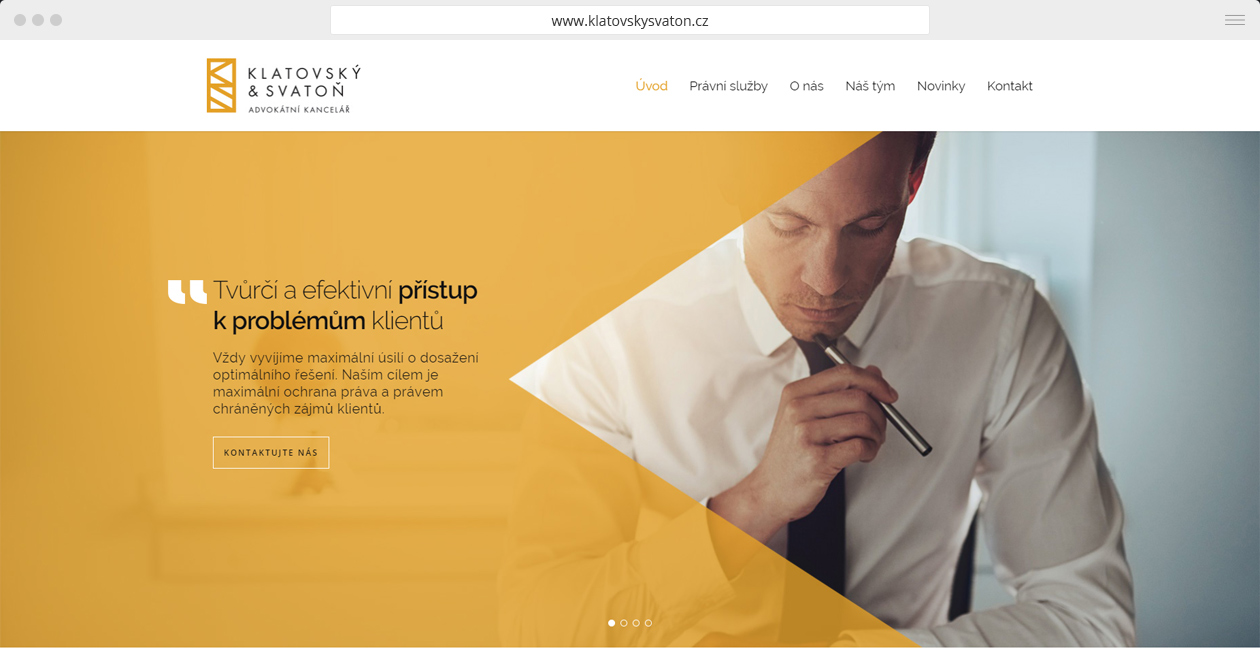
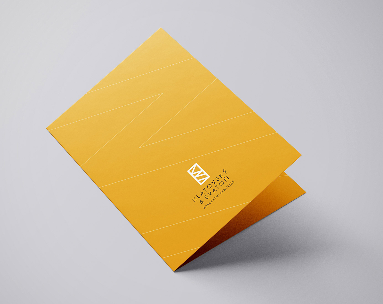
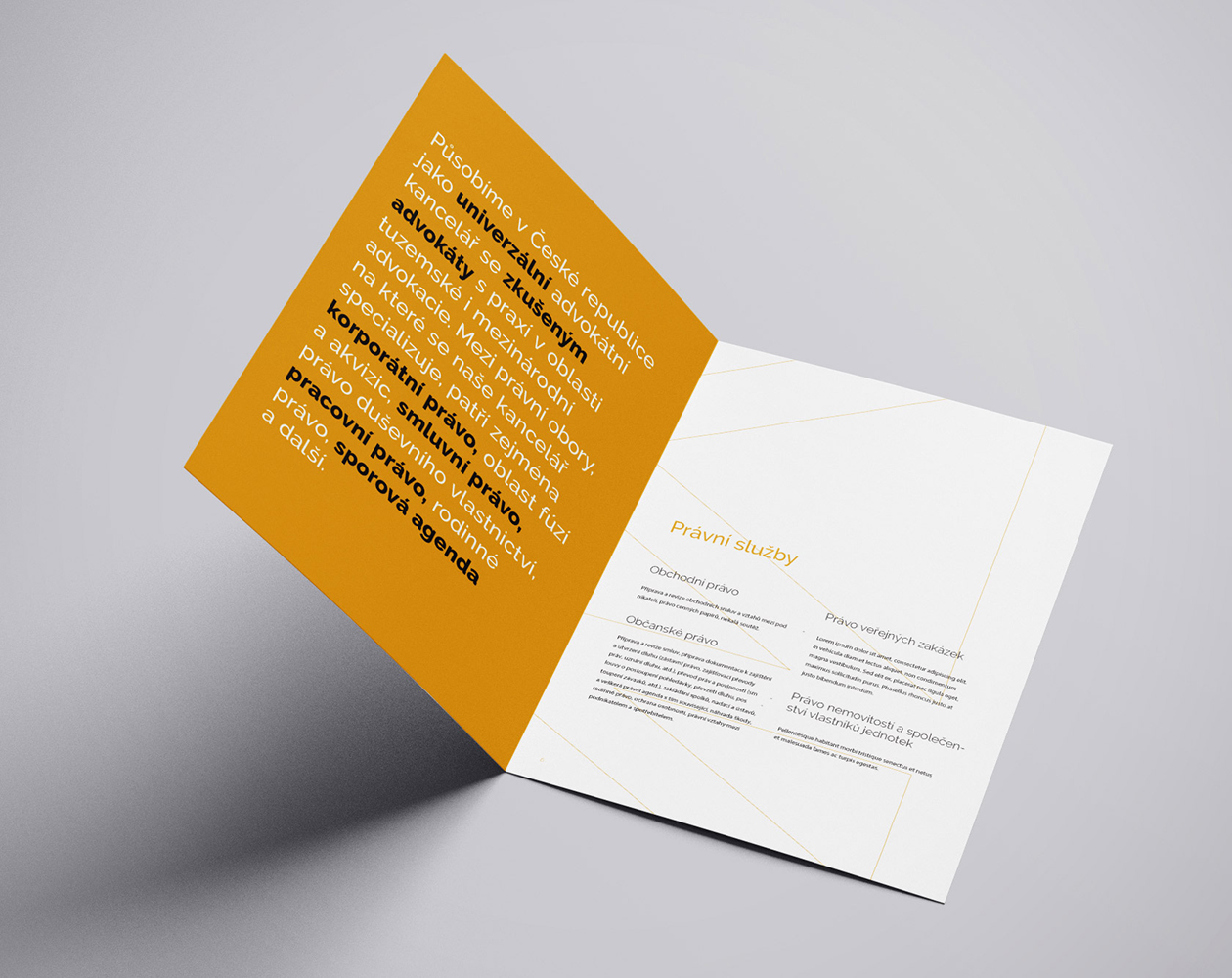
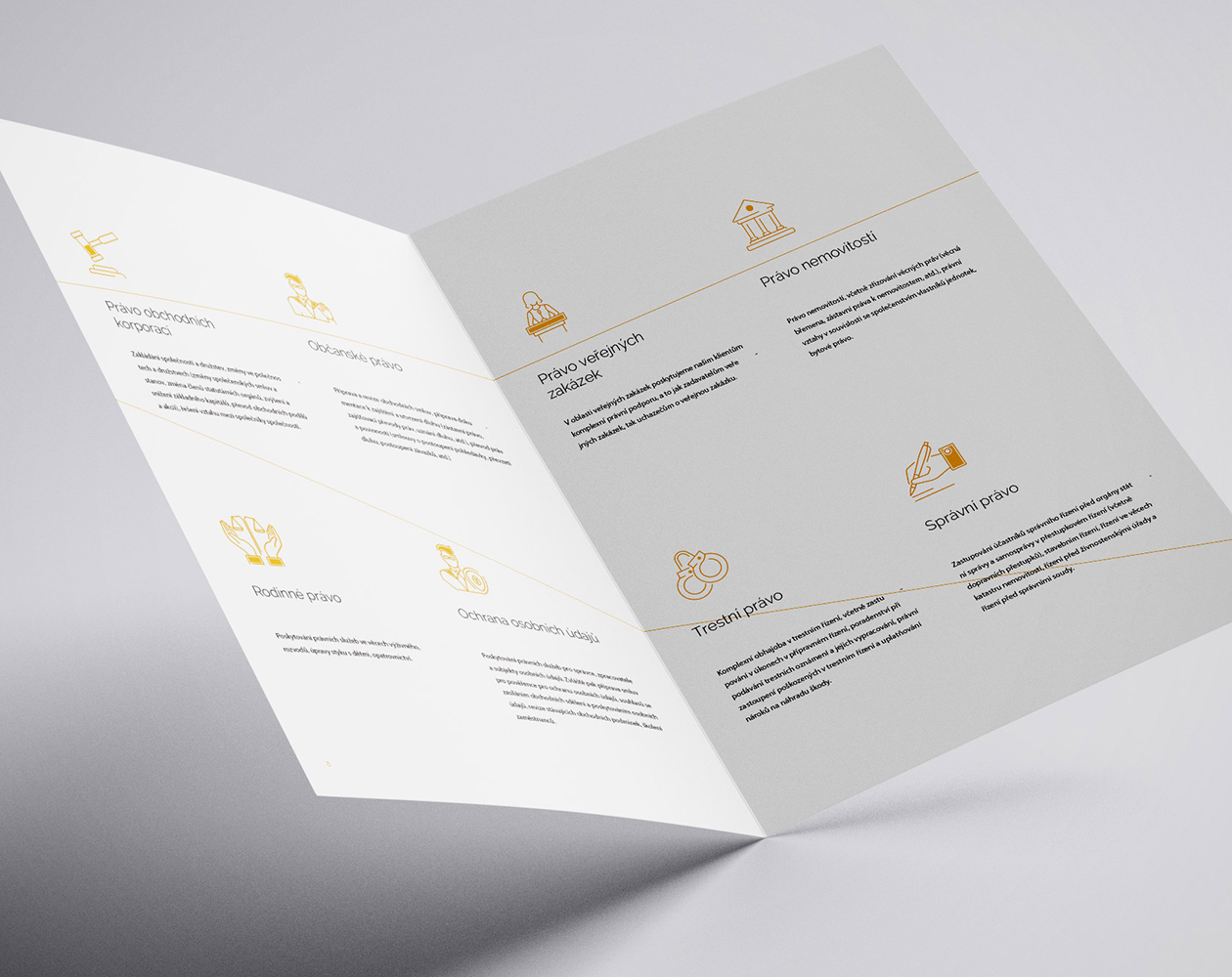
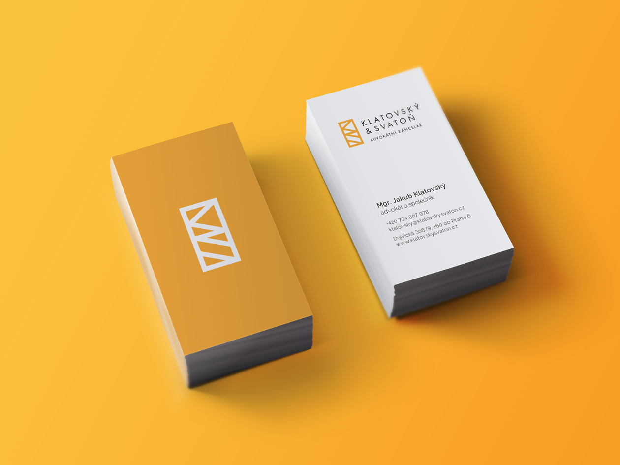
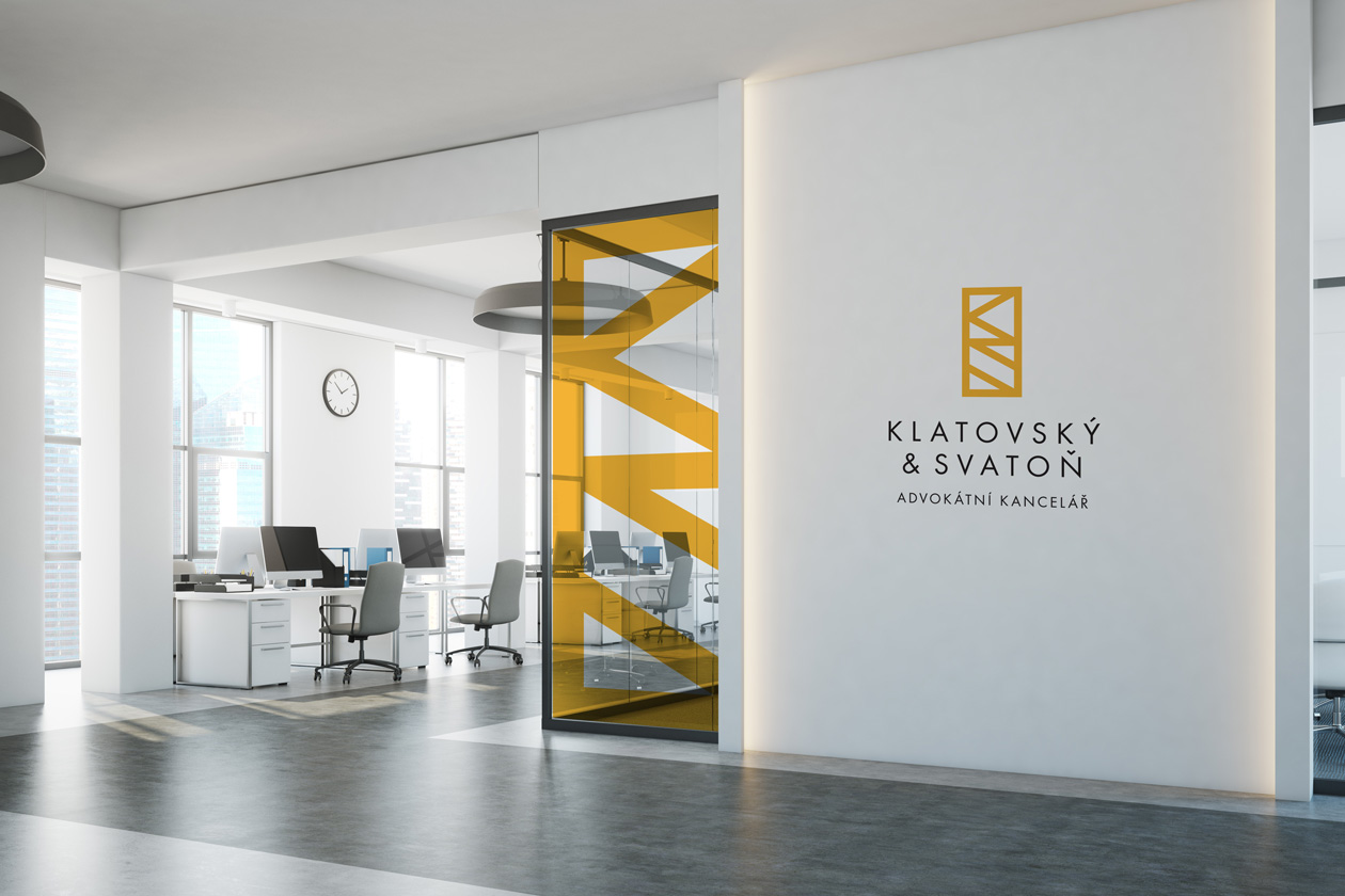
For Klatovský & Svatoň we redesigned the logo and unified the visual identity. We also designed the website – rollsite and provided the creation of printed materials.
IIdentity supplemented by manual
The Prague law firm KLATOVSKÝ & SVATOŇ approached us some time ago with a proposal. Our task was to redesign the logo and create a new visual identity for the company. Although we already had something to build on, we tweaked the existing design and developed a new design manual in addition to it.
The neat and clean visuals are based on the logo and built on a combination of areas and lines. It is dominated by the colour yellow. Along with the complete redesign of the visual, we also developed a brand manual for the office. We provided the company with a complete service including the creation and delivery of printed materials and a beautiful brochure.
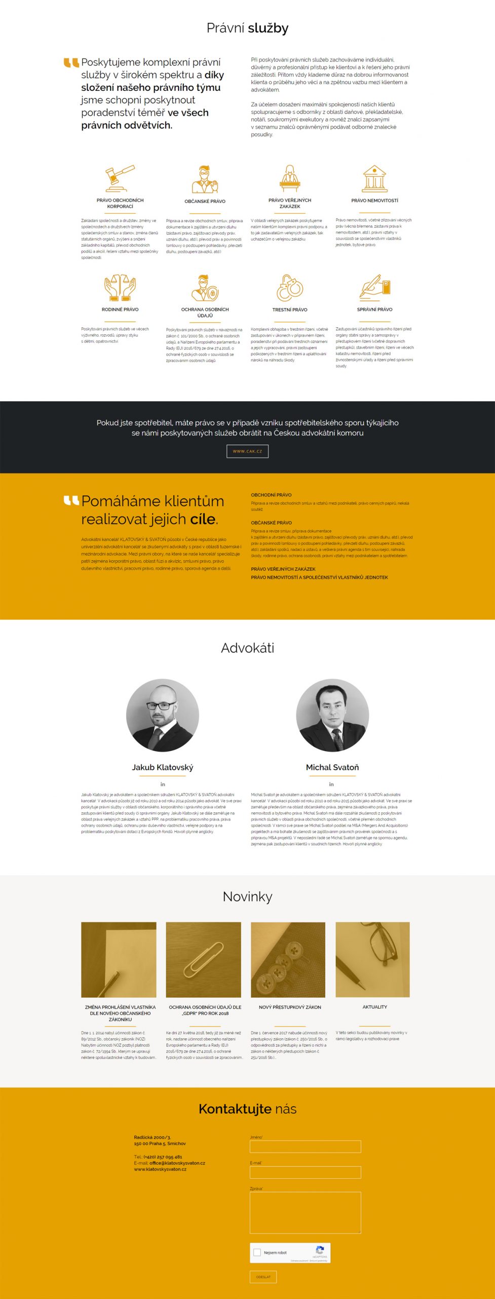
A conservative minimalist website for modern attorneys
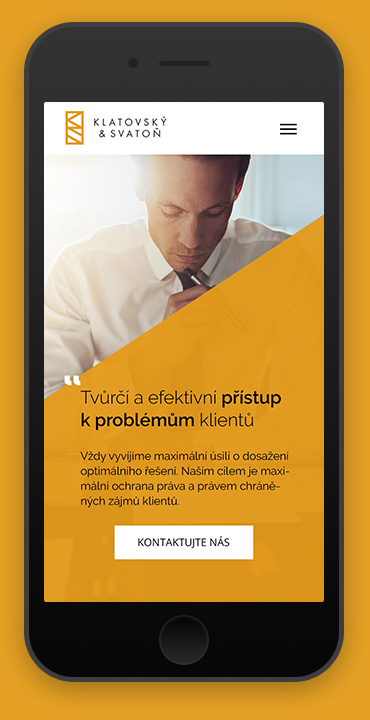
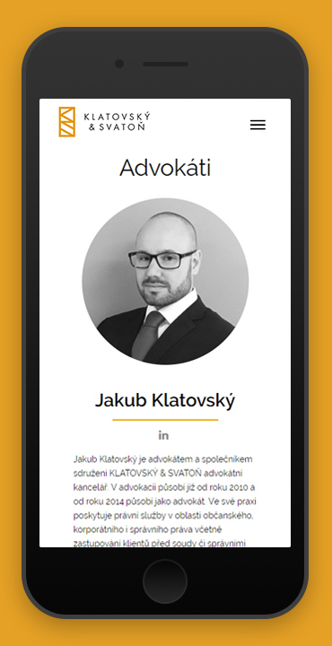
When the visual identity is complete and the author has the opportunity to develop it further, the result has a much better effect. We were able to create a simple scrolling website with a beautiful blend of identity and style transfer online. SEO onpage parameters are a given, and we already consider responsive tweaking for mobile and tablet devices to be standard.
Basic data protection, cookies and "I'm not a robot"
At the very end of the web page you should always check that all external links are connected and that they are working properly. For Klatovský & Svatoň, even though it is a smaller website, as for all our clients, we have implemented all the basic things: google analytics account, introduction of remarketing pixels for tracking visits and their possible remarketing, contact form with bot protection, cookie manager with active management of individual classes (for GDPR needs) and implementation of google maps with the company's listing on google business
