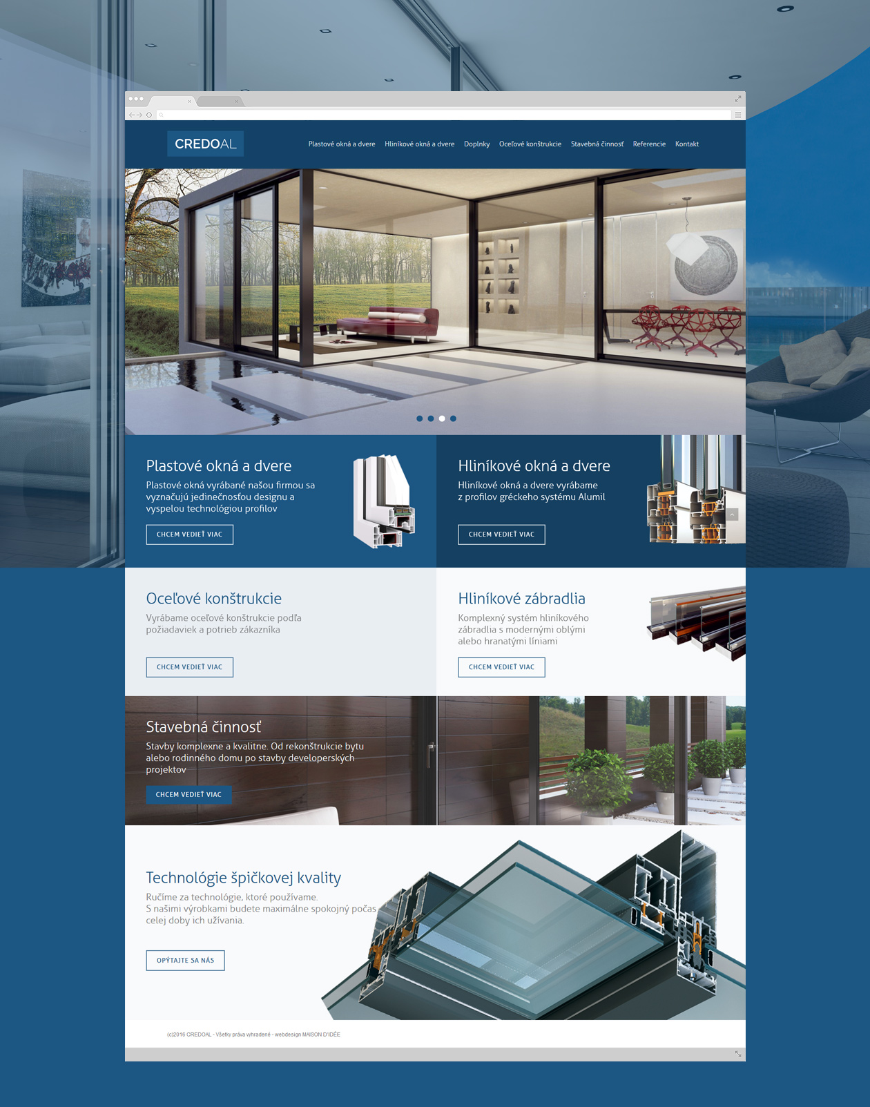
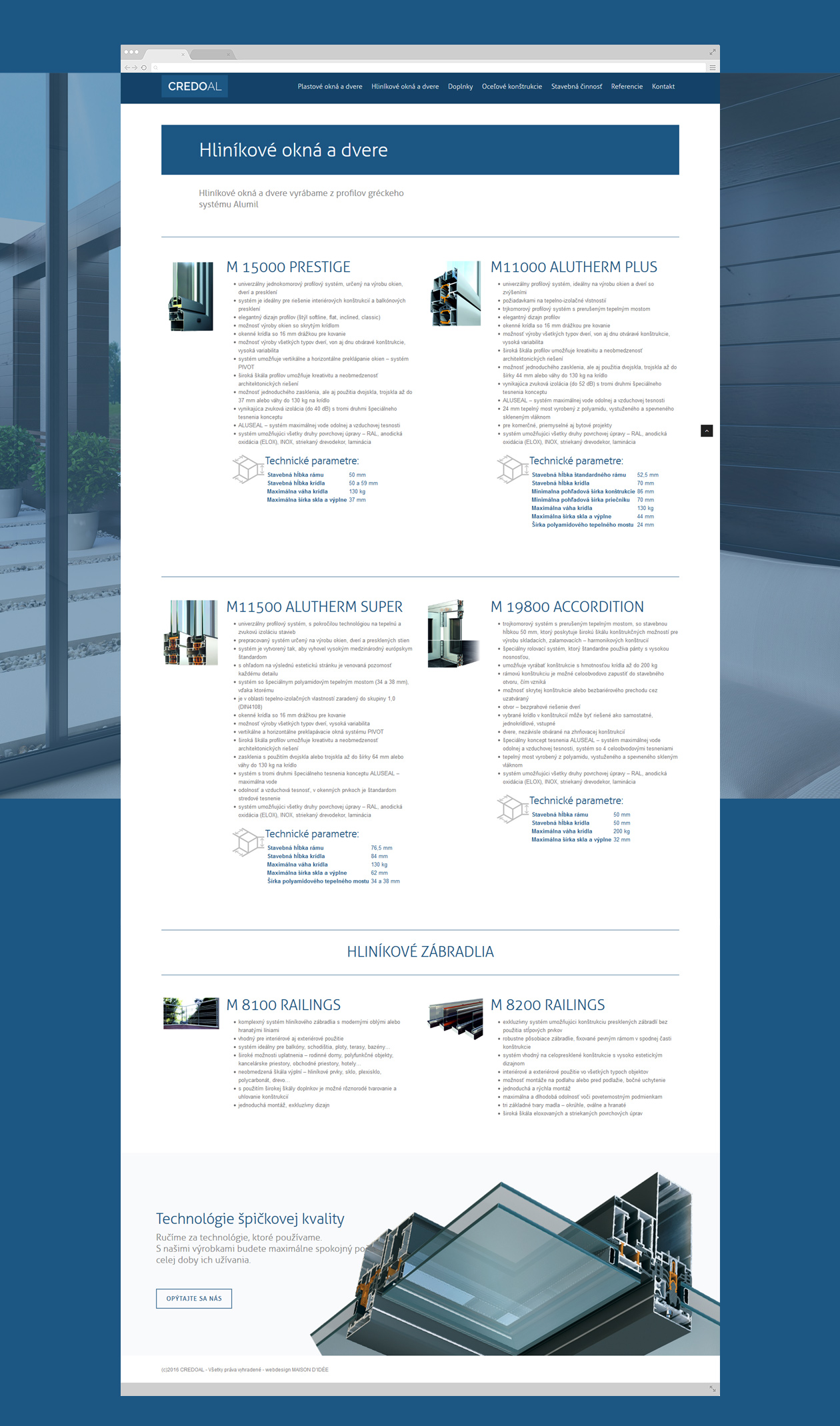
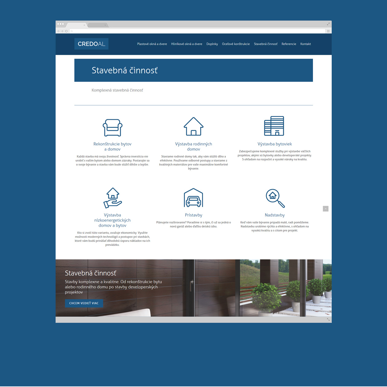
The web design for the aluminum window profile producer in Europe is characterized by its simplicity and functionality. The website adopts a minimalist approach, focusing on delivering essential information to visitors in a clear and straightforward manner.
With a clean layout and intuitive navigation, the website allows users to easily access key details about the company’s products and services. The design prioritizes usability, ensuring that visitors can quickly find what they’re looking for without unnecessary clutter or distractions.
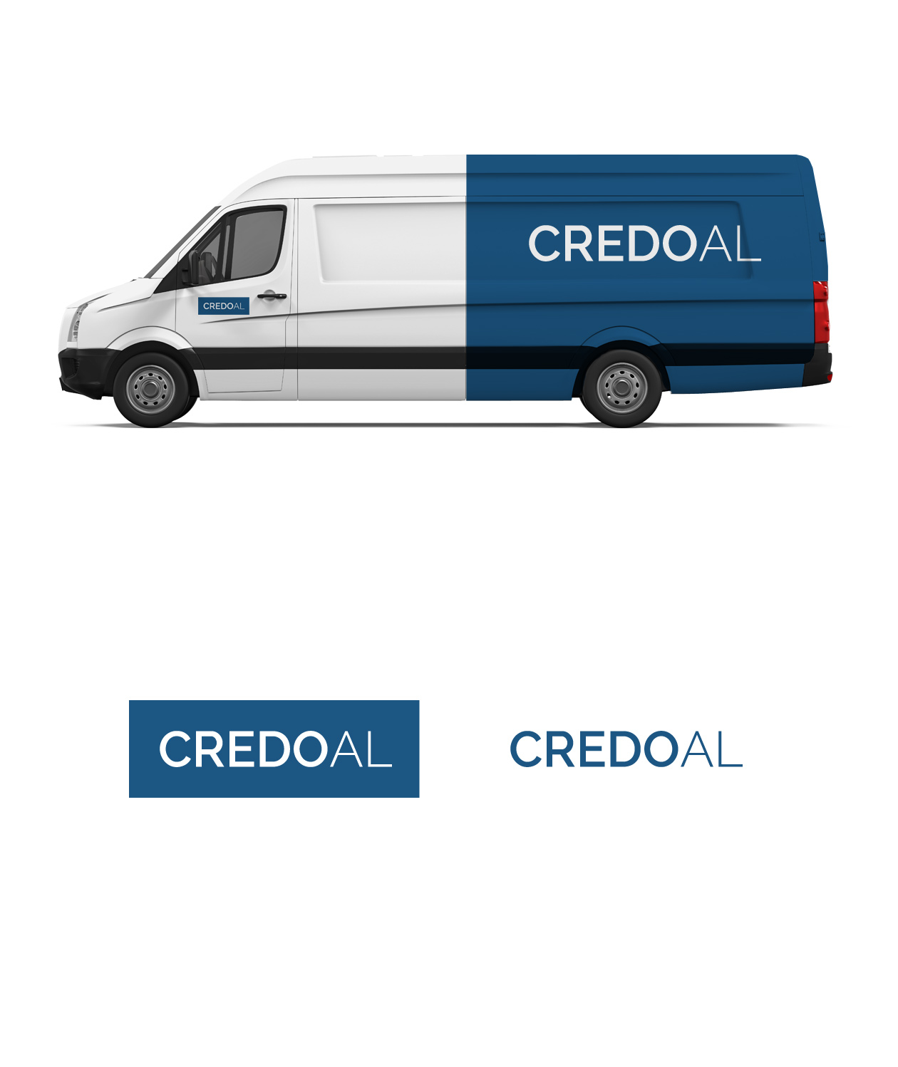
The color scheme is typically neutral, with shades of blue, gray, and silver, reflecting the clean and modern aesthetic commonly associated with aluminum window profiles. This understated color palette helps to maintain a professional and elegant appearance throughout the website.
The web design for the aluminum window profile producer in Europe is designed to be functional, user-friendly, and aesthetically pleasing. Its simplicity allows the focus to remain on the company’s offerings, ensuring that visitors can easily learn about their products and make informed decisions.


