#fermesauvage #illustration #ilustrace #pate
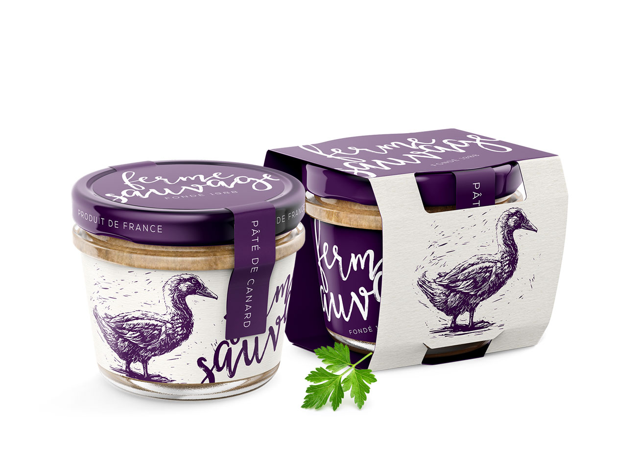
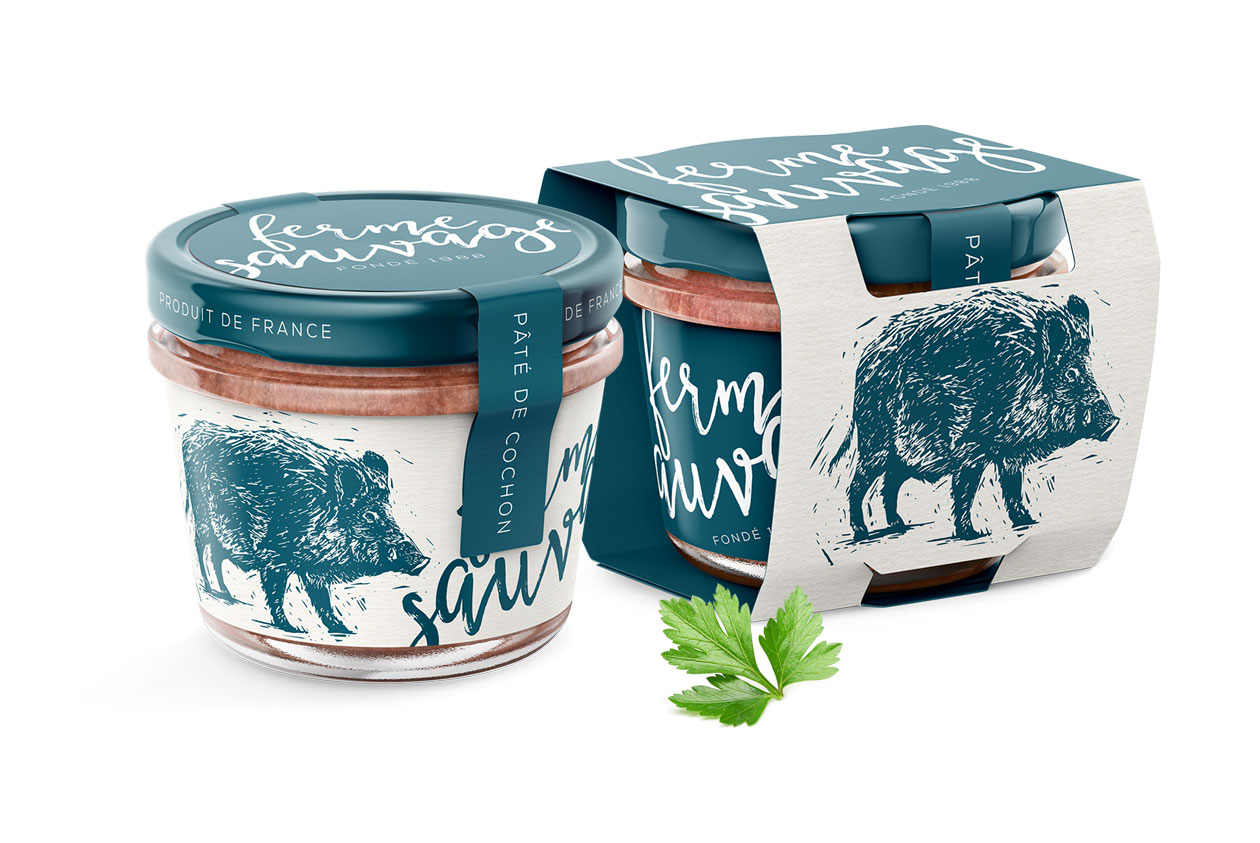
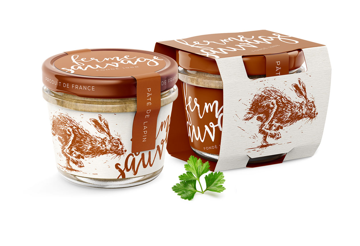
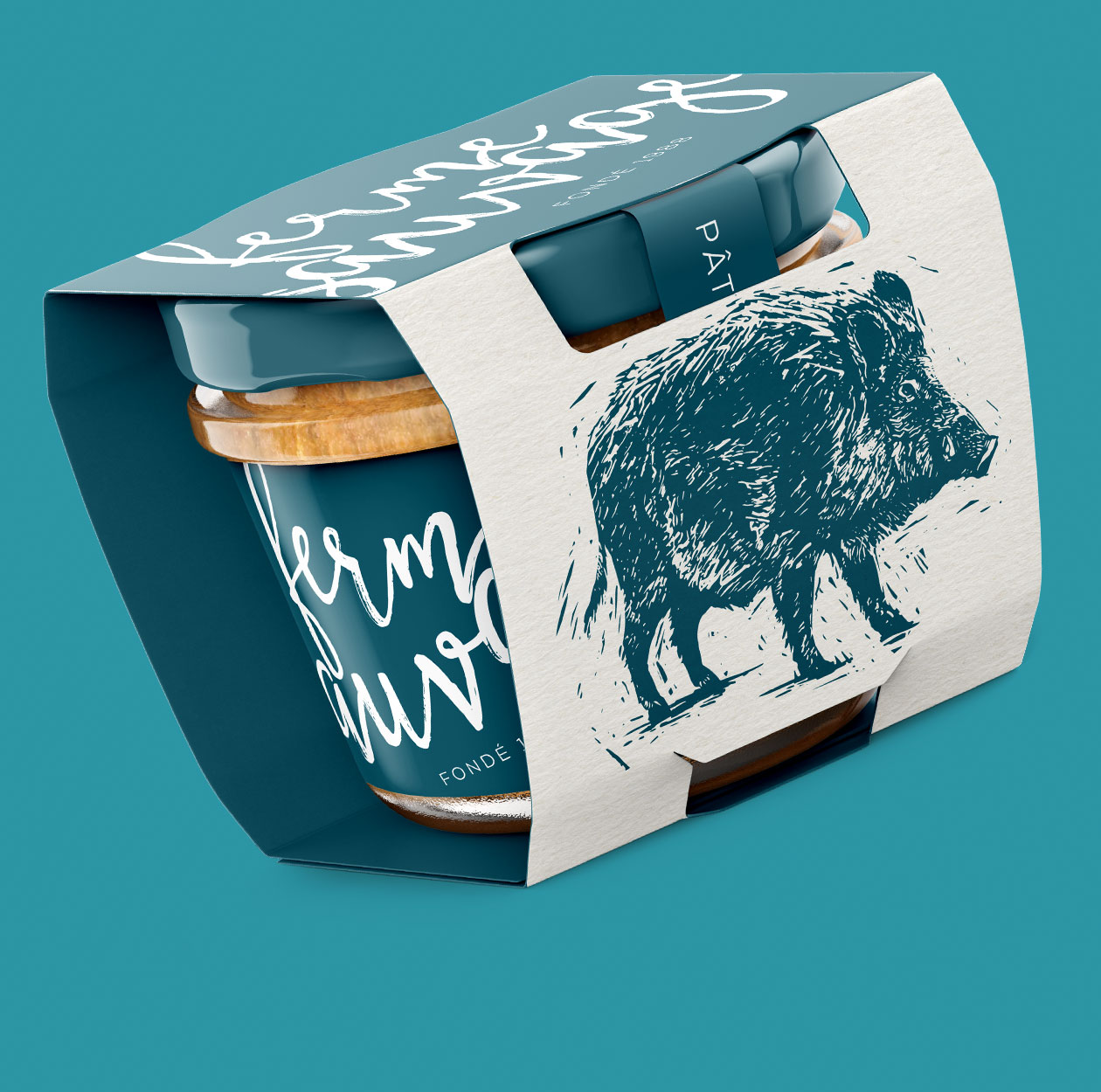
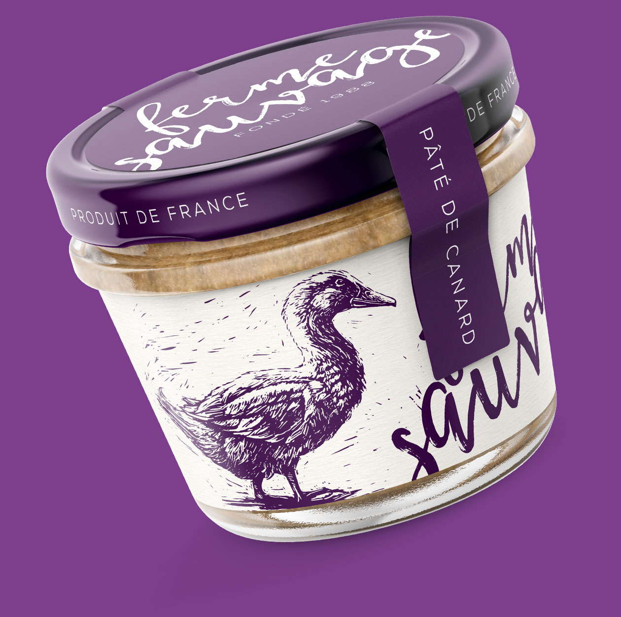
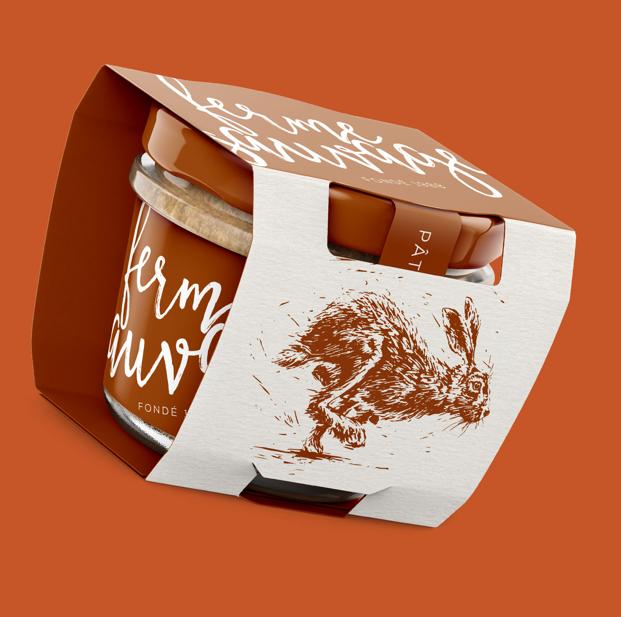
At the beginning we told ourselves that this design will be based on three things. A wood-carving illustration, single-color print and an easy branding based on relaxing, calligraphic typography in form of a blown-out logo.
According to us, packaging design of Ferme Sauvage project should feel as a harmonic connection of craftsman approach to graphic design, single-color theme for the packaging by design and also of a modern look at aesthetic in this field.
We didn’t want the product to feel unnecessarily luxurious or unobtainable; on the contrary, we were striving for a balance between playfulness, modern feel and a traditional craftsman work.
Our talented illustrator took the opportunity to create a series of beautiful pictures of animals. A cute duck, a running rabbit and a mighty boar support each other visually and create some sort of continuity. That helps their functionality as a secondary graphical element within the visual identity of the project. Getting such a good looking and functional series of graphical elements is great for creating other marketing materials (both DTP or online) to follow. The use of them is limitless.
