#logo #branding #design #corporateidentity #interior
The branding and corporate identity of the architectural company showcased in our portfolio is likely to reflect creativity, innovation, and attention to detail.
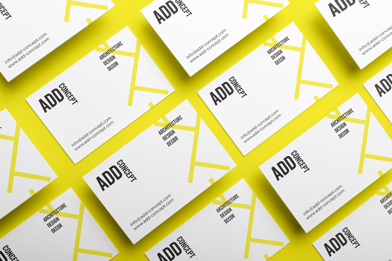
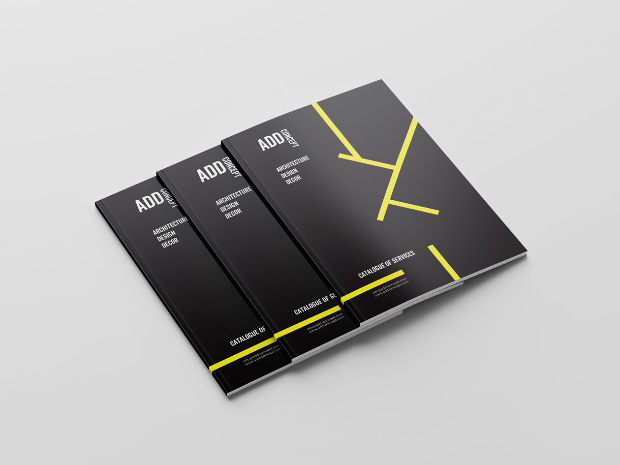
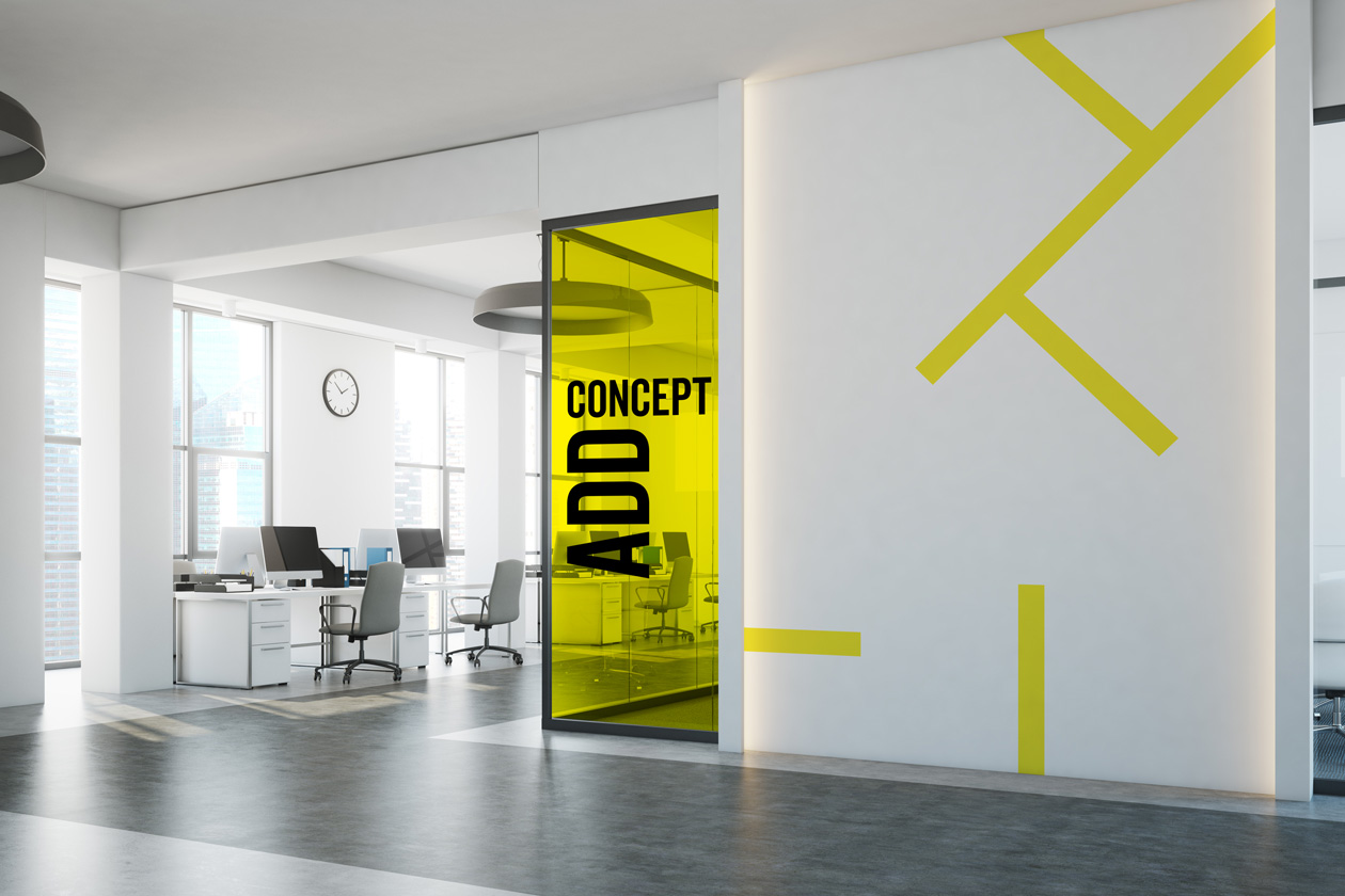
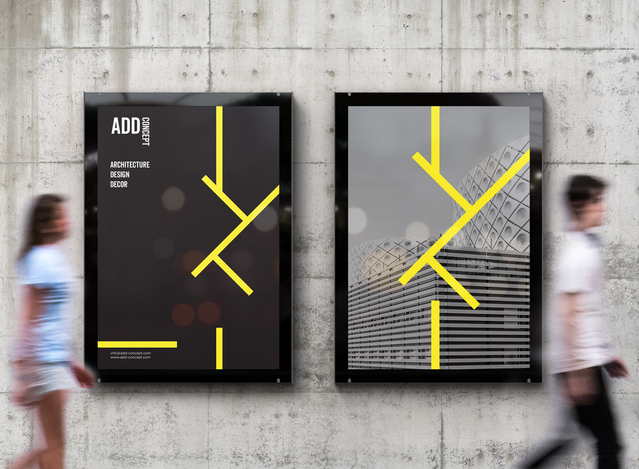
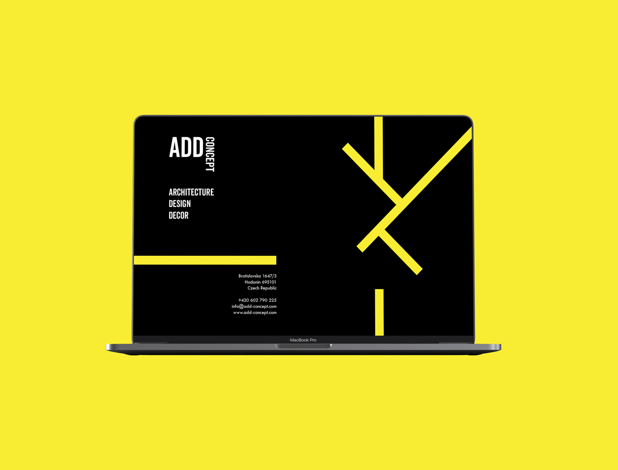
The color palette chosen for the branding may include a combination of neutral tones such as white, black, and yellow, along with accent colors that evoke a sense of sophistication and modernity. These colors create a clean and timeless aesthetic, allowing the company’s architectural designs to take center stage.
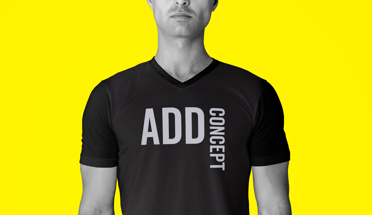
The logo design is likely to be simple yet elegant, with clean lines and geometric shapes that reflect the precision and creativity of the company’s work. The typography chosen for the logo is likely to be modern and sleek, conveying a sense of professionalism and expertise.
In addition to the logo, typography plays a crucial role in shaping the company’s visual identity. The choice of fonts for marketing materials such as business cards, letterheads, and brochures is likely to be consistent with the overall branding, reinforcing the company’s image as a leader in architectural design.
Imagery is also important in conveying the company’s design philosophy and aesthetic. High-quality photographs of completed projects, architectural drawings, and sketches may be used to showcase the company’s portfolio and highlight its unique approach to design.
Overall, the branding and corporate identity of this architectural company are likely to convey a sense of creativity, innovation, and expertise, positioning the company as a trusted partner for clients seeking exceptional architectural design solutions.
