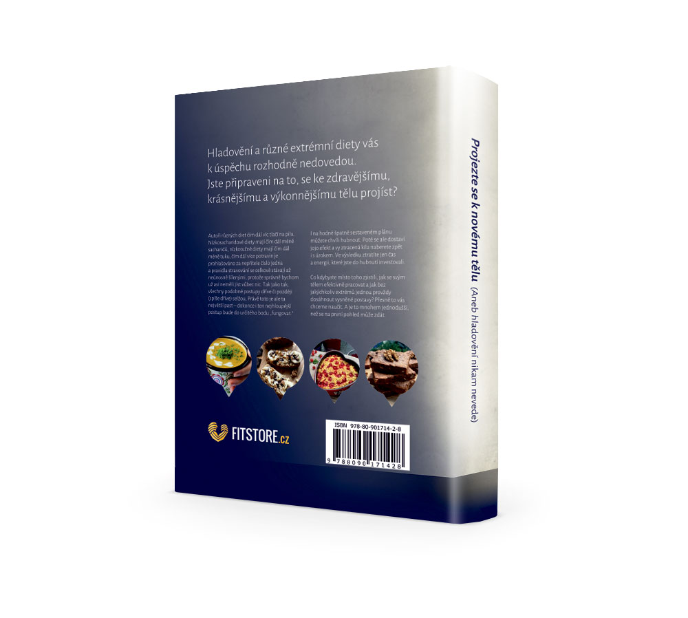
New packaging and graphic editing of book publications
Approximately a year ago, the client addressed us with the request to create a cover for their new book in the absurdly short time. The book name: “What nutritionists do not tell you (Because they do not know)”. We’ve mastered the design and the book got out of the way without any problems.
Therefore, the client, happy with the results, gave us a year to prepare the graphic design of the sequel of this book, this time with the processing of the content itself.
How to select a wrapper and how to work with the content?
For the project, we created a series of graphic packaging designs that were then tested on a sample of 800 people from a selected target group of fitness and nutrition enthusiasts. Subsequently, we evaluated the survey results and decided for the variation you see in the project. The aim was to avoid designing cookbooks that make this book immensely distant from its actual purpose. The client continued to insist on a conservative and serious way of breaking the content, as well as the manuscript of selected illustrations created for a tailor-made project. This styling should clearly deviate from polished advertising or brochure visuals, and should be closer to a serious, scientifically-based publication that this book definitely is. Recommendations and explanations of the functioning of metabolism, the impact of exercise and the composition of the diet lead the reader to a deeper, study-based understanding of the complex behavior of the human body. With over 280 sources referred to by Mr. Walek and Mr.Tóth when writing, we bow to their amazing job. Their primary aim was to disprove the vicious habits of people who try to lose their weight through “guaranteed” ways or through unprofessional life-style magazines or other unsubstantiated sources that ultimately never lead to a long-term sustainable outcome. We recommend reading for everyone!

