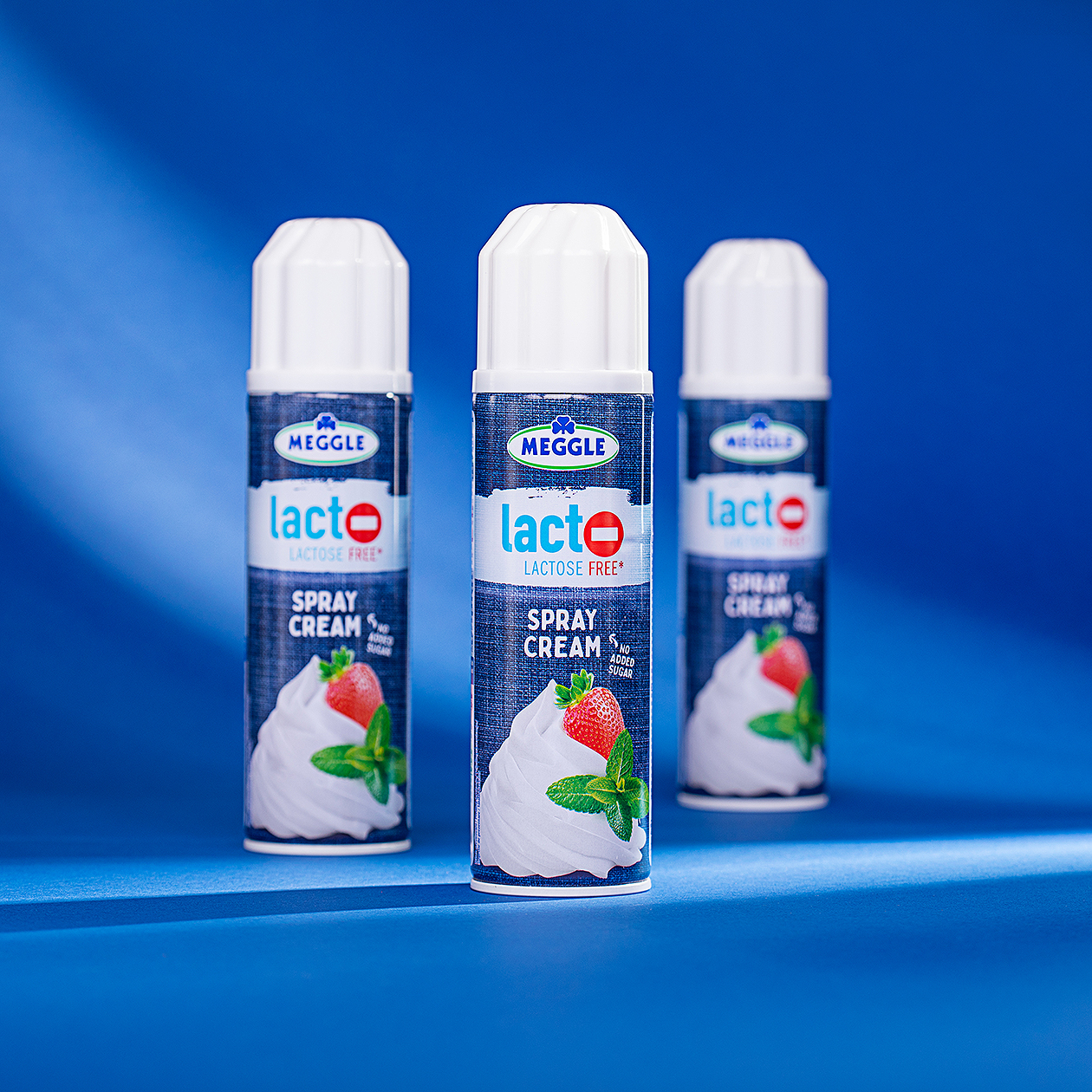
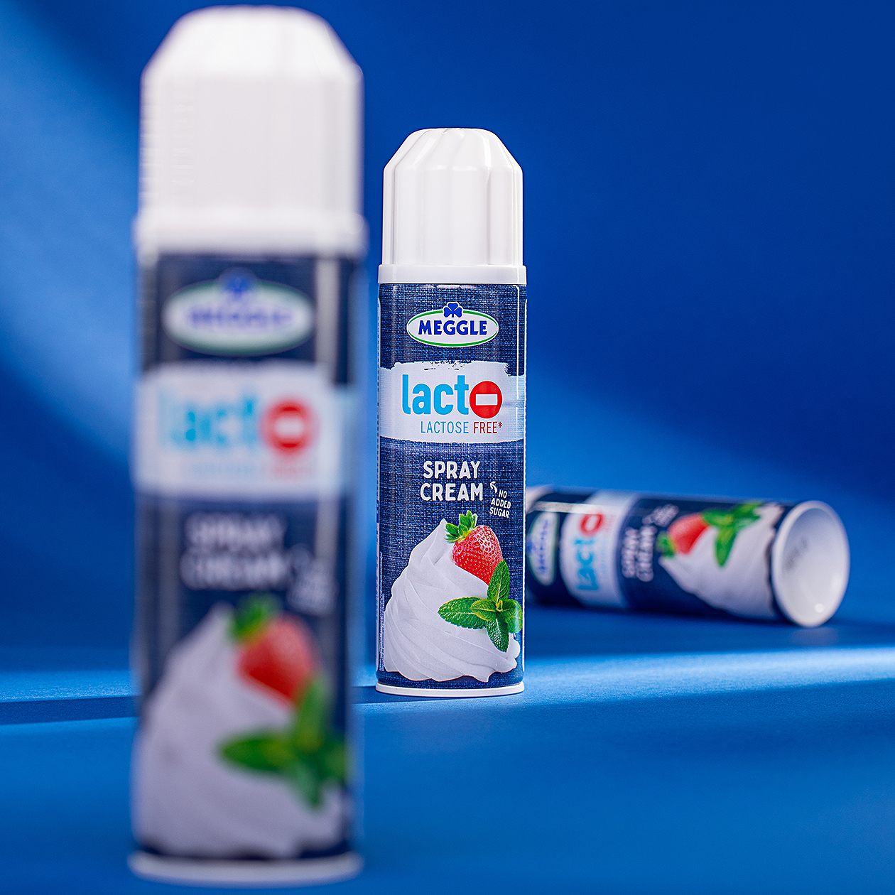
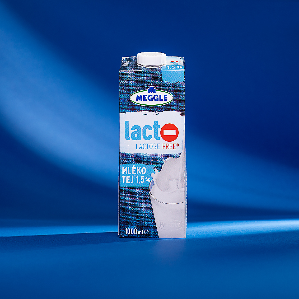
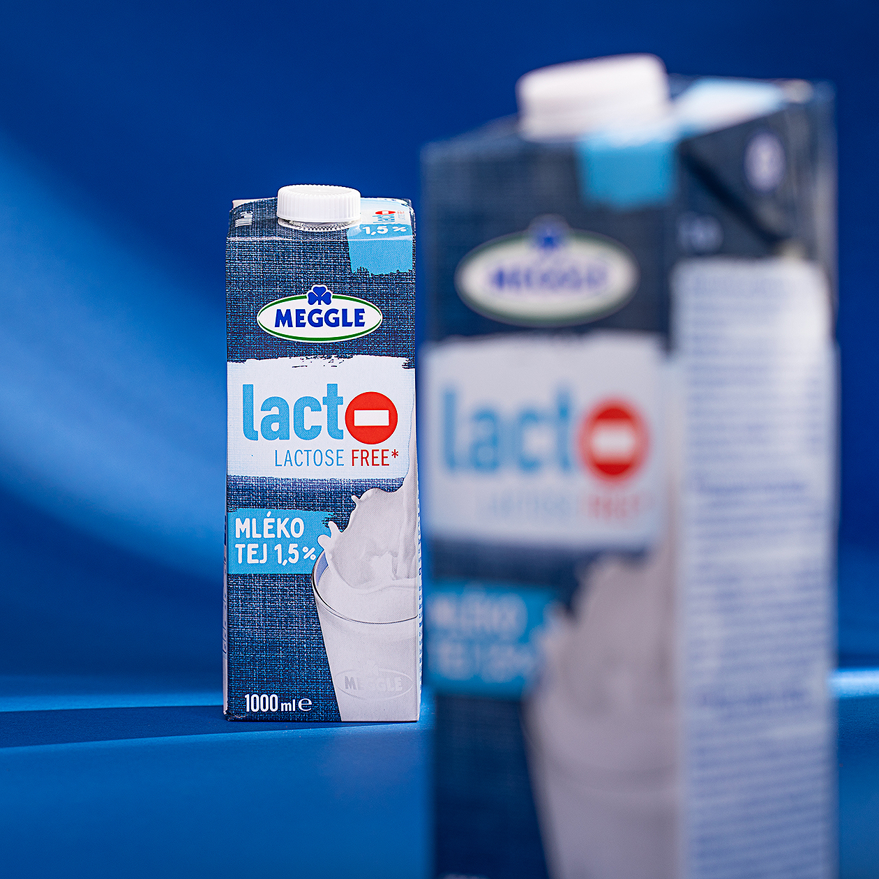
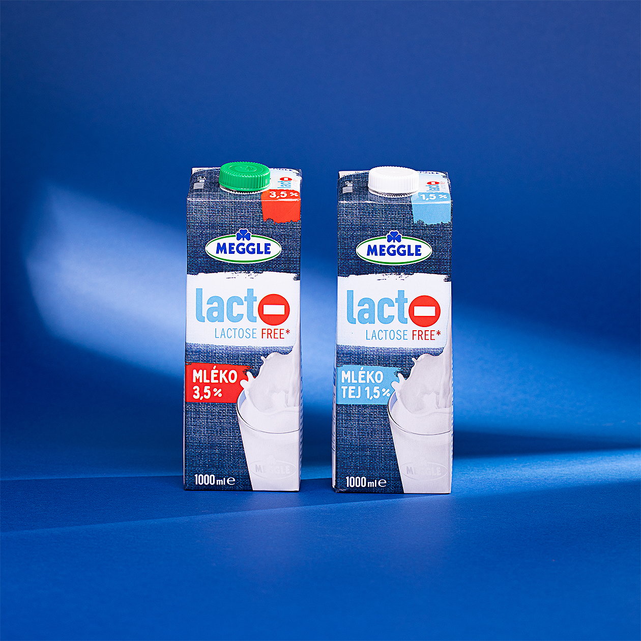
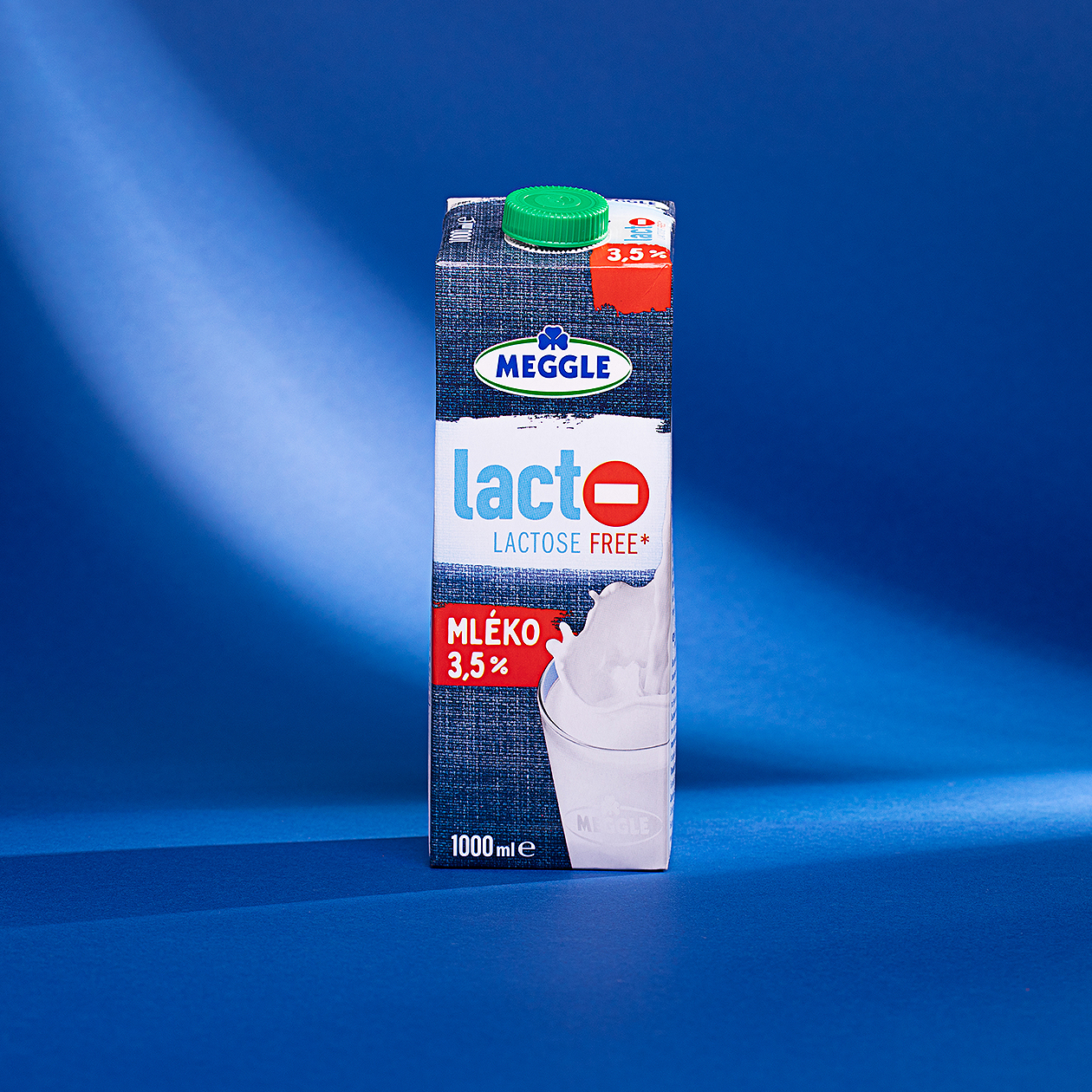
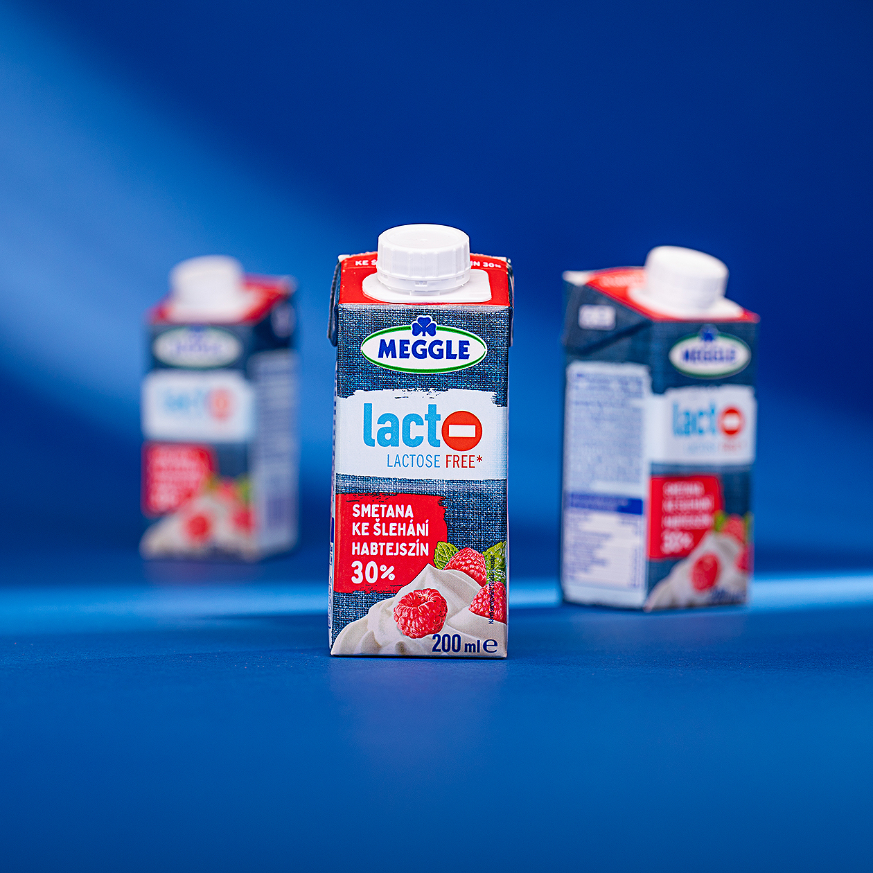
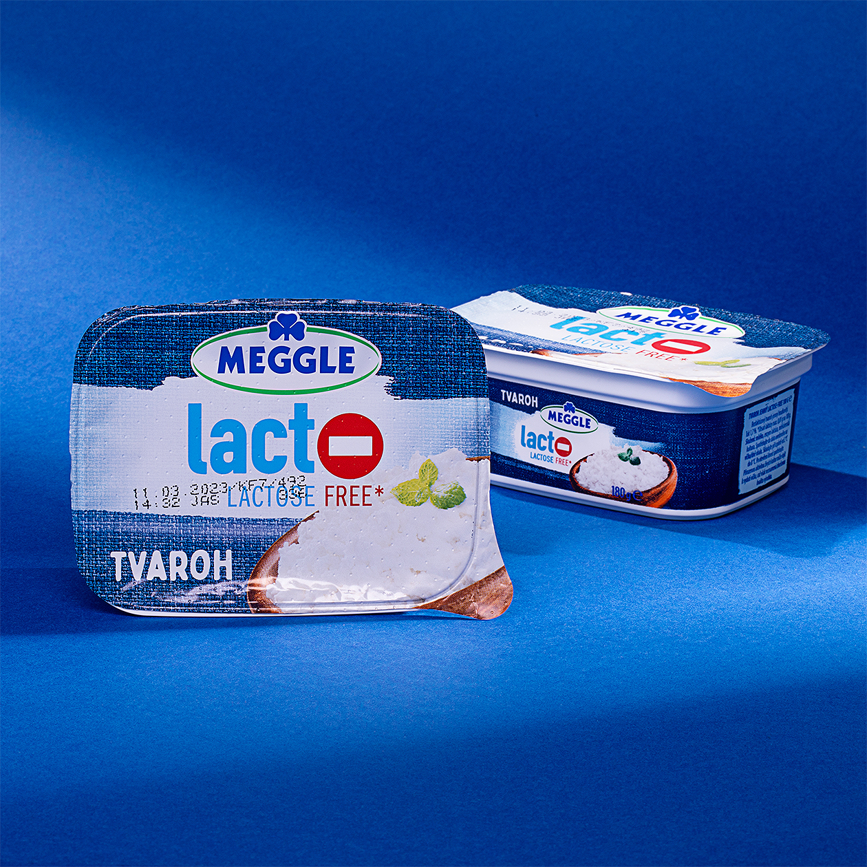
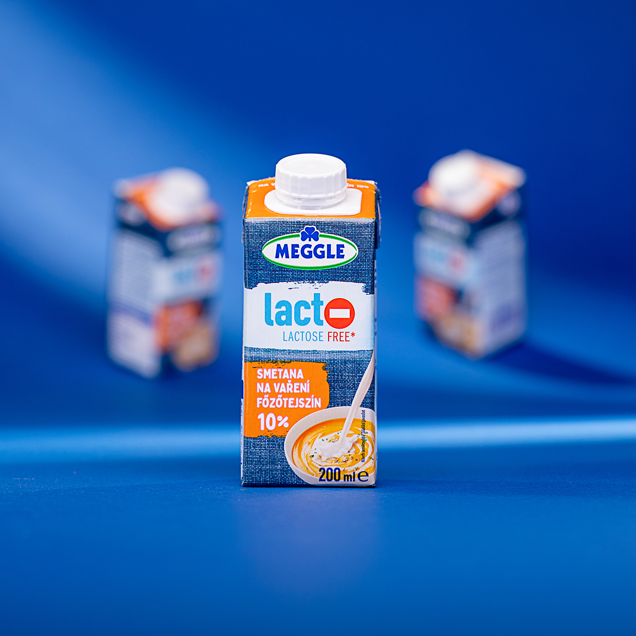
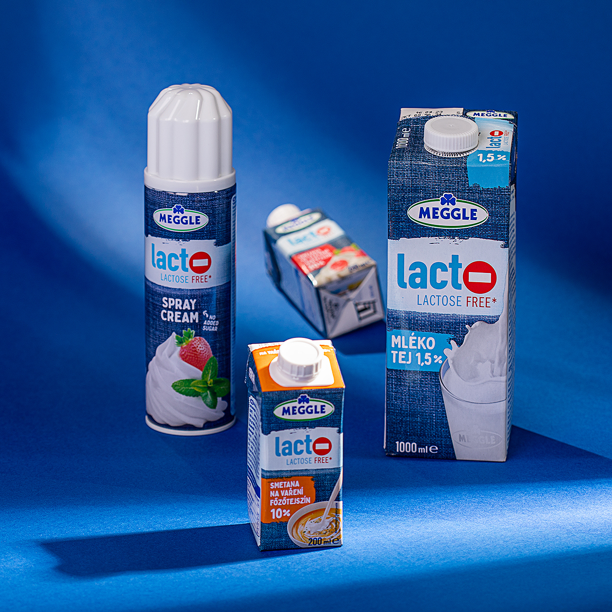
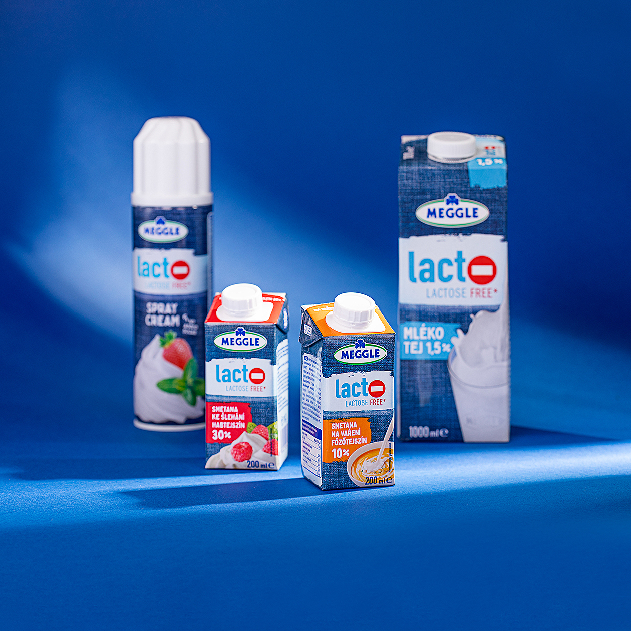
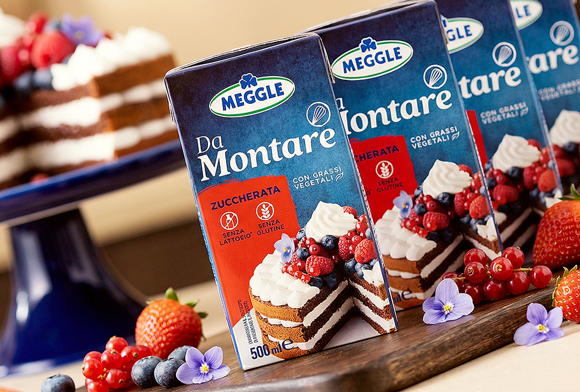
We are happy to share the great news with you. As part of the of MEGGLE, we have prepared a new Lactose-free milk products are no longer a novelty. The first lactose-free milk products appeared in the late 1970s. Thanks to technological progress, we can find a wide variety of these products on the market. Customers with dietary preferences can enjoy their favorite foods without regrets. The MEGGLE Lactose free product line is easily recognizable in the market. The with the red mark in place of the letter "O" can be seen from a distance and is not difficult to discover on shelves across the world.
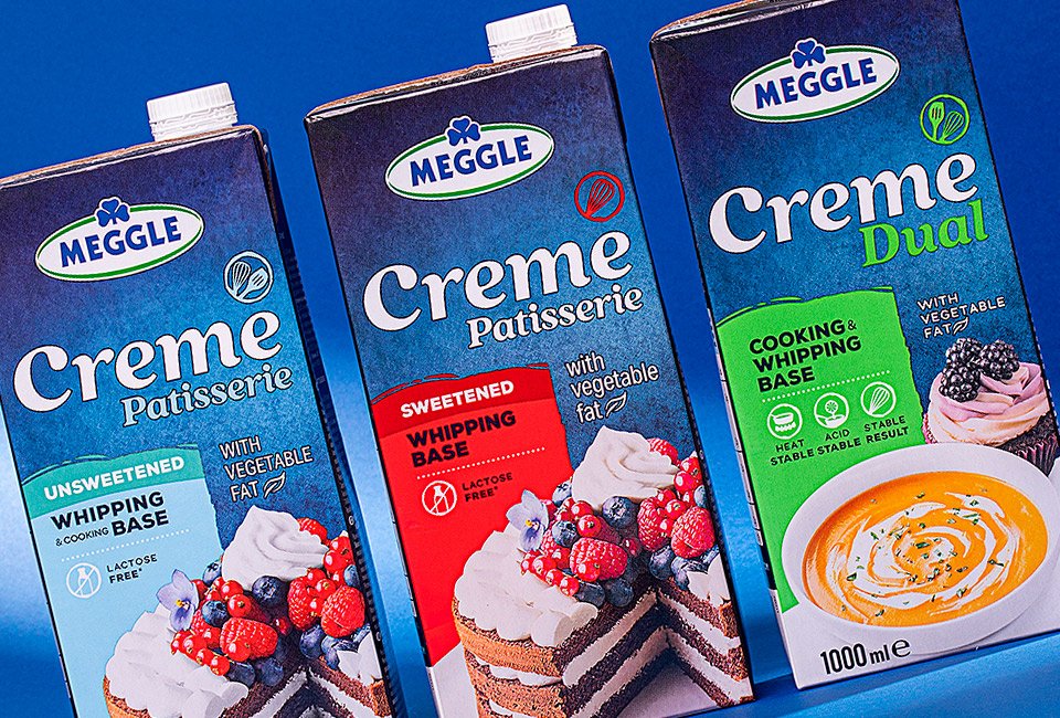
As part of the of the entire MEGGLE company, we received a new assignment of the Lactose Free range and its extension with an additional product. Today people who reduce their lactose intake can enjoy desserts decorated with whipped cream. Our task was to prepare a following the new of the company but to keep the unchanged. Also, we had to prepare complete according to the technical requirements of the printing houses. For this project, we faced a challenge: for the press and fitting it into six colors without compromising. Our priority is not only to follow the technical requirements but also to achieve the best possible result. The final look of the after the redesign speaks for itself.
