#disinfectants
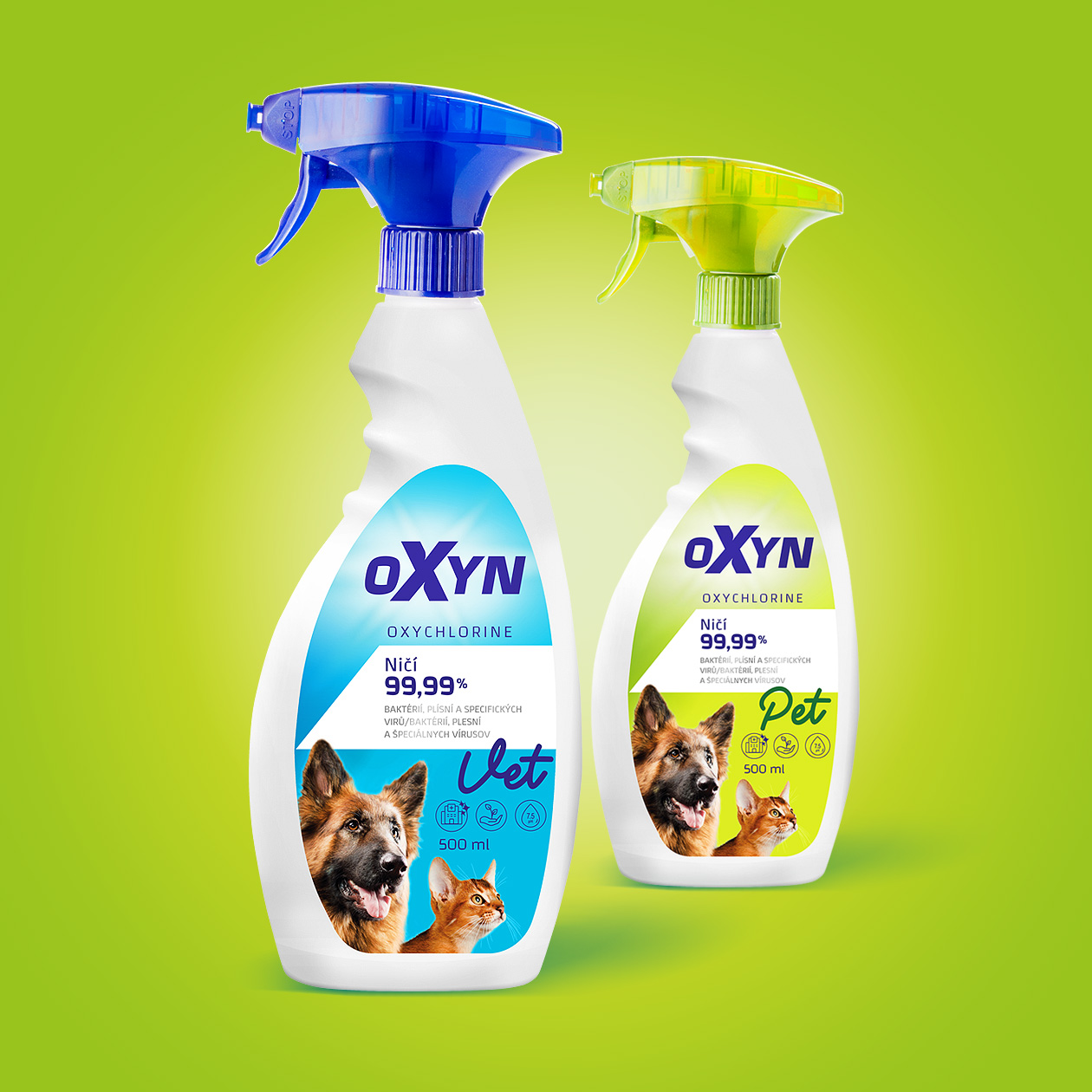
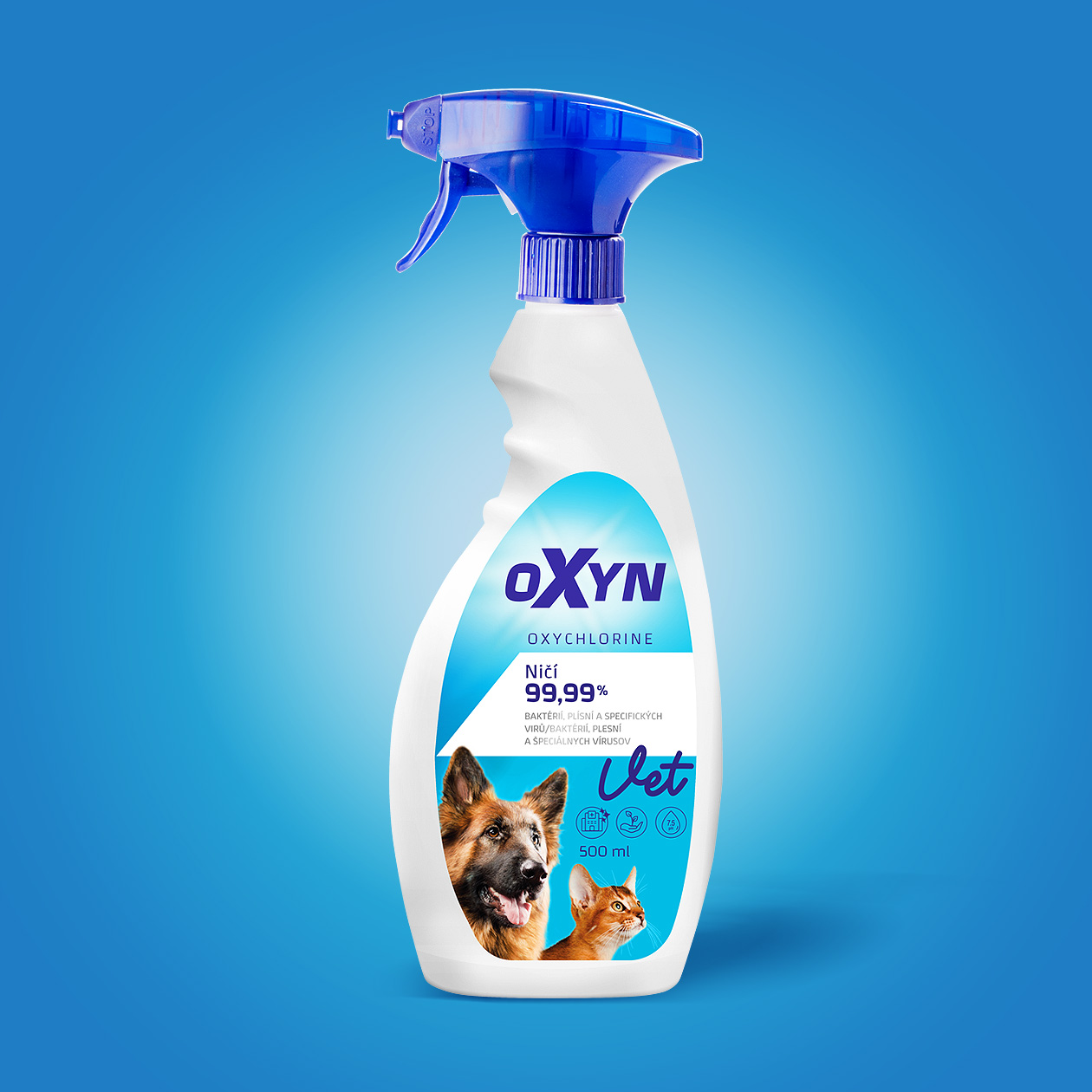
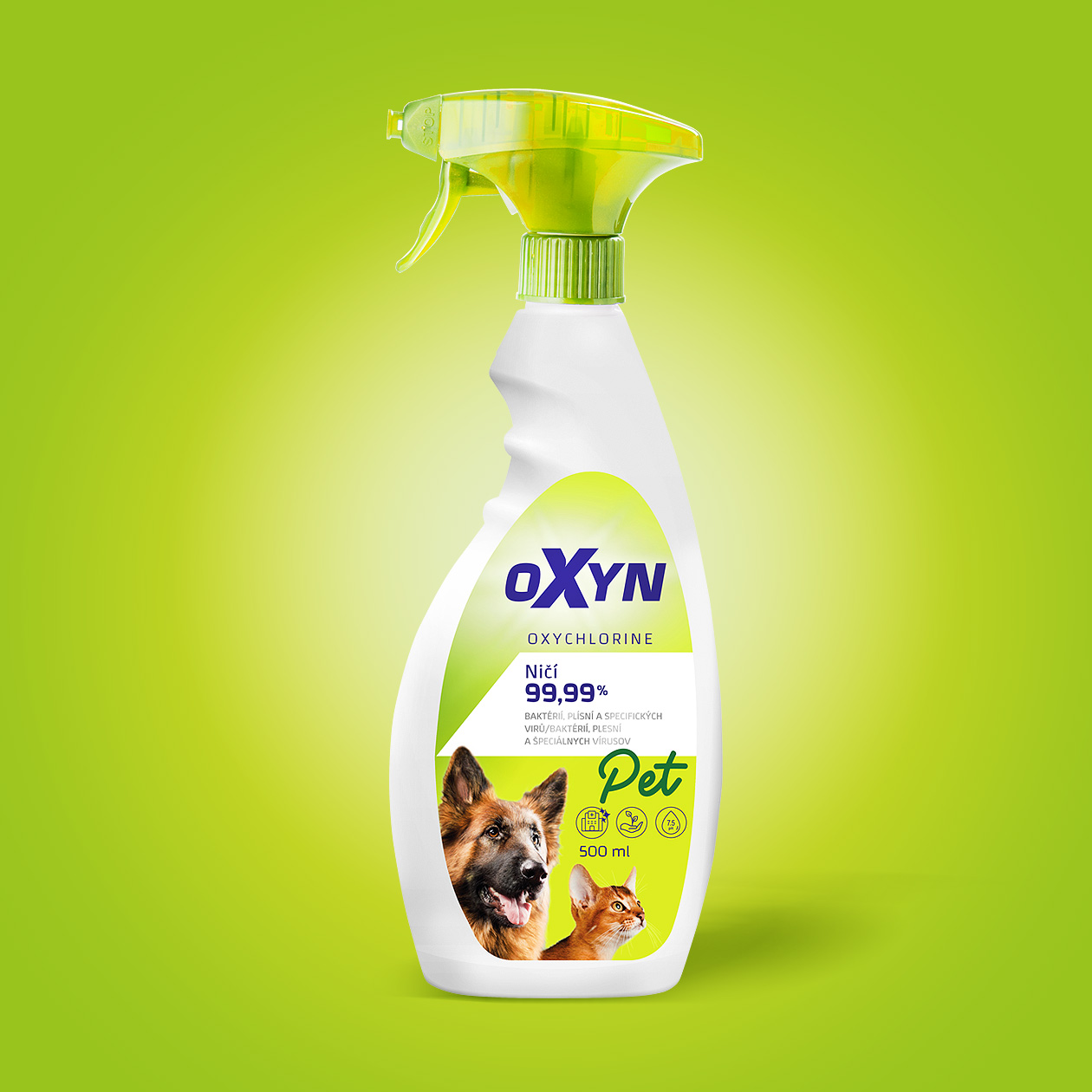
We had the opportunity to join the project from the very beginning. We designed the brand concept, logo and overall communication visual. This was transferred to the packaging design itself. We complemented it with colourcoding, which helps to make the products for household and professional use easily distinguishable. This differentiation is complemented by the Pet or Vet information, which is graphically executed in calligraphic font, in addition to the change in the colour scheme.
Working with contrast is essential in any graphic design, in packaging the function of alternating contrasts is all the more important. The calligraphic, loose and rounded typeface was chosen to highlight the category because of its contrasting appearance against the otherwise hard and technical design of the rest of the elements on the packaging. Packaging for the non-food category provides many opportunities towards improving its visuality, which we are always keen to do.


