#obal #packaging #penny #privatelabel #whitelabel
We dressed up Karlova koruna’s food packaging with new branding. In addition to redesigning existing products, Penny Market in the Czech Republic asked us to add new products to the private label’s product line.
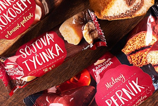
When branding the packaging for Karlova koruna products, we were tasked with designing a whole new visual including a new logo. We decided to take the original logo in the shape of a sign, simplify it significantly and include the powerful symbol of the royal crown. We chose a clean typography font to make the symbol stand out, while illustrating the entire design, which extends downwards and sideways.
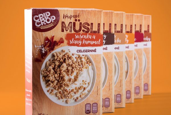
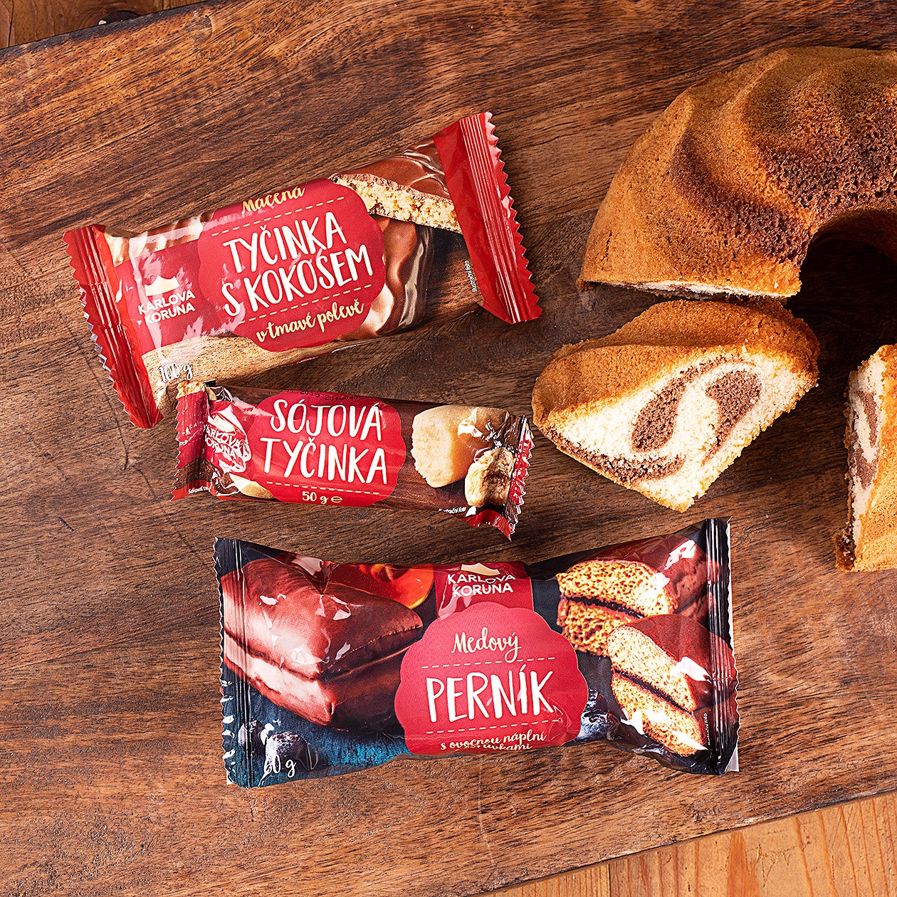
While in the design of Penny Market’s other private label brand – Crip Crop – we unified the entire visual by using light wood as the main material, we went in the opposite direction with the Charles Crown. The original look of the products worked with dark wood as one of the main motifs. We decided to significantly rejuvenate this look and base our redesign on coloured seals.
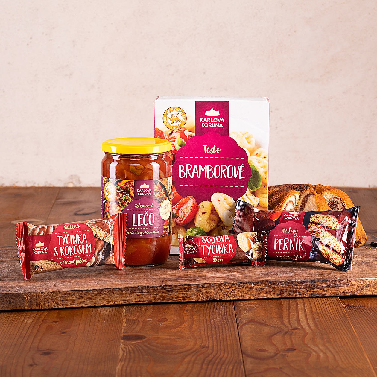
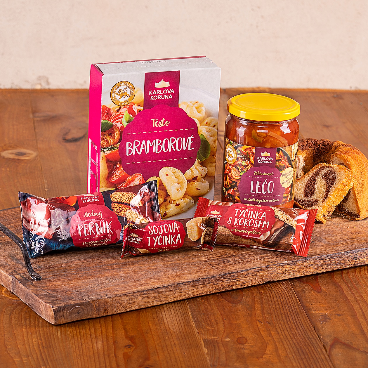
We designed the branding seals to have their prescribed color-coding in 18 different colors. For example, we use a purple variant for sweet pastries, green for spreads and frozen products wear blue. In this way, we have ensured that related products follow a unified visual line and already belong together at first glance. We decided to keep the seal as the main communication element of the design, so the most important advantages and product features are listed here. On the sides, the seal is accompanied by a tastefully prepared product photo, which was supplied to us by an external photography studio for the individual packages.
The packaging of the Karlovy Koruna product line has a coherent graphic style, which can be expanded to other products in the future. If, for example, Penny Market decides to produce a new line of previously non-existent food products, we have already prepared colour schemes and the entire visual style can be enlarged or reduced as needed to suit the needs of the new products. Currently, we have applied this branding to thin packaging such as sugars or yeast powders,
bags of dumpling mix or puff pastry, tubs of salads and spreads or gingerbread, soy bars and other small products.
We are really happy with the finished products. We managed to deliver 80 SKUs in record time in different types of packaging, united in the same branding. They look even better in real life than in the prepared visuals; you can see a visual coherence to all the products. So if you can’t miss the pastel products with the seal on the shelves of Penny Market, it will be a sign that we designed them right.
