#byMAISON #cereal #musli #pennymarket #privatebrand #redesign
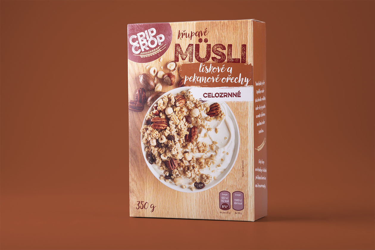
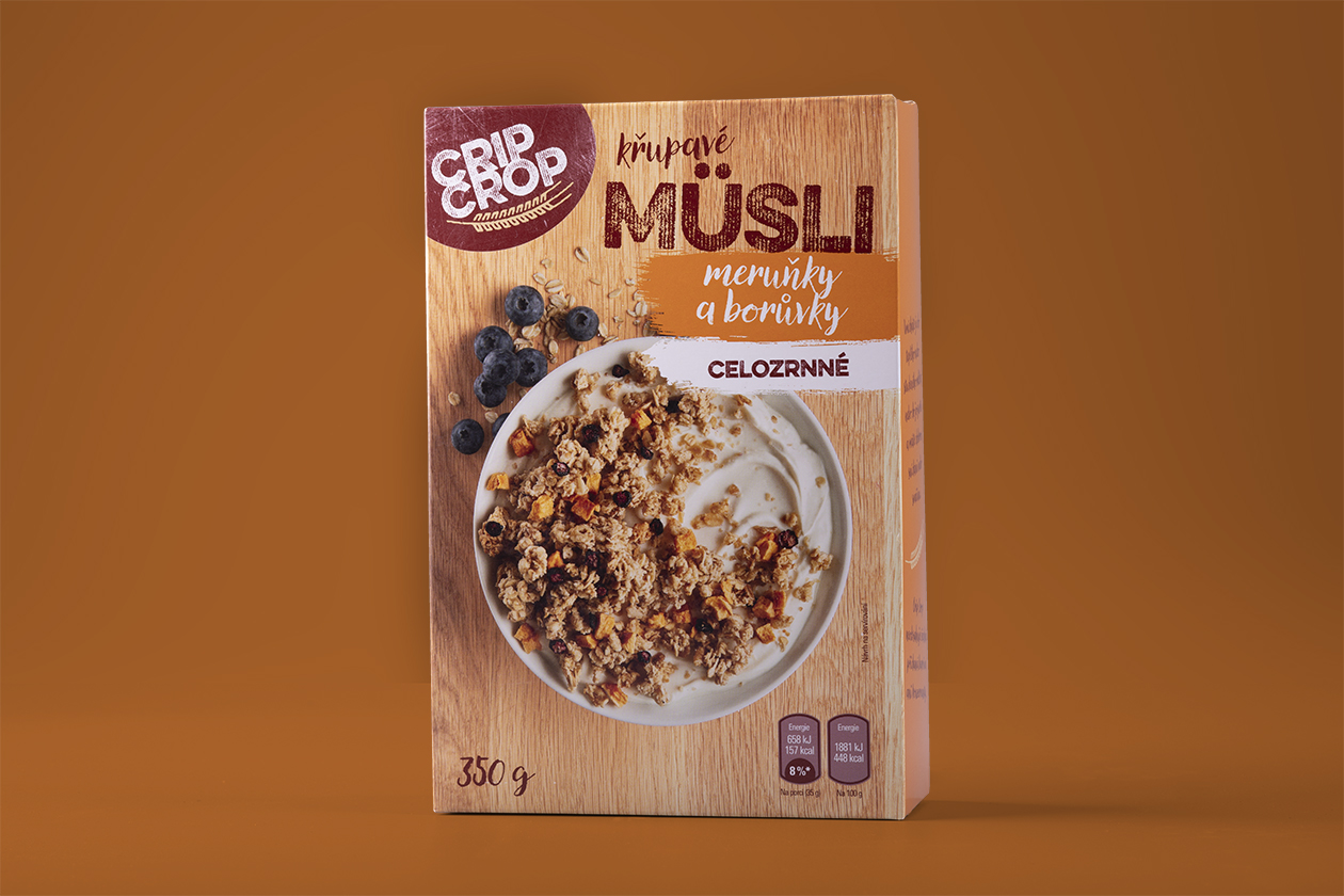
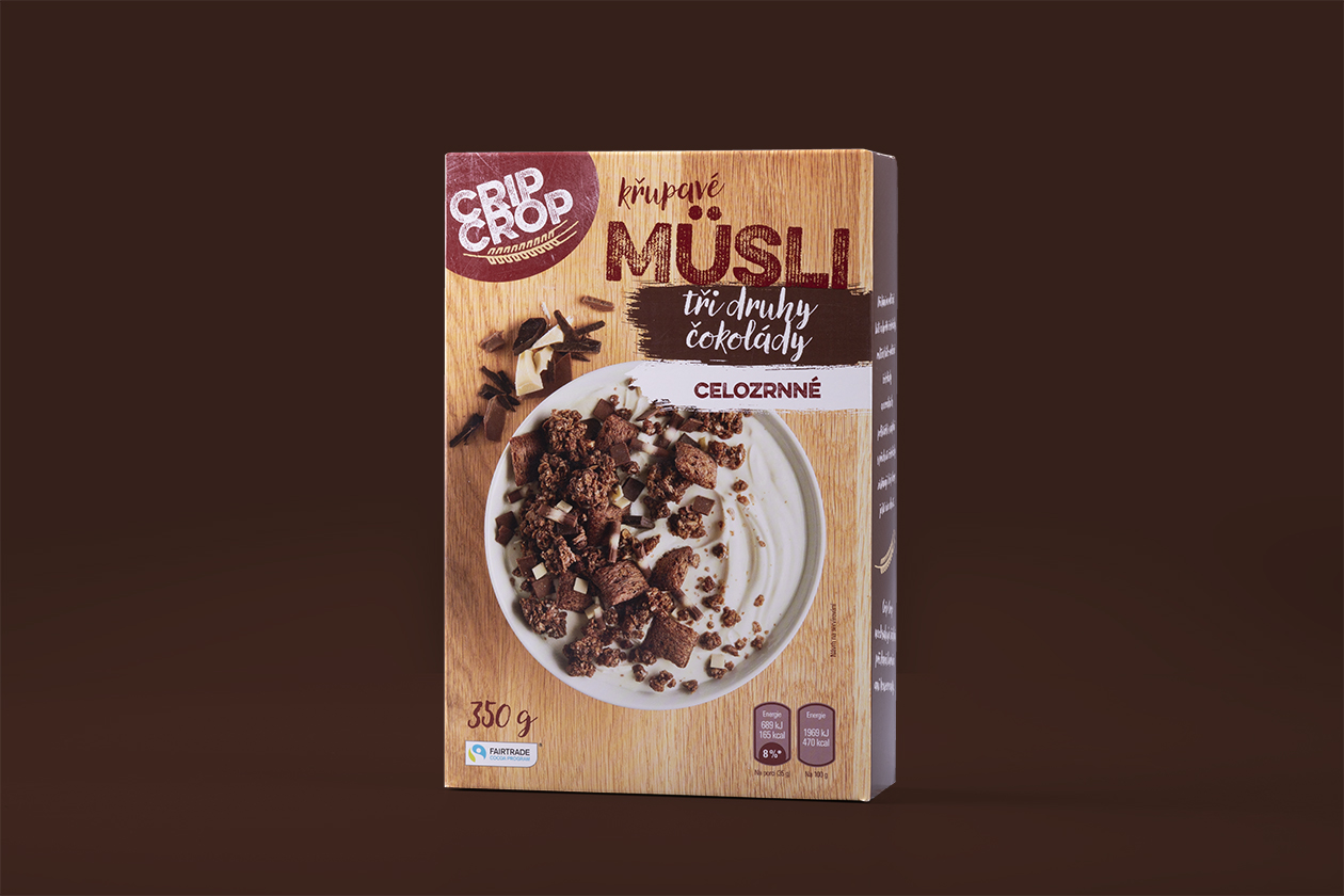
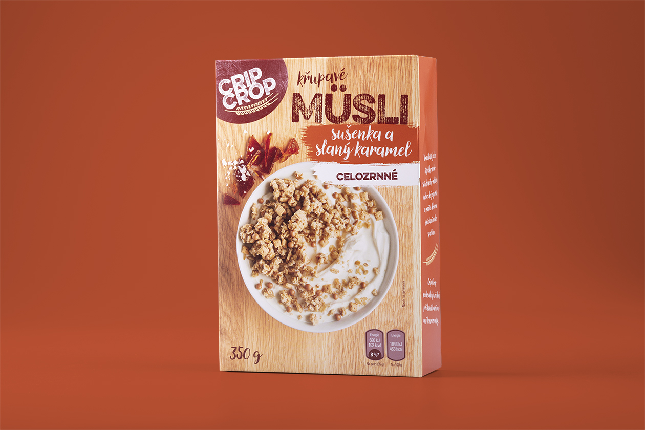
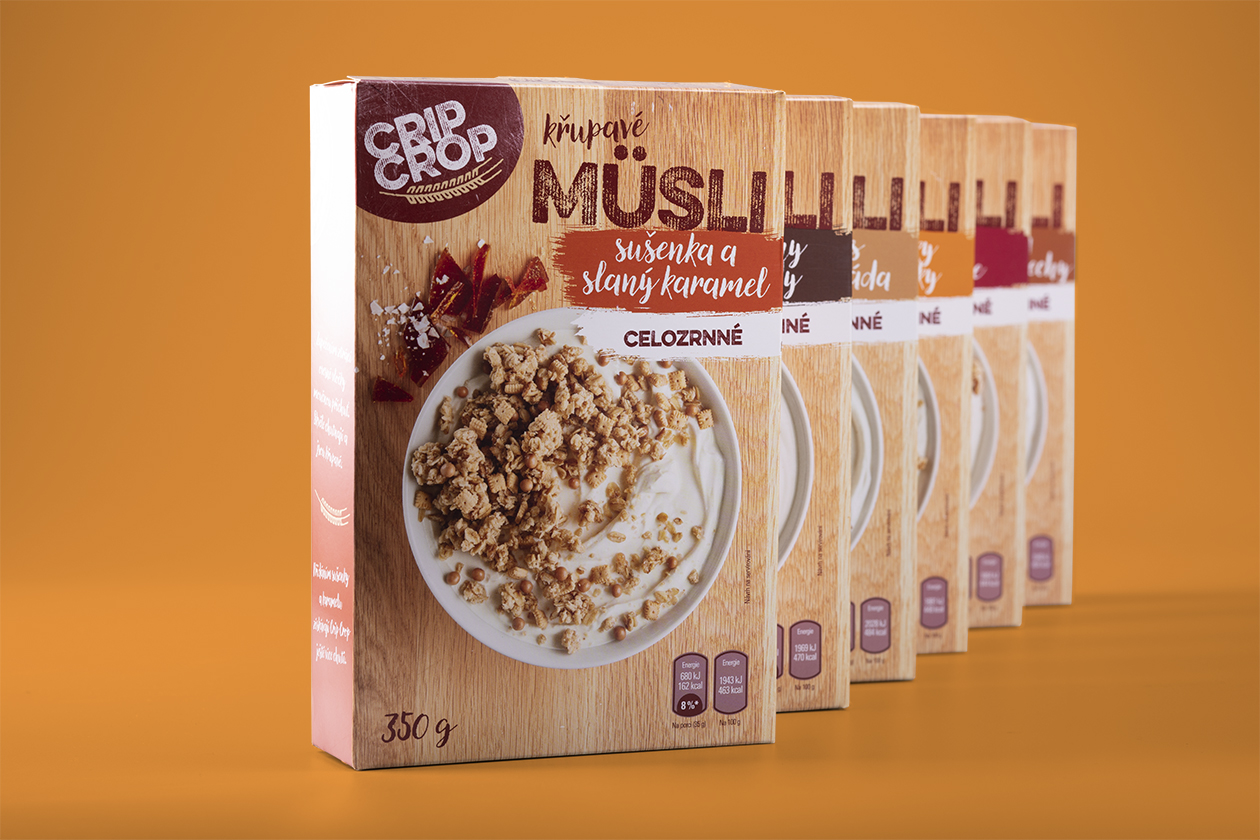
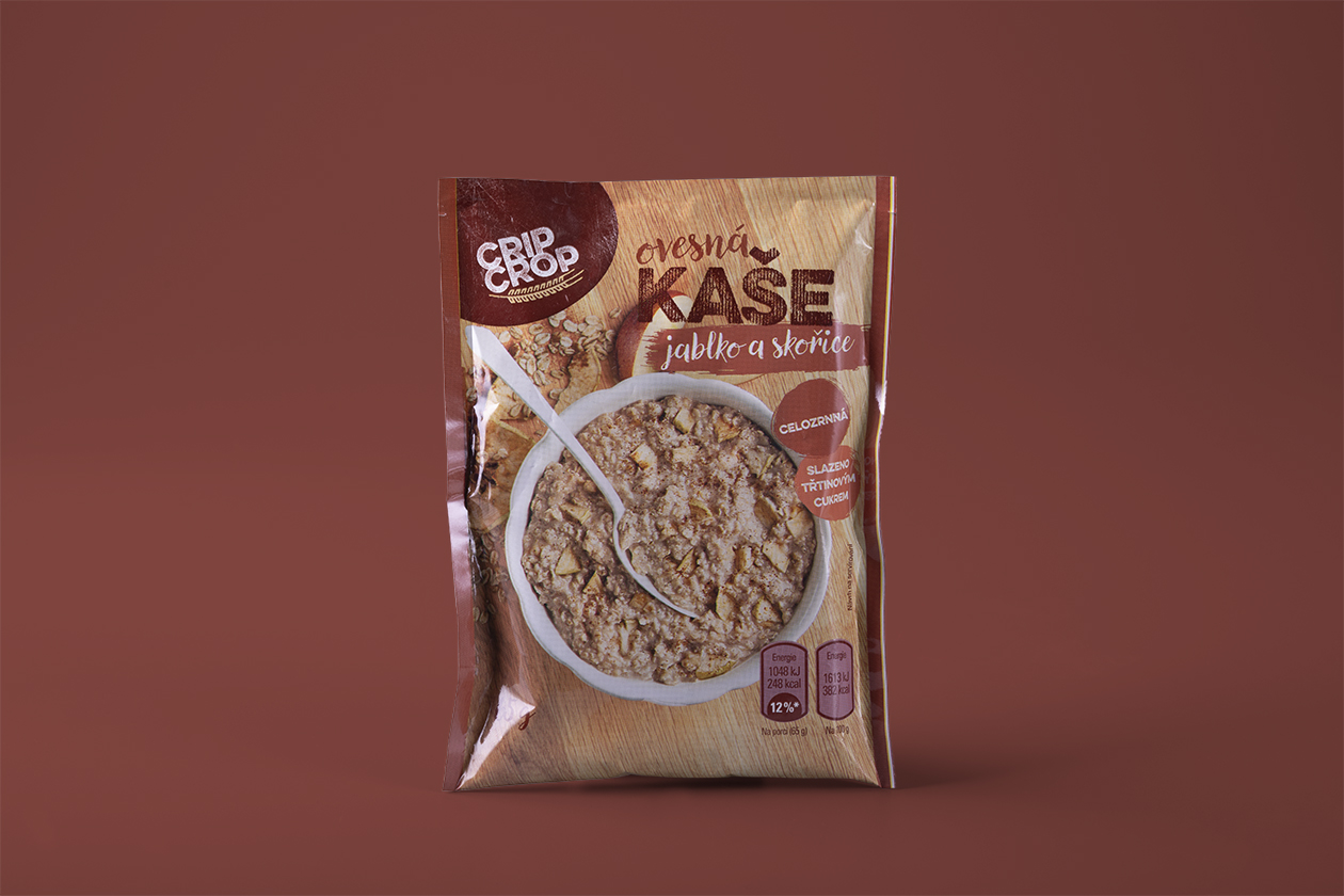
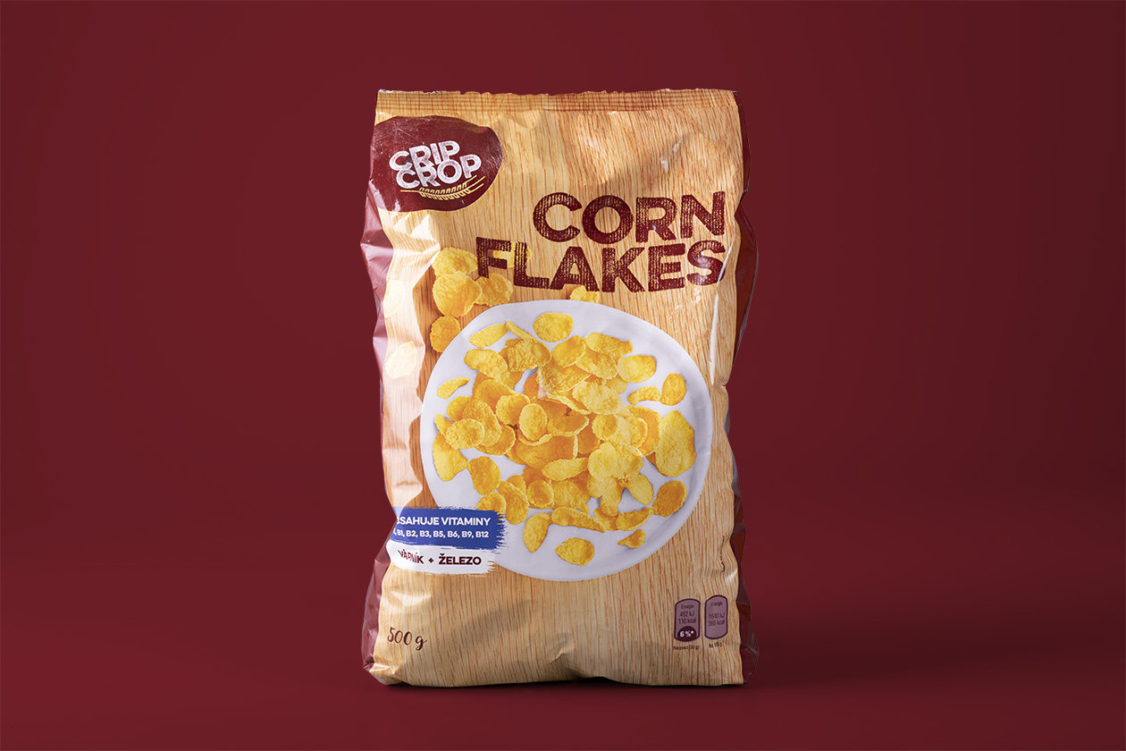
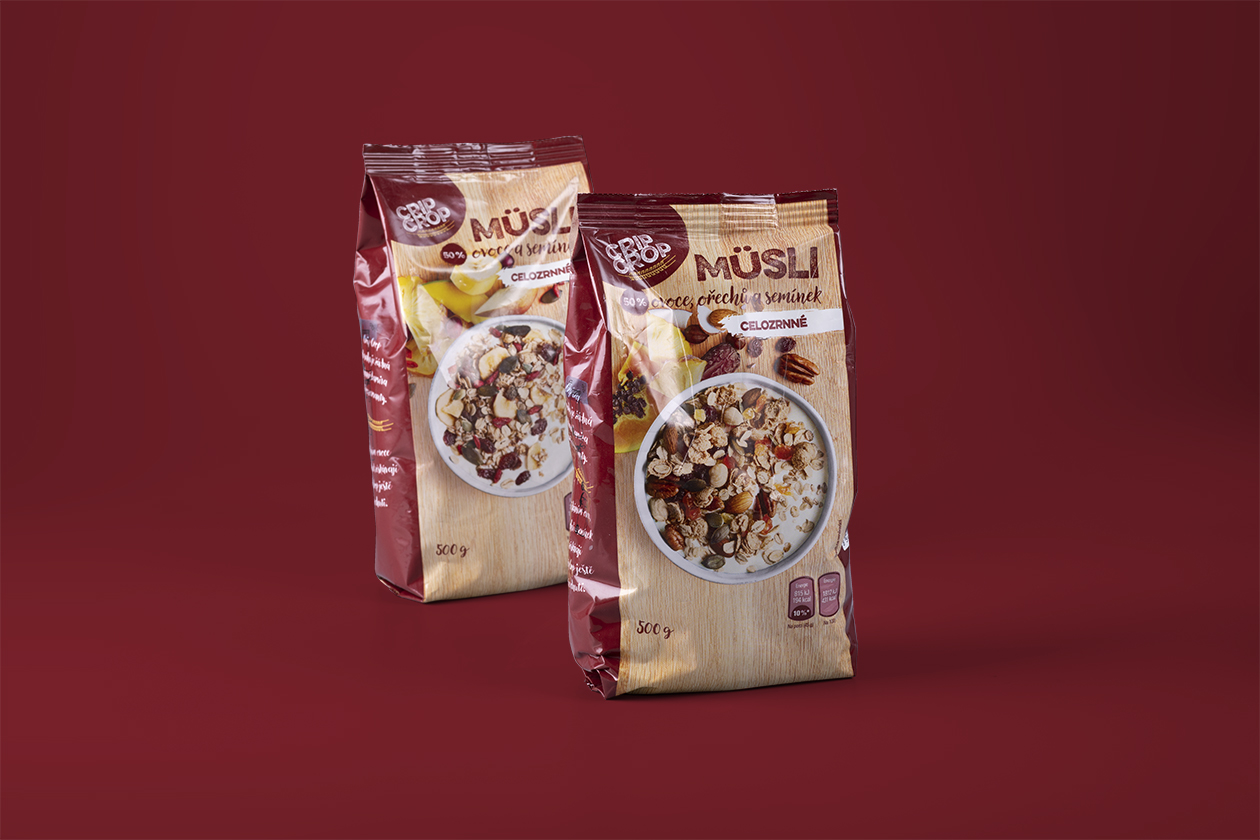
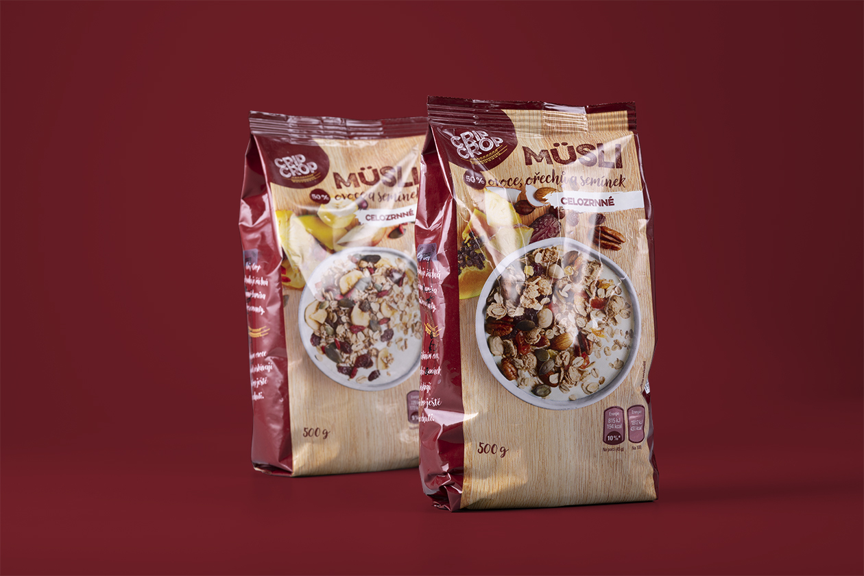
Our biggest challenge during the designing process of Crip Crop packaging for Penny Market was to unite all the products under the integrated visual. Some products like corn flakes and müsli already existed with older designs and our task was to rejuvenate them and transform them into the new graphic language. On the other hand, some products such as porridge or other flavors of the bars had to be created from the beginning and with different printing technology.
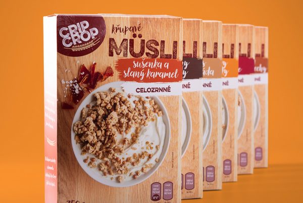
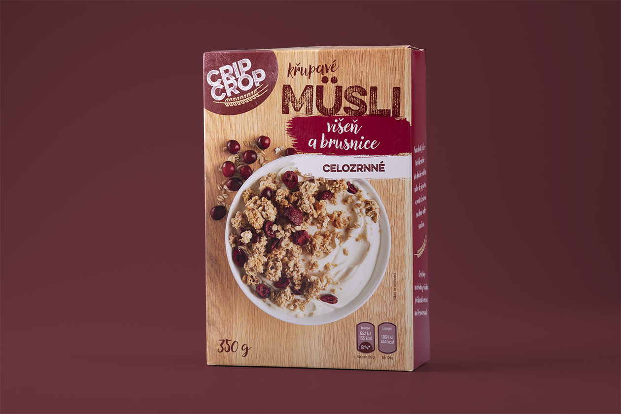
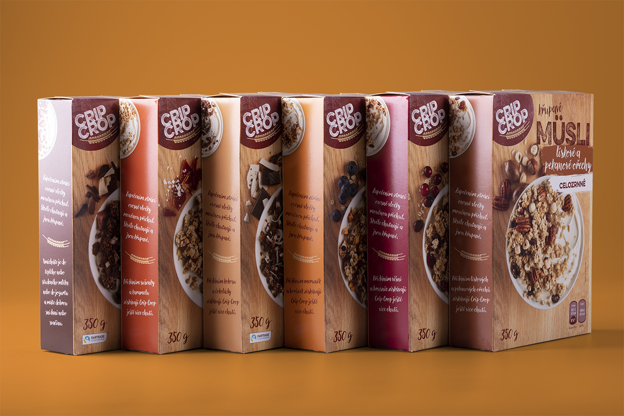
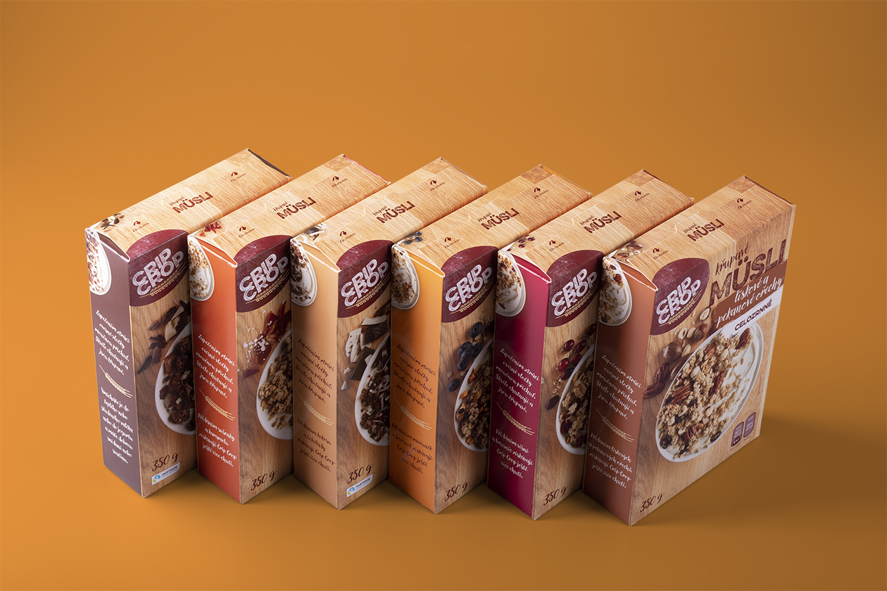
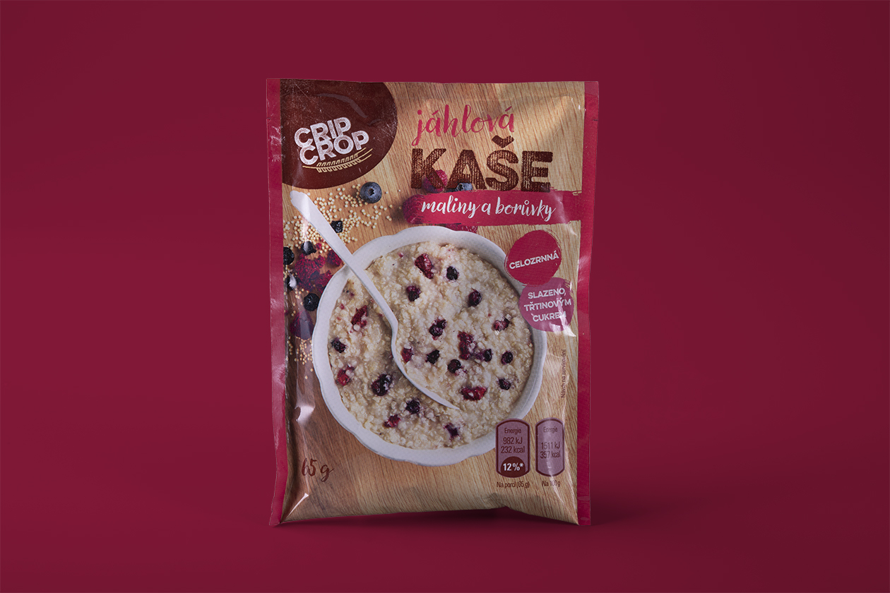
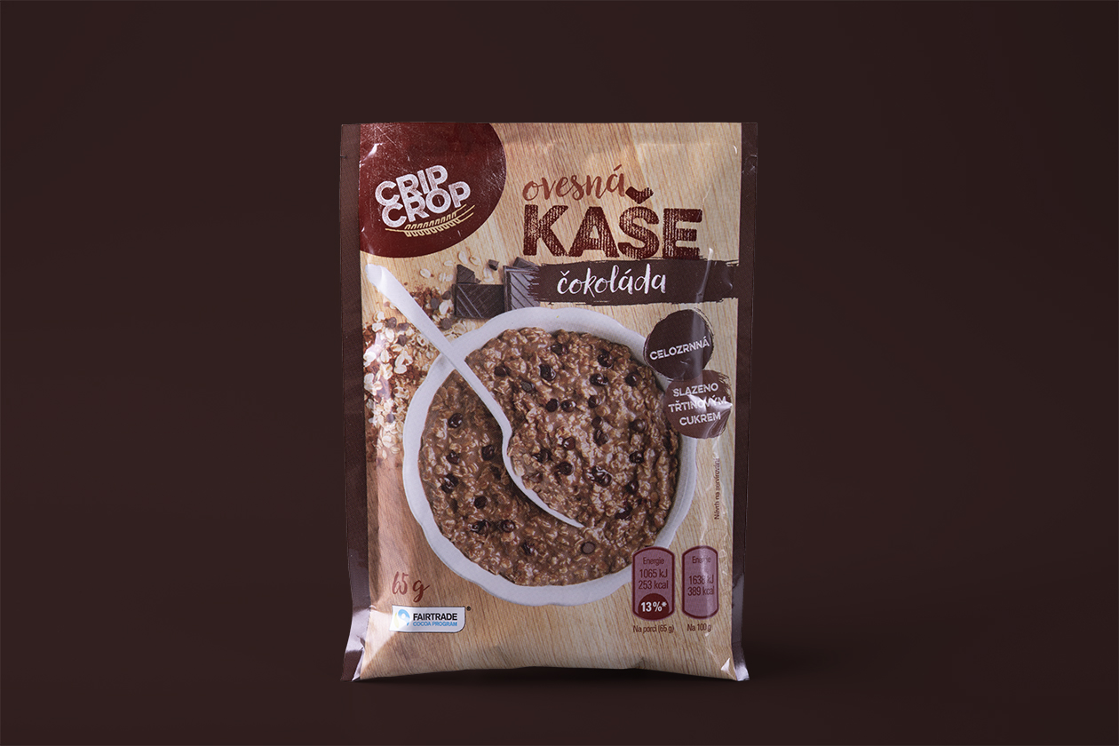
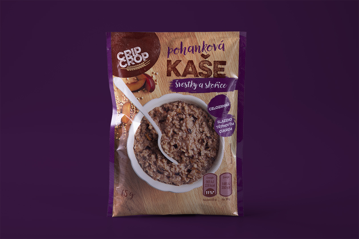
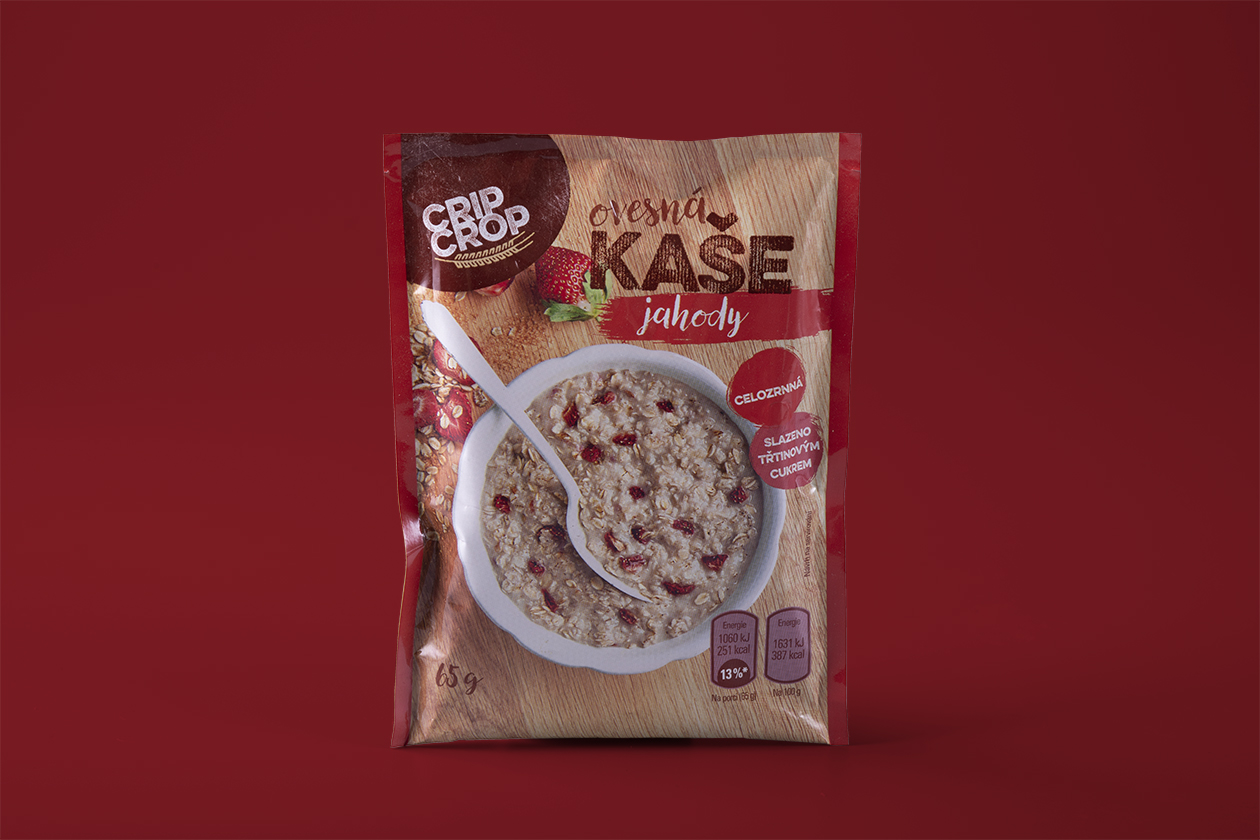
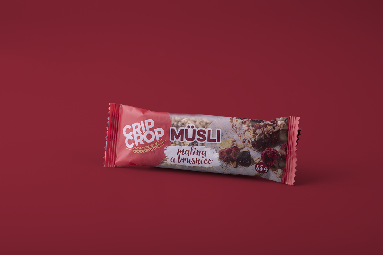
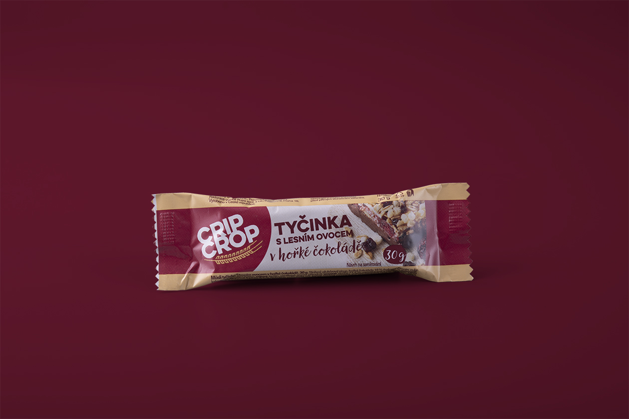
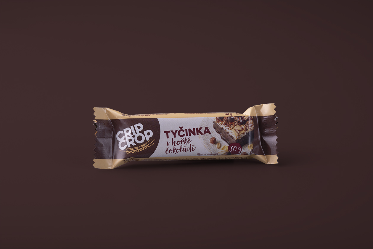
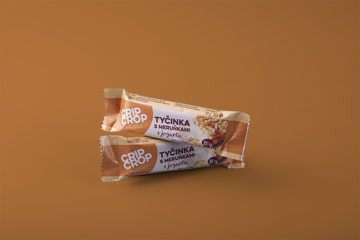
Overall, we needed to create 7 products in 27 flavors. A tasteful Bordeaux-colored logo with a natural-looking texture of light wood was chosen as the main pillar of our design, supplemented by beautifully arranged product photography, which was delivered by an external graphic studio.
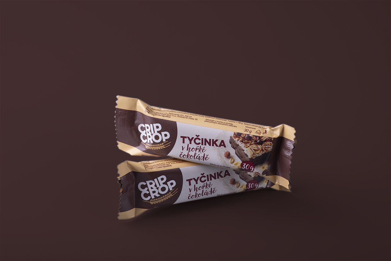
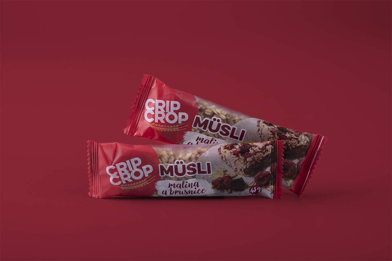
The main goal of our communication was for the customer to trust Crip Crop as a supplier of tasty and natural breakfast and snacks. The packaging design of the new Crip Crop packaging is clean and precisely displays the main advantages and features of the product. Thanks to the color-coding it is easy to distinguish the flavors and identify your favorite one on the shelf in the supermarket.
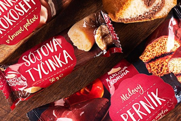
The biggest challenge turned out to be the printing process. Not only did we have to put all the important information in the significantly smaller space but with some flavors, we also worked with the transparency of the packaging. One part of the packaging is reserved for the transparent window for the bar itself to complement the design and taking it to a whole new level. Observant people might notice the small simplification of the font in the title of the bars, without which the transparency wouldn’t be possible.
Eventually, we are excited that we have managed to keep the design clean and fresh. Thanks to that you won’t mistake your favorite Crip Crop products with anything else.
