#packaging #rajo #design #cottage cheese #byMaison
Recently, our great client RAJO contacted us .They wanted us to “pump” the cottage a bit, because they decided to extend product to the extra large version.
But how to do it so it does not look like a cheap private label promo, but at the same time to make it clear XXL?
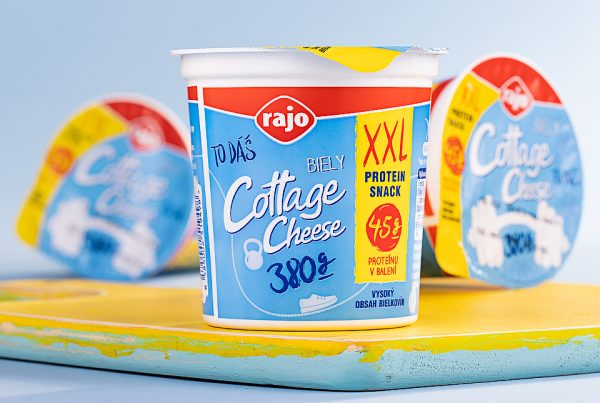
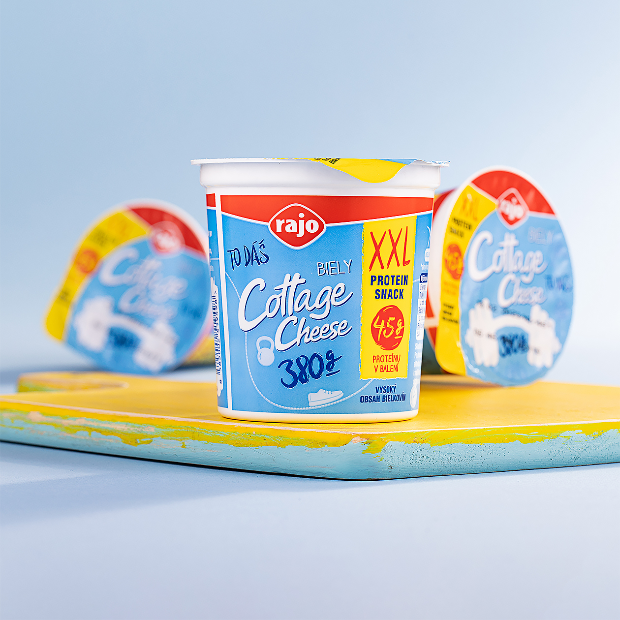
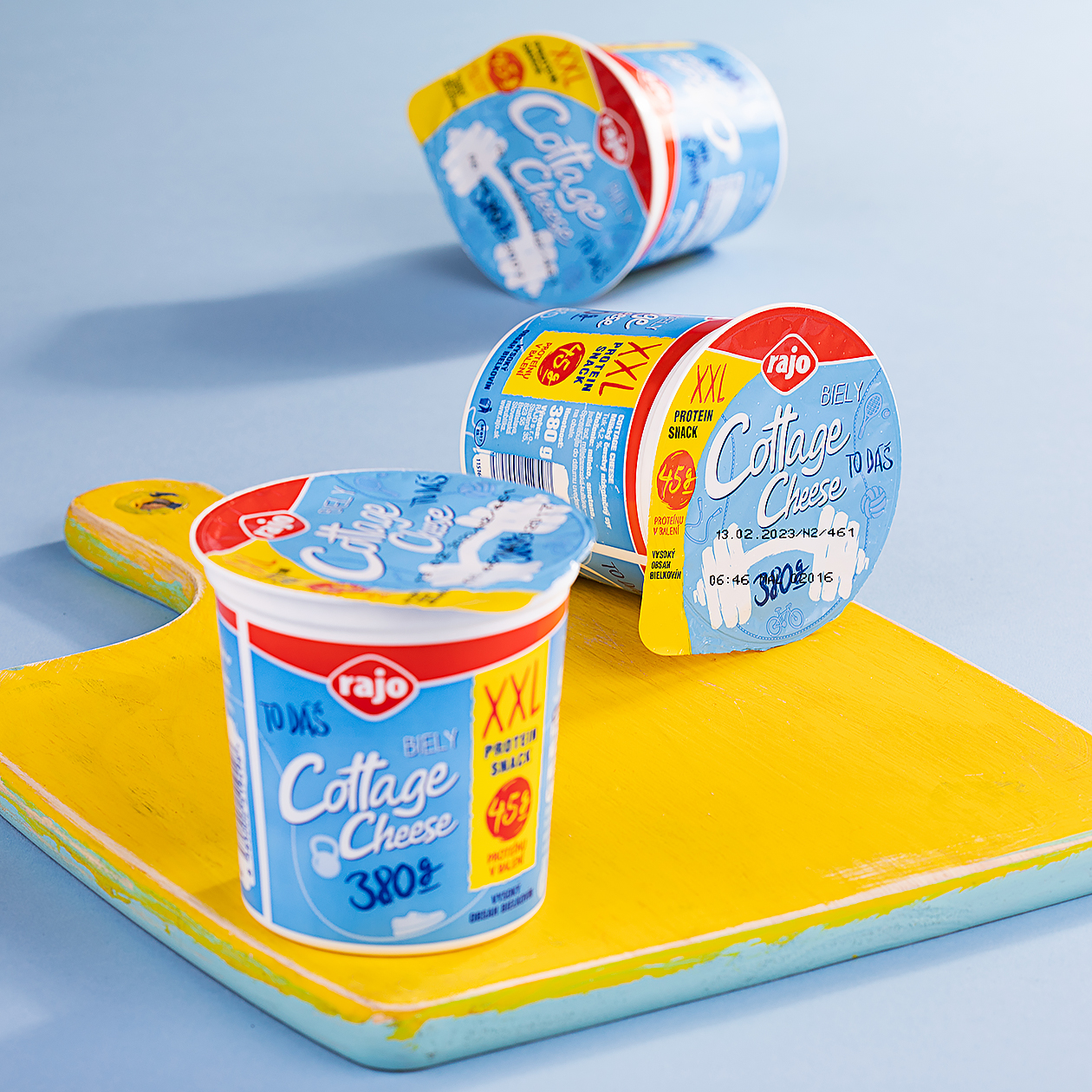
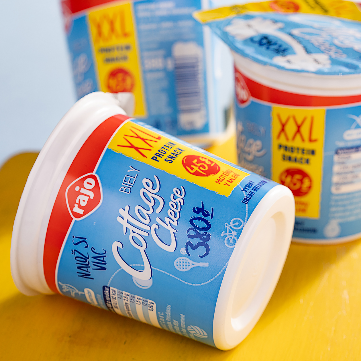
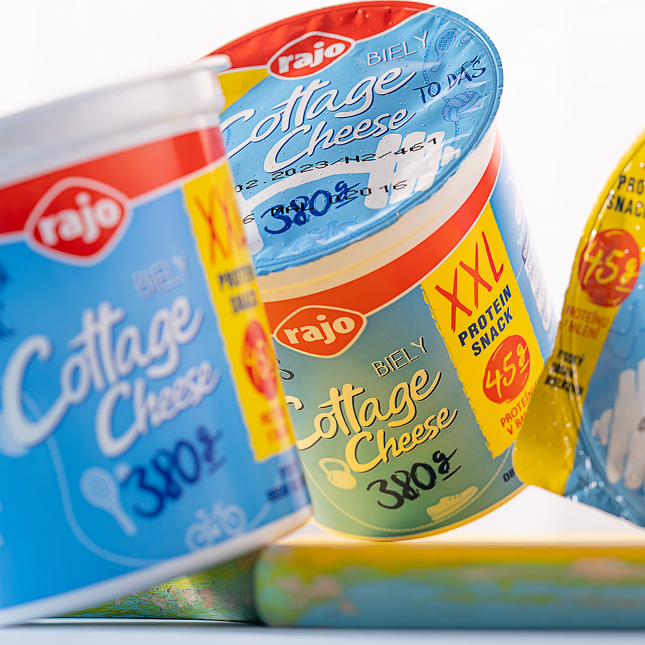
The first important thing that we had to consider is who is the target group of the larger version. We found out that these are mainly athletes who have a cottage as part of their daily meal plan. In addition, cottage cheese is naturally high in protein. We managed to communicate these things through the nice illustration of a dumbbell placed on the upper part of the packaging. Dumbbell is accompanied by two supporting claims- You can do it and Load more. It helped to complete the overall emotion for the target group. And at the end, it all refers to its smaller half in the form of the original white cottage cheese.
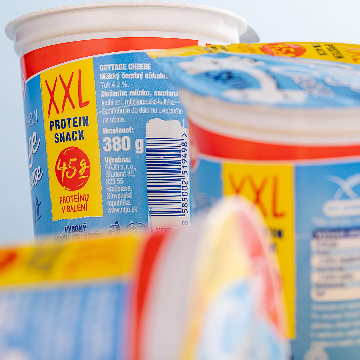
We decided to reach the key benefits by differentiating the product on the counter through a highlighted yellow background with red lettering (yellow and red colours encourage to purchase according to the FMCG surveys). We put an emphasis on the weight of the proteins in the package and XXL convenient packaging, so it does not look like an ordinary cheap advertising, but as a natural part of the product.
