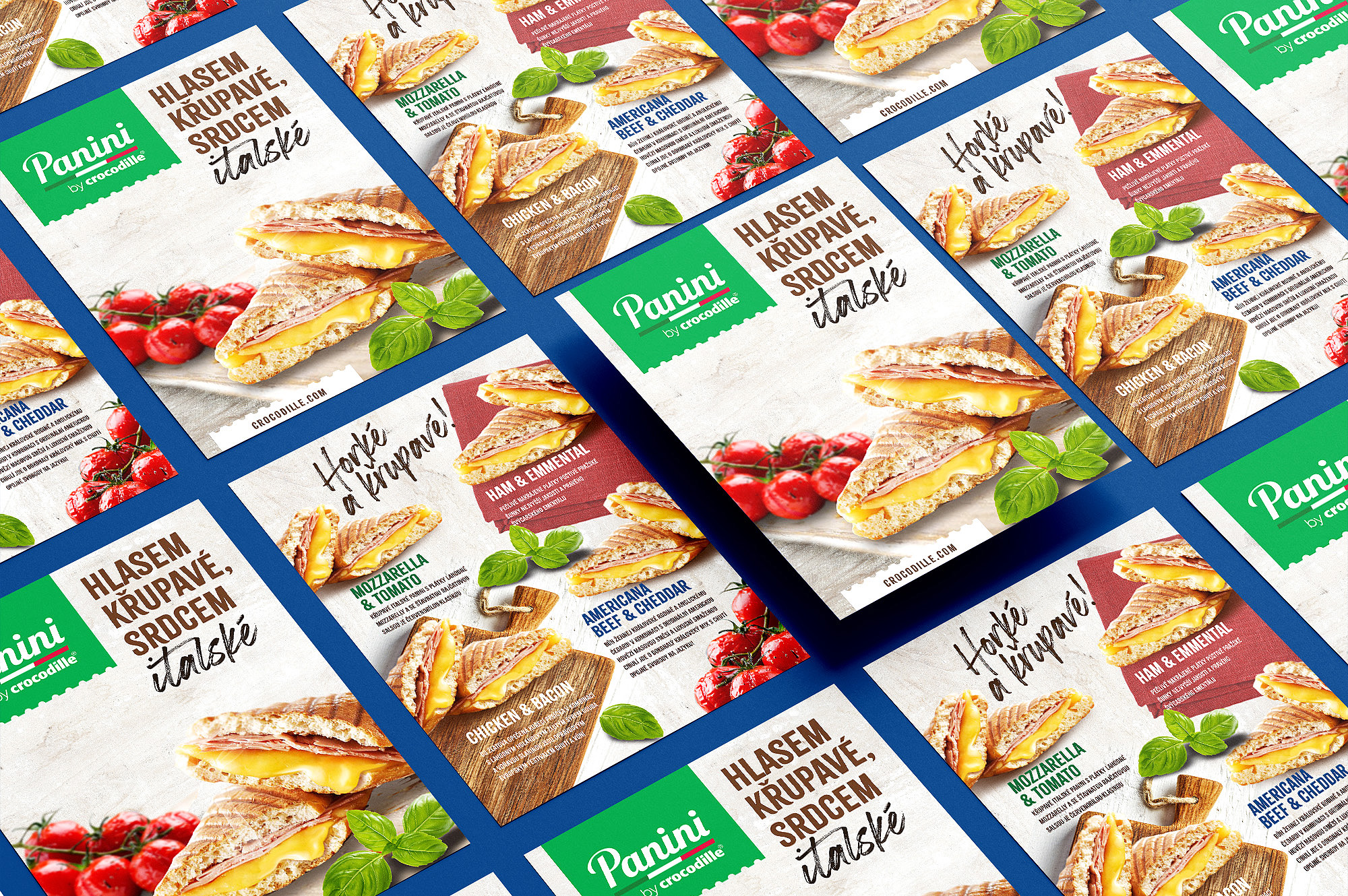
Our task was to create a packaging design combining the elements of traditional italian architecture and the modern bit still visualy pleasing appearence of the graphic design.
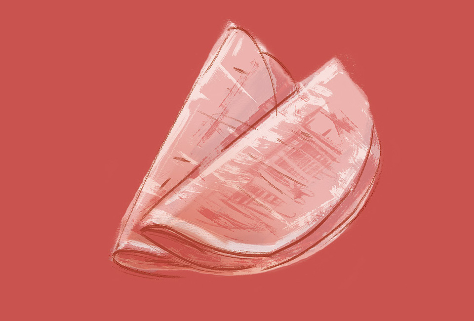
We chose the specific and easily recognised elements of architecture for our four various flavors. We wanted to avoid the traditional pen drawing during the designing process, so we decided to use our own stylized graphic design. Every illustration is created by the simply connected line with the specific form of rounding. The presented buildings are fluently melting into the displey of its surroundings in the form of a landscape. Meybe you will notice this small detail next time when you will be enjoying your Panini. If it will make your consumer experience at least a little more pleasing, we did a good job.


