#packaging #design #maspoma #slovakia #byMAISON
Application of a singular approach to brand creation
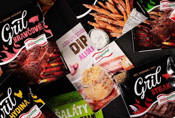
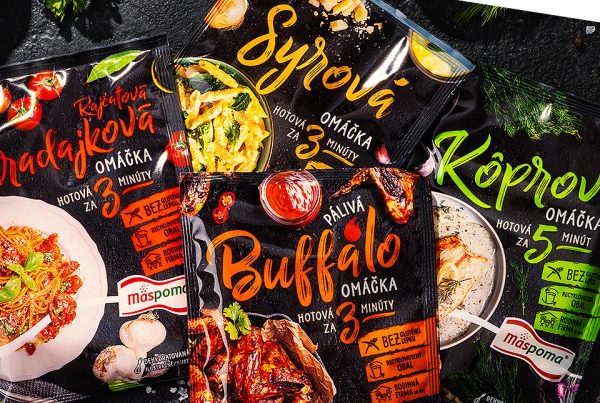
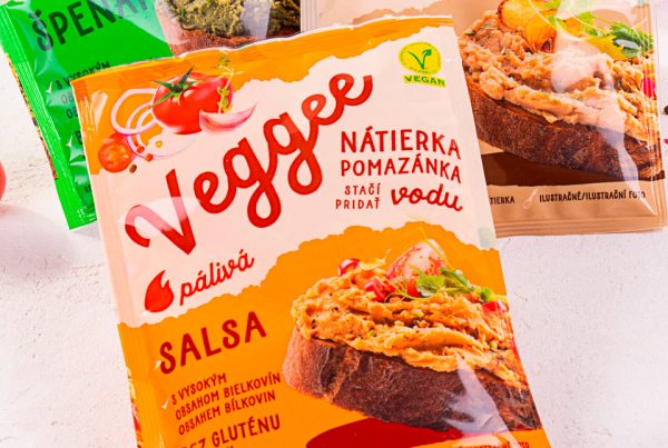
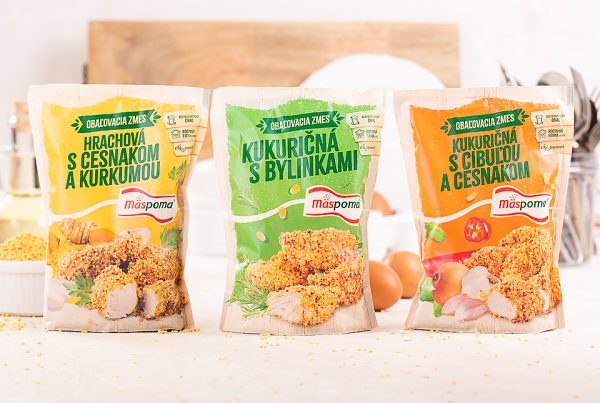
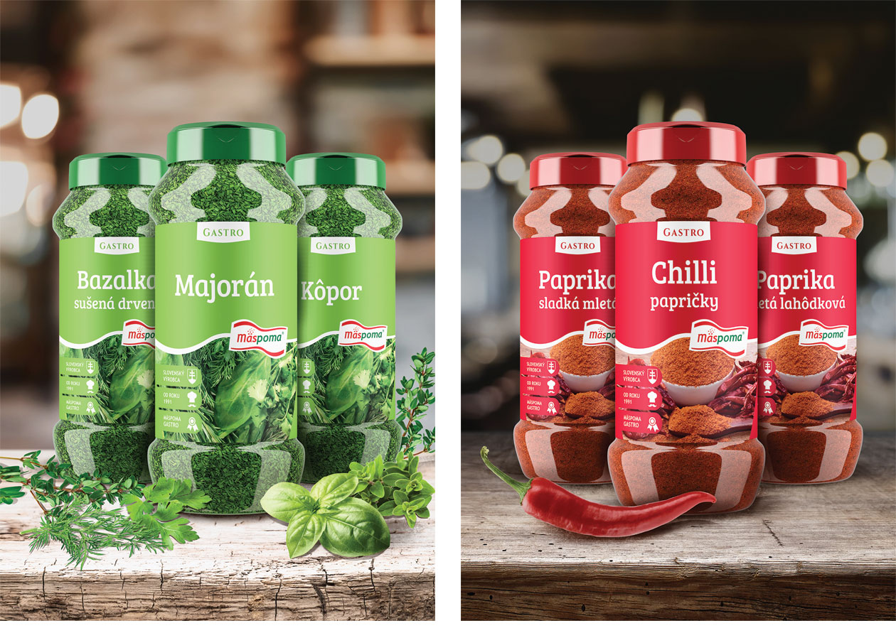
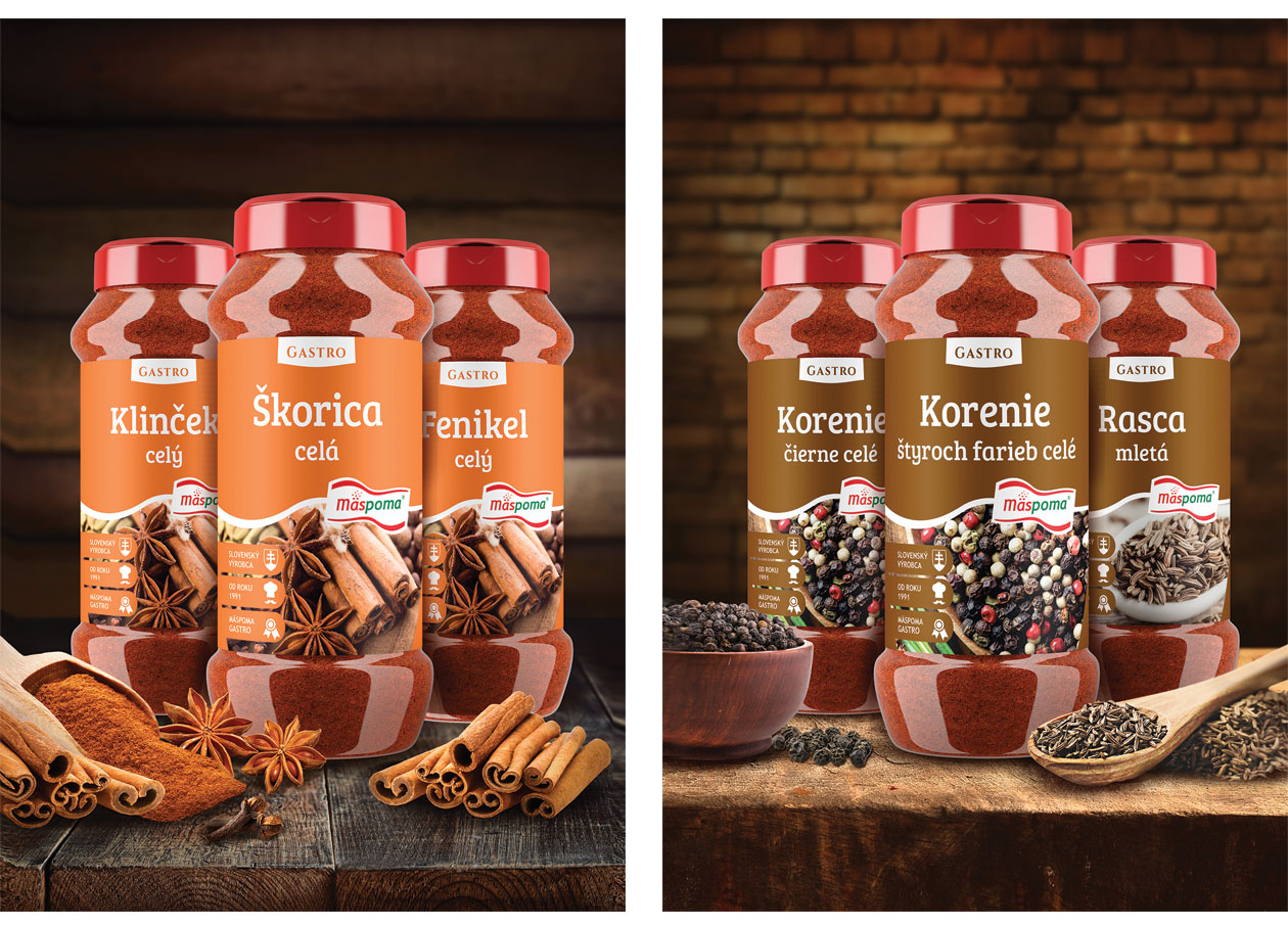
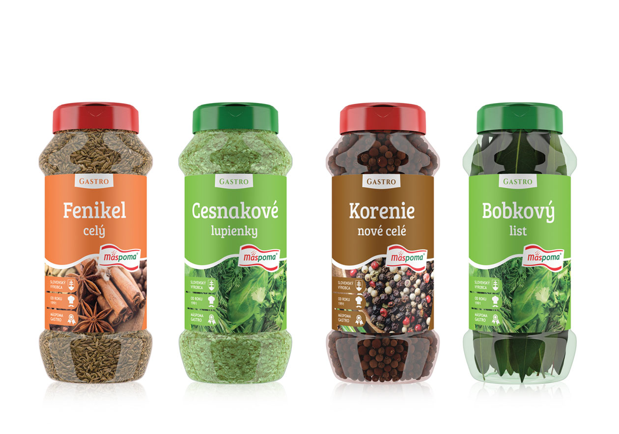
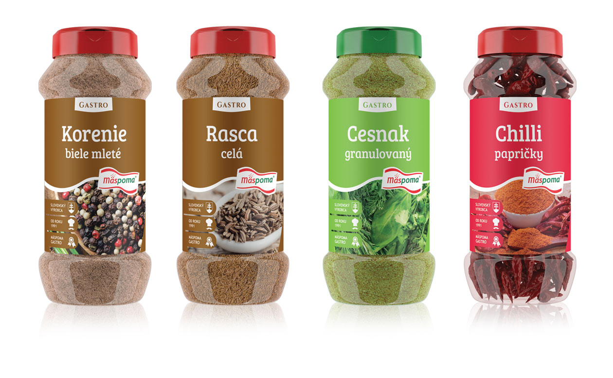
While designing packaging it’s crucial to keep scalability in mind, especially in terms of flexible composition. In our designs of classic seasoning packs we introduced a system for positioning of the main logo, product name, separating wave, background image, informational icons as well as a space for communicating the product line, news or other promos (in the top row). Often we hear the same sentence from clients, “I cannot imagine it”. Being creative is one thing but a systematic approach to work and the design creation works for us in a long term. The creation process of the seasoning packs introduced a set of limitations for us. Flexographic printing limits our range of contrast in our color palette and the label limits our layout. The bottom line is, if you think ahead and choose the system correctly, it is possible to apply it in a way that preserves the continuity of visuals and supports brand awareness creation.
