#bars #raw #vegan #venhel
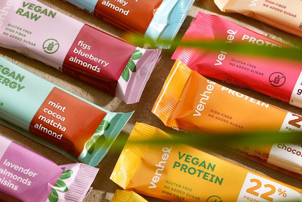
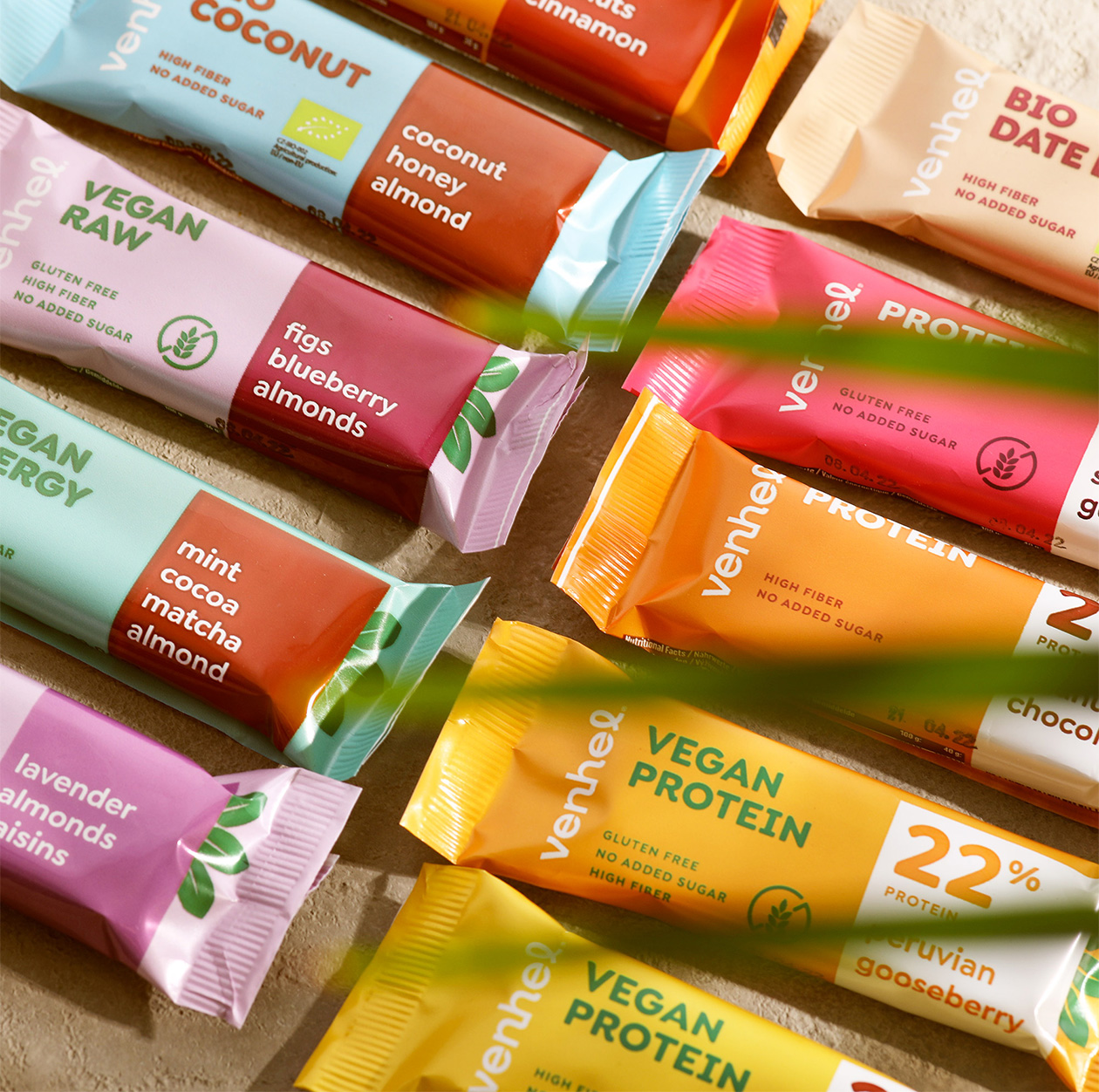
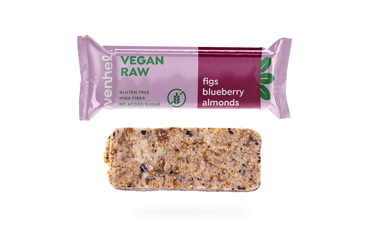
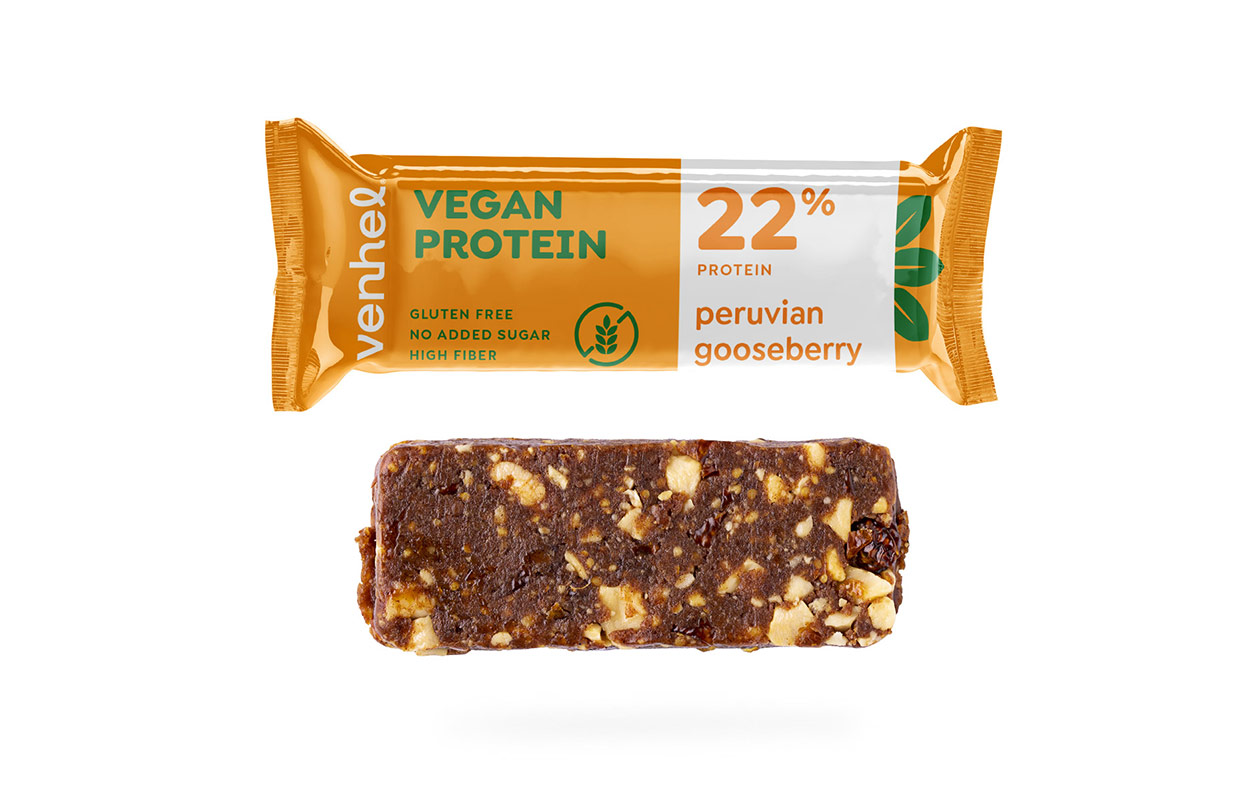
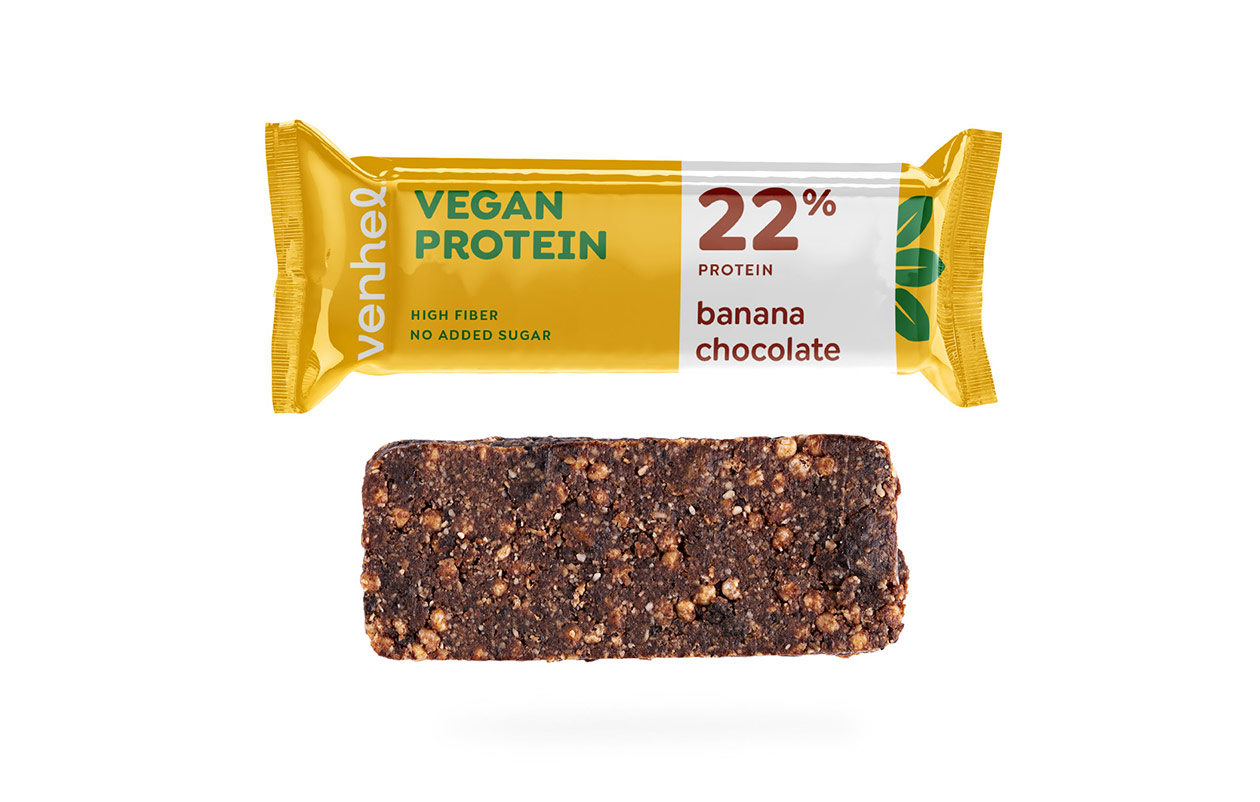
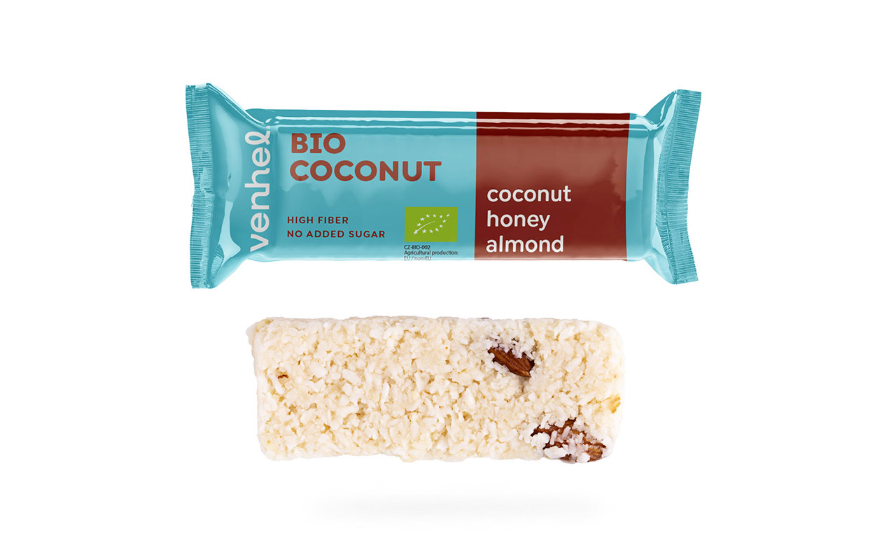
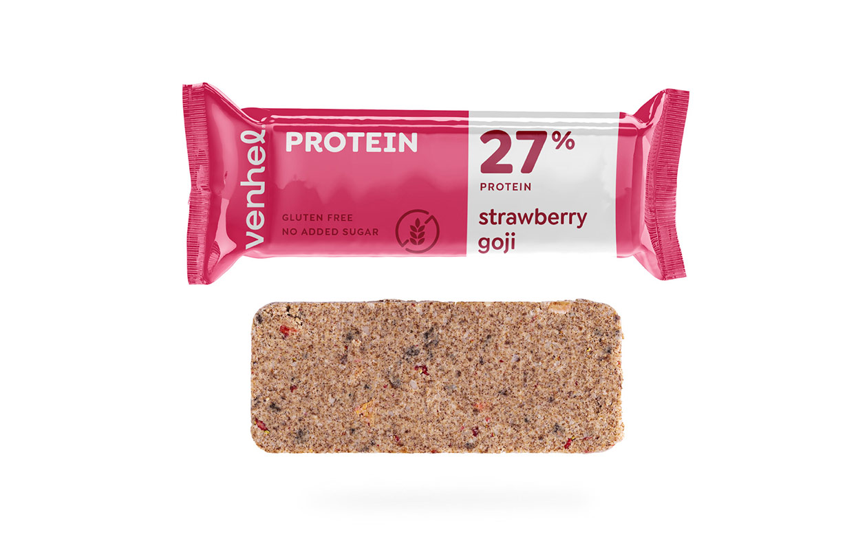
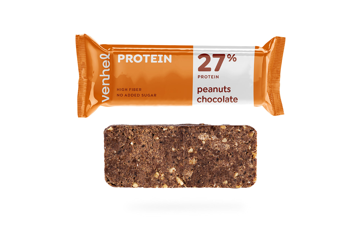
Sometimes the hardest thing about packaging design is choosing what not to put on it. There are many advocates of a minimalist approach to packaging design. We try to choose well where to add graphics and where to skimp with it. When we saw this wide range of candy bar packaging, we decided to build on the strong color hierarchy and clear text structure. It was the choice of colour palette that was crucial for us.
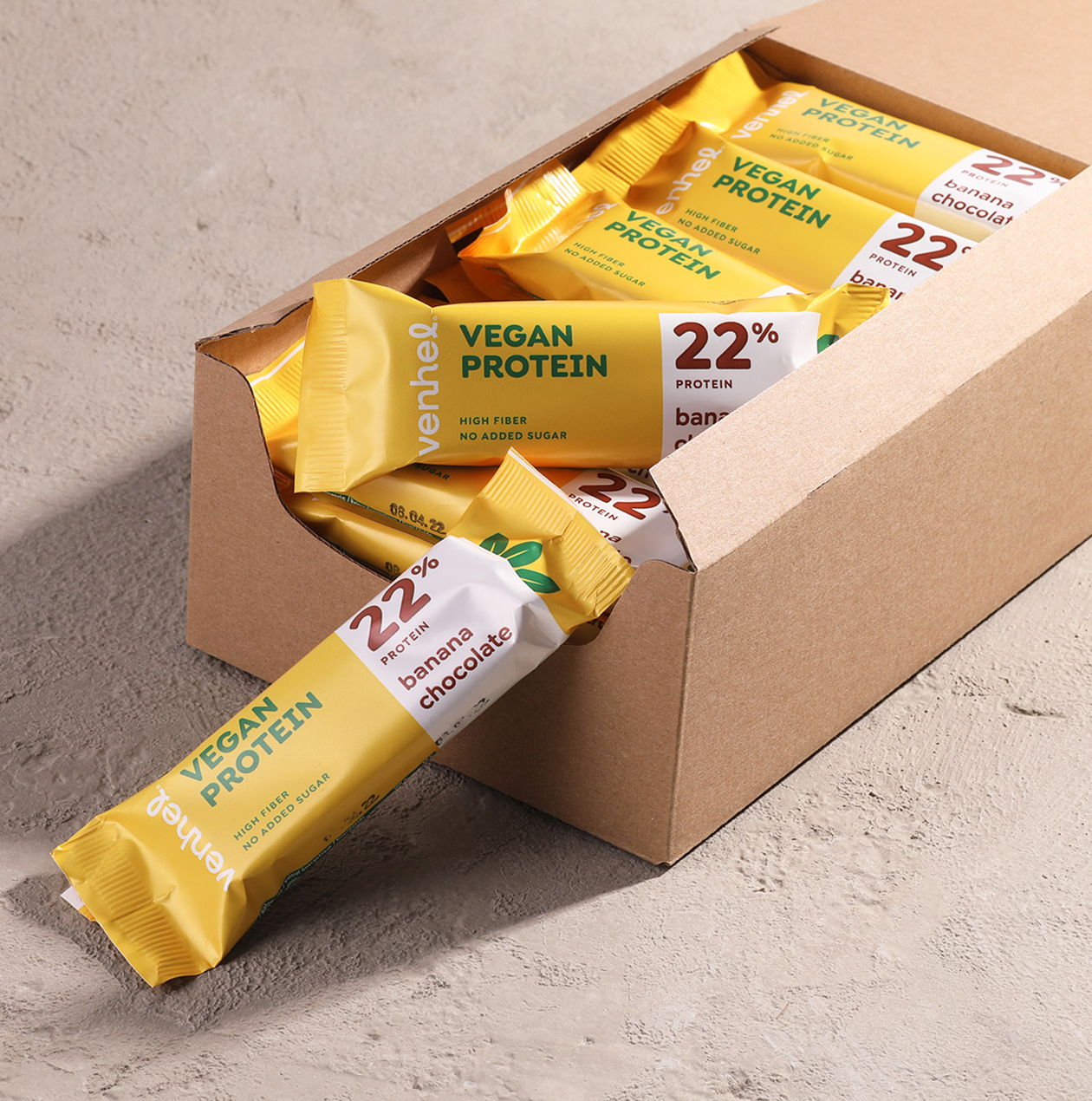
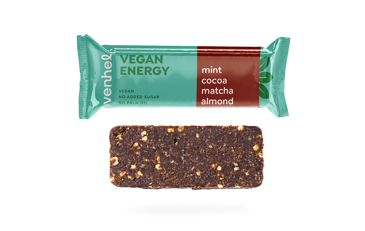
The colour combinations you will find on the packaging design of VENHEL bars are very intuitive and perfectly represent the composition and taste of each individual bar. For the vegan series, we have additionally added a simple graphic element in the form of stylised leaves to achieve a better differentiation from the rest of the product range.
