#logo #branding #design #corporateidentity
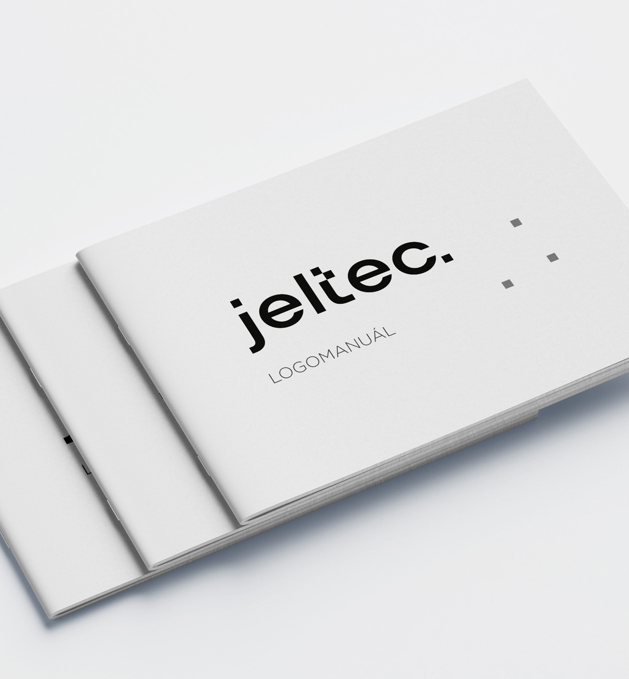
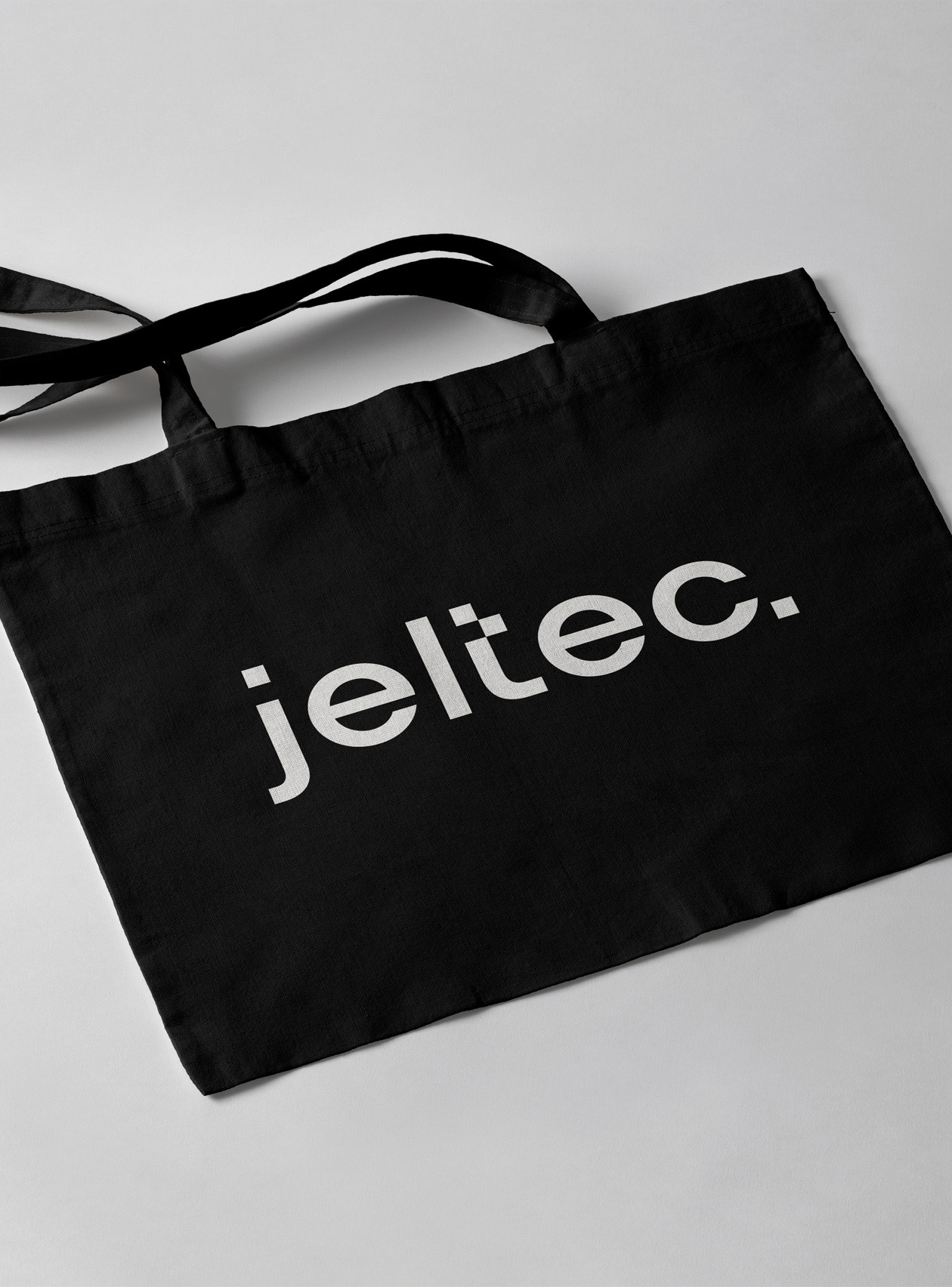
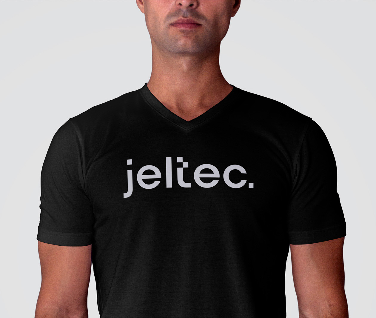
As the graphic design agency behind the minimalist branding for the construction company showcased in our portfolio, we’ve crafted a logo and visual style that embody simplicity, elegance, and professionalism.
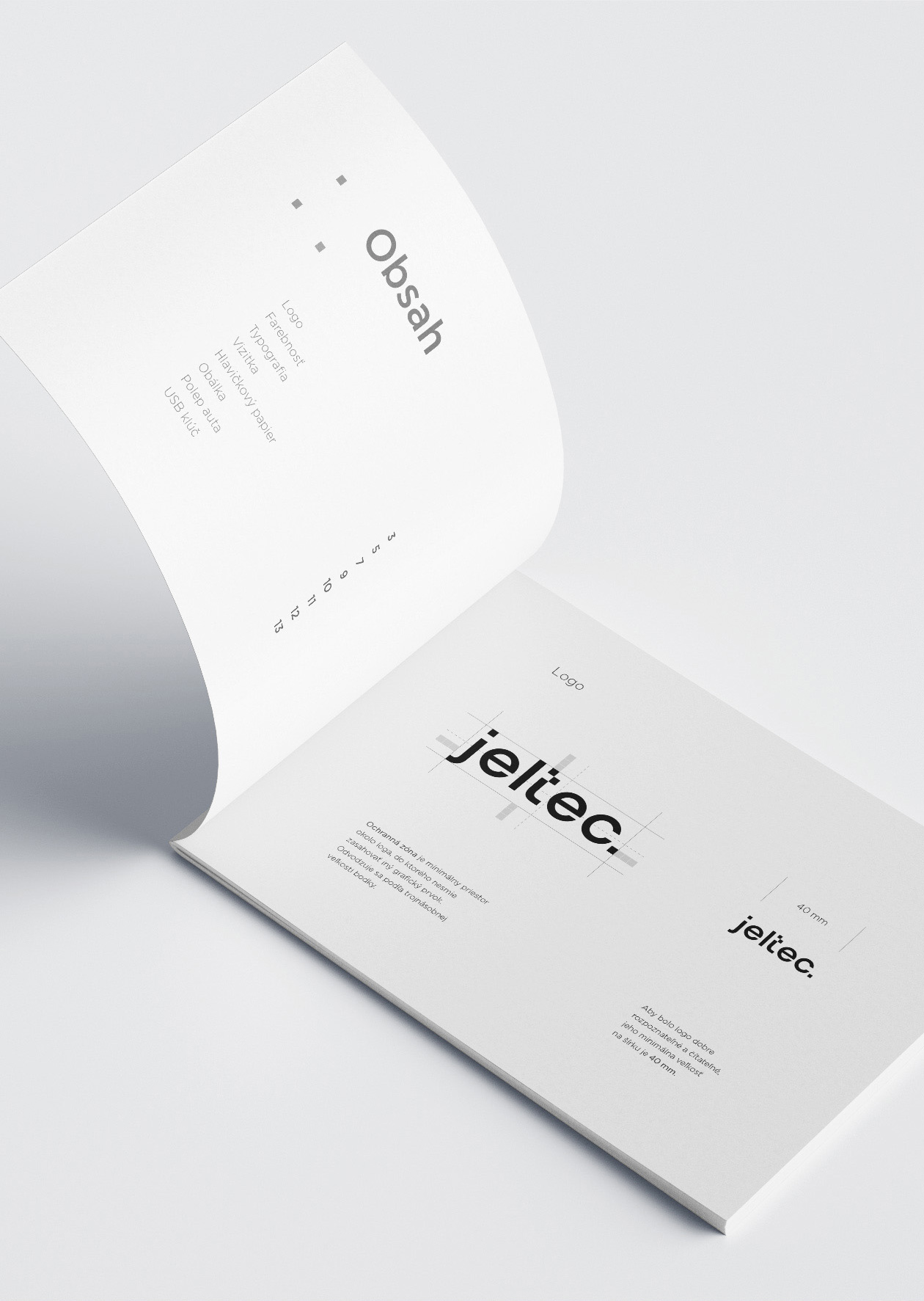
The logo we’ve designed for the construction company is clean and minimalistic. It features a simple geometric shape, possibly resembling a house or a building, rendered with clean lines and precise symmetry. This minimalist approach conveys the company’s commitment to precision, quality, and attention to detail in their construction projects. The use of a single color, likely a shade of blue or gray, enhances the logo’s simplicity and sophistication.
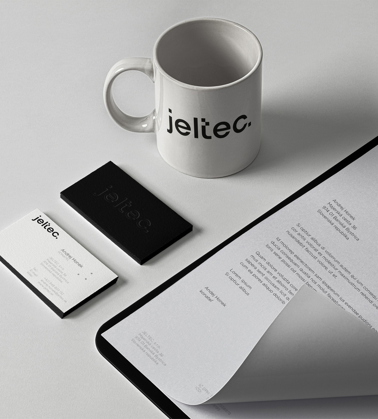
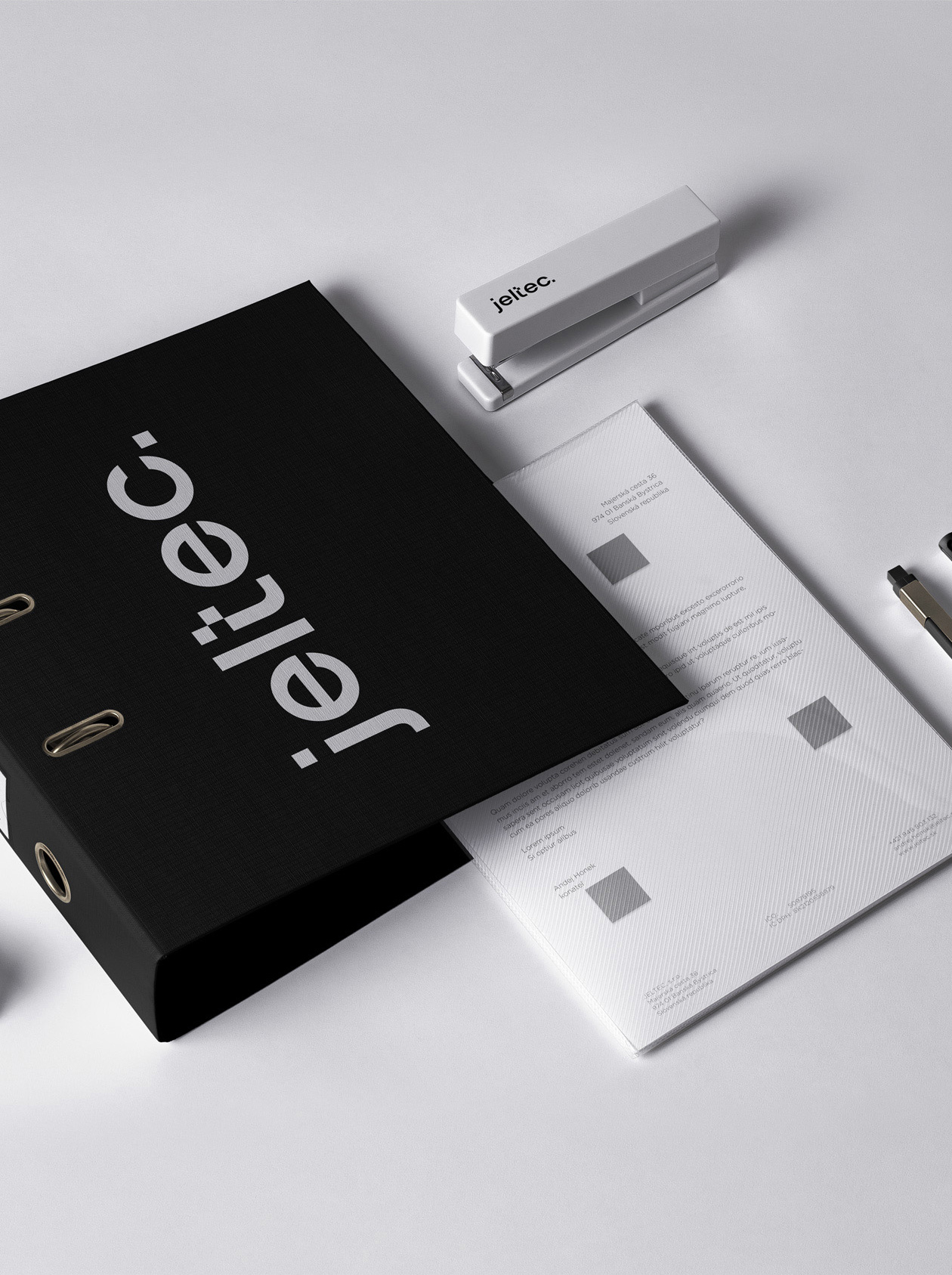
In terms of visual style, we’ve opted for a minimalist aesthetic throughout the company’s branding materials. This includes business cards, letterheads, and other stationery items. Clean lines, ample white space, and a restrained color palette contribute to a modern and professional look. The typography chosen is likely a sleek sans-serif font, further emphasizing the company’s contemporary approach and commitment to simplicity.
Photography, if used, is likely to showcase the company’s completed projects in a clean and uncluttered manner, allowing the quality of their workmanship to speak for itself. Overall, our graphic design agency has created a logo and visual style that reflects the construction company’s values of precision, quality, and professionalism while exuding a sense of modernity and sophistication.
