Logo design as the first step of corporate identity
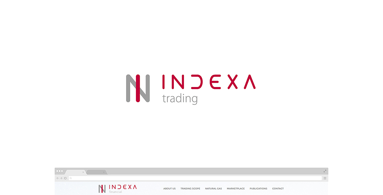
The whole process of creating the visual image of a new company, or rebranding an existing company, starts with designing the logo and selecting its final version. Our client chose a very original and visually strong logo, which was perfect to work with when creating a website, design manual and printed materials.
Design manual and brochure
Part of the creation of each logo is, of course, the design manual, which in its minimal design addresses the use of the logo, its variants, correct application, corporate colors and typography. The extended manual defines the processing of business cards, letterhead and mailing envelopes. Most often, this type of design manual is extended to include the use of the logo and corporate visual on promotional items, in advertising according to preferred media, flyers and brochures, or it outlines a solution for logo placement in web pages.
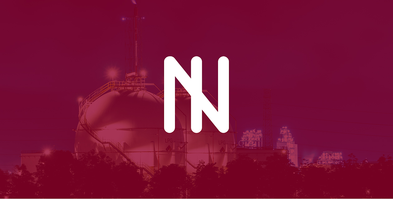
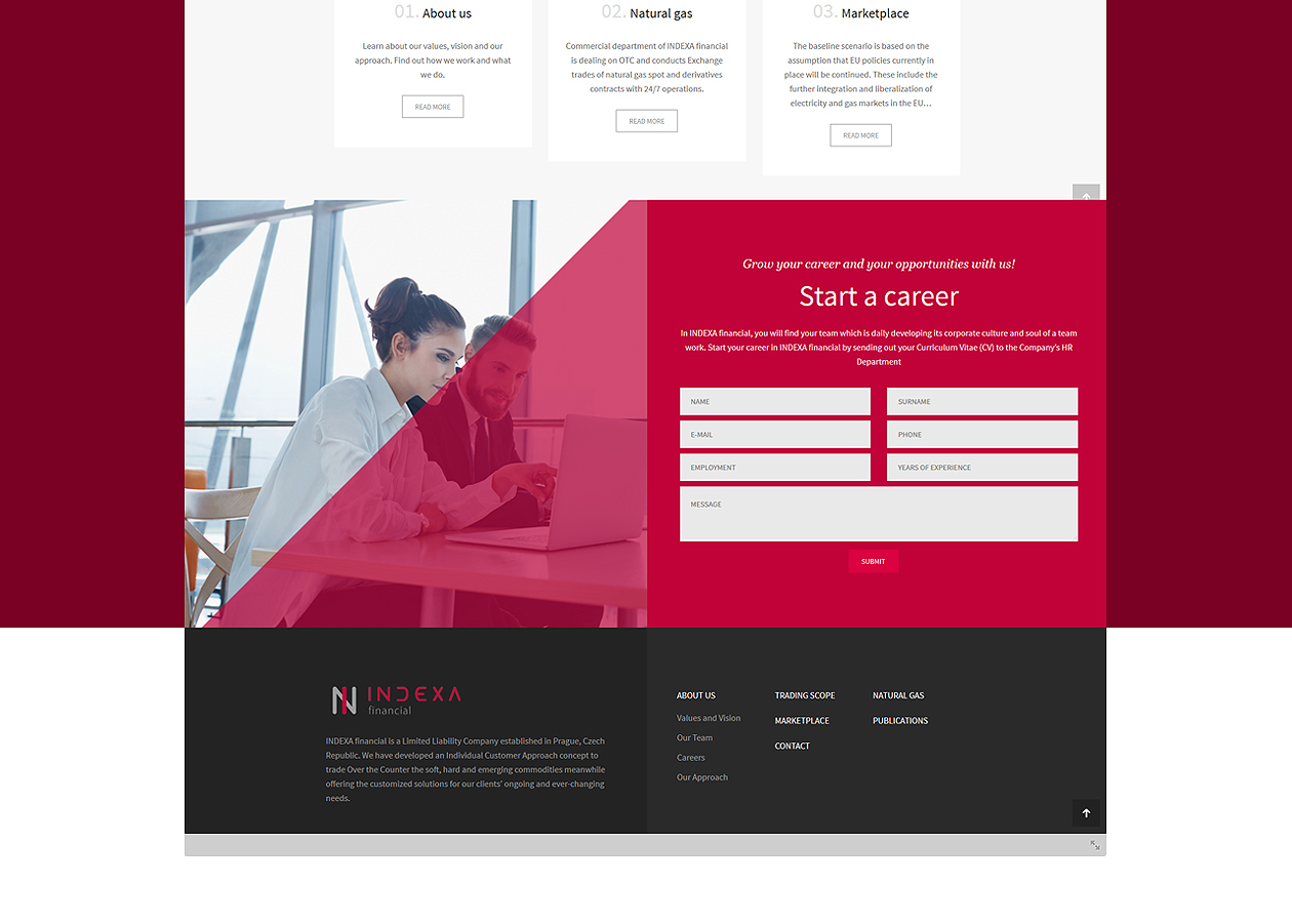
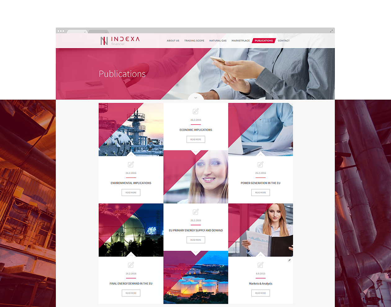
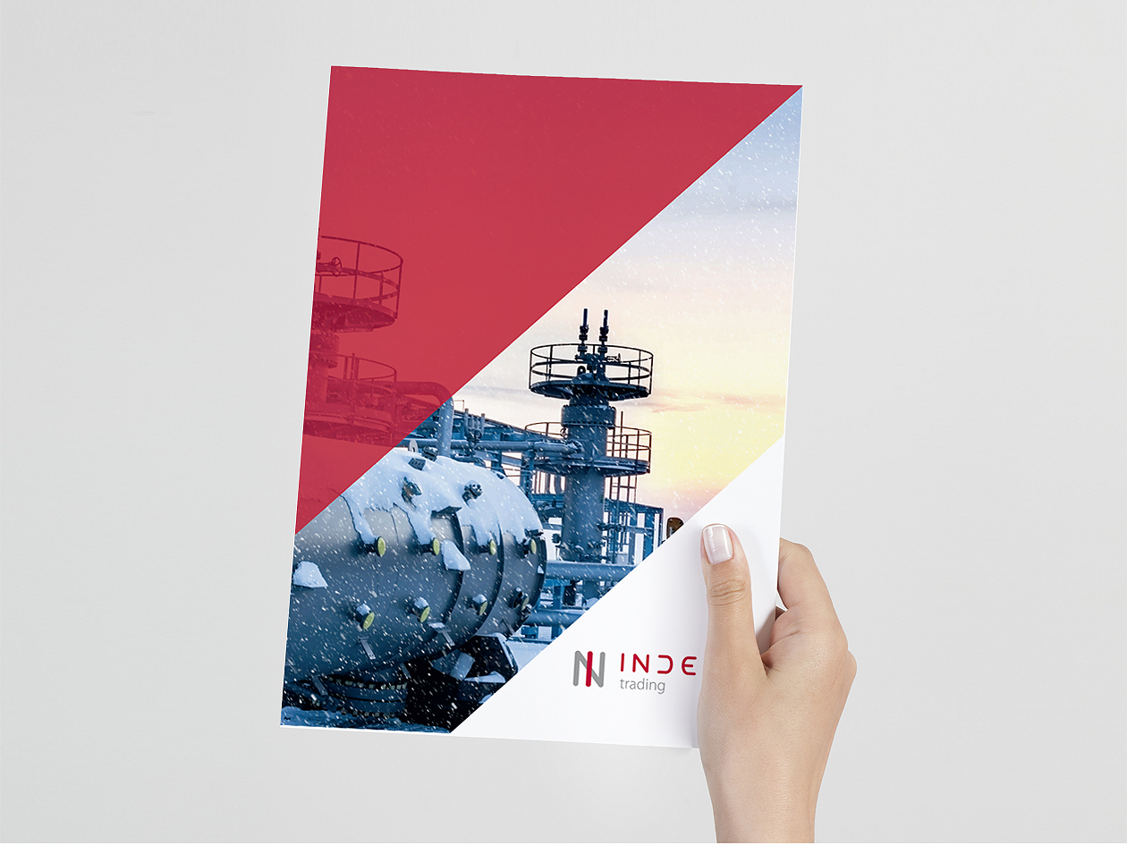
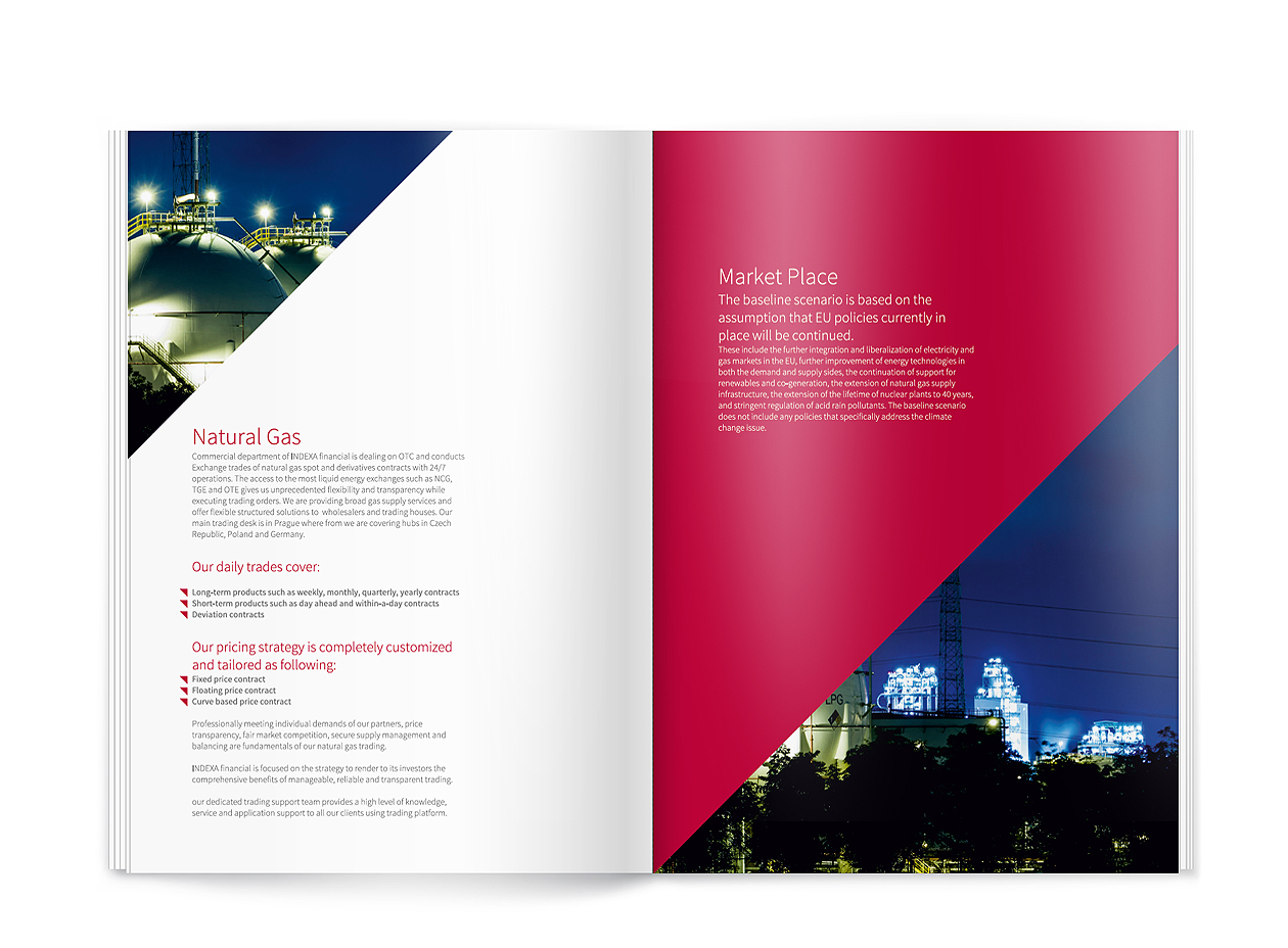
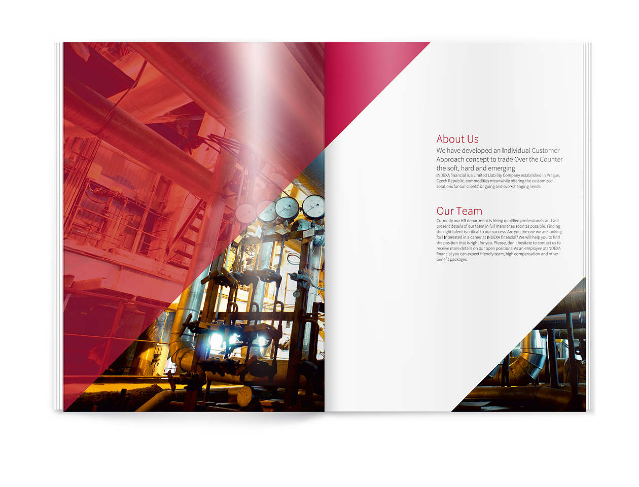
The whole identity of this project works with very subtle graphic elements, so we decided to build the look of the individual materials on photography, subtle work with text and a secondary, triangular graphic element that enters diagonally into the individual compositions, dividing them into full-colour, blank or photo-overlapping areas.
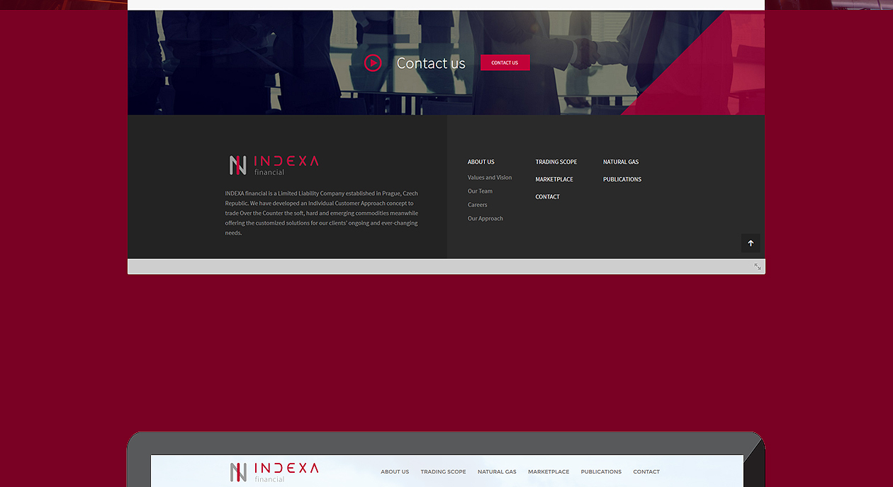
The worked case study shows a sample of the brochure and the website, the design manual of each project is only presented during a personal meeting.
Websites, responsiveness and application of corporate identity
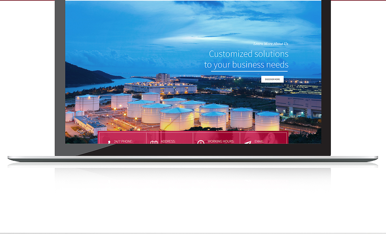
The current trend in web design is a certain unification of composition and individual visual elements or construction procedures in websites, due to the necessary optimization of content for a wide range of display devices. Nevertheless, we are constantly looking for ways to link web design with the visual identity of the project in the best possible way, thus maintaining the generally accepted functionality and the required creativity.
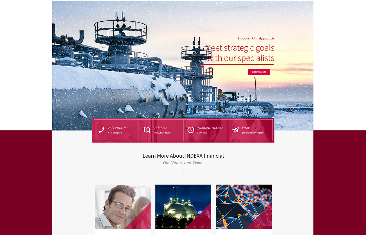
For this project, we built on the corporate identity defined by the design manual on the website by transferring photos, font choices, and of course, applying a secondary graphic element – a diagonally intersecting red area. The result is a very fresh, modern and, we believe, at the same time elegant website that seamlessly connects to all promotional materials and brand elements.
