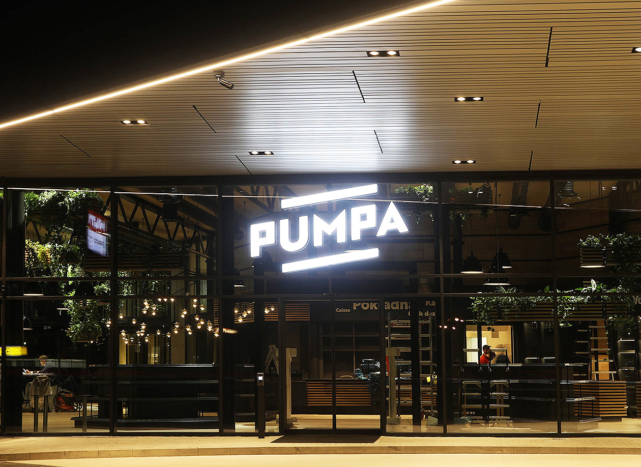
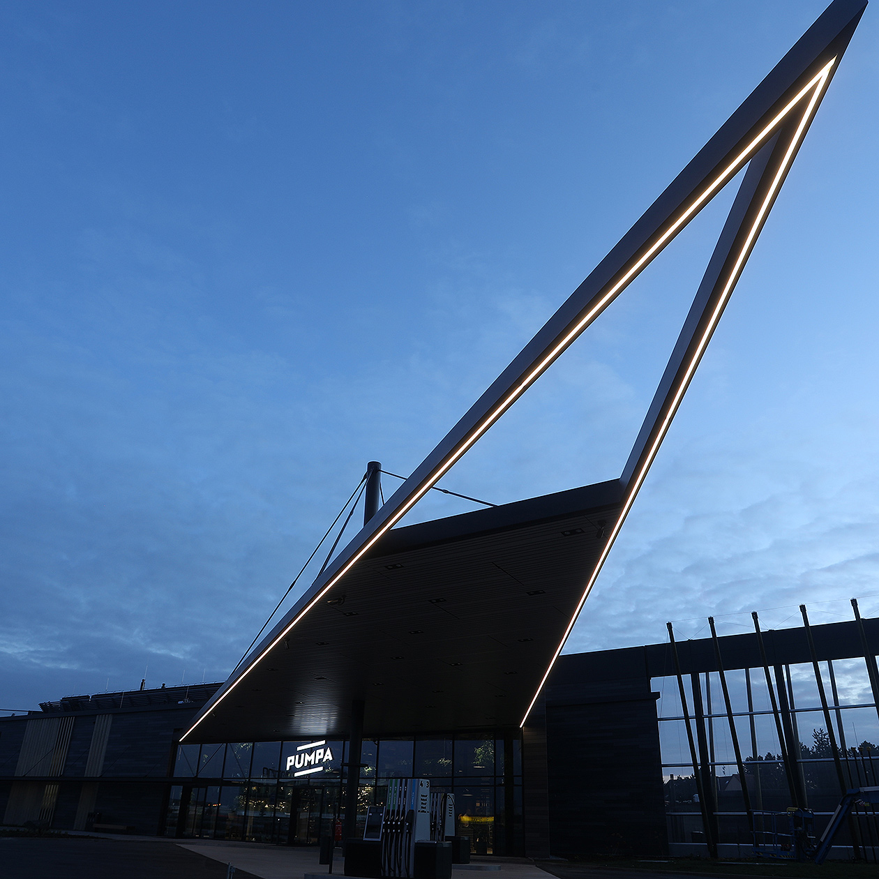
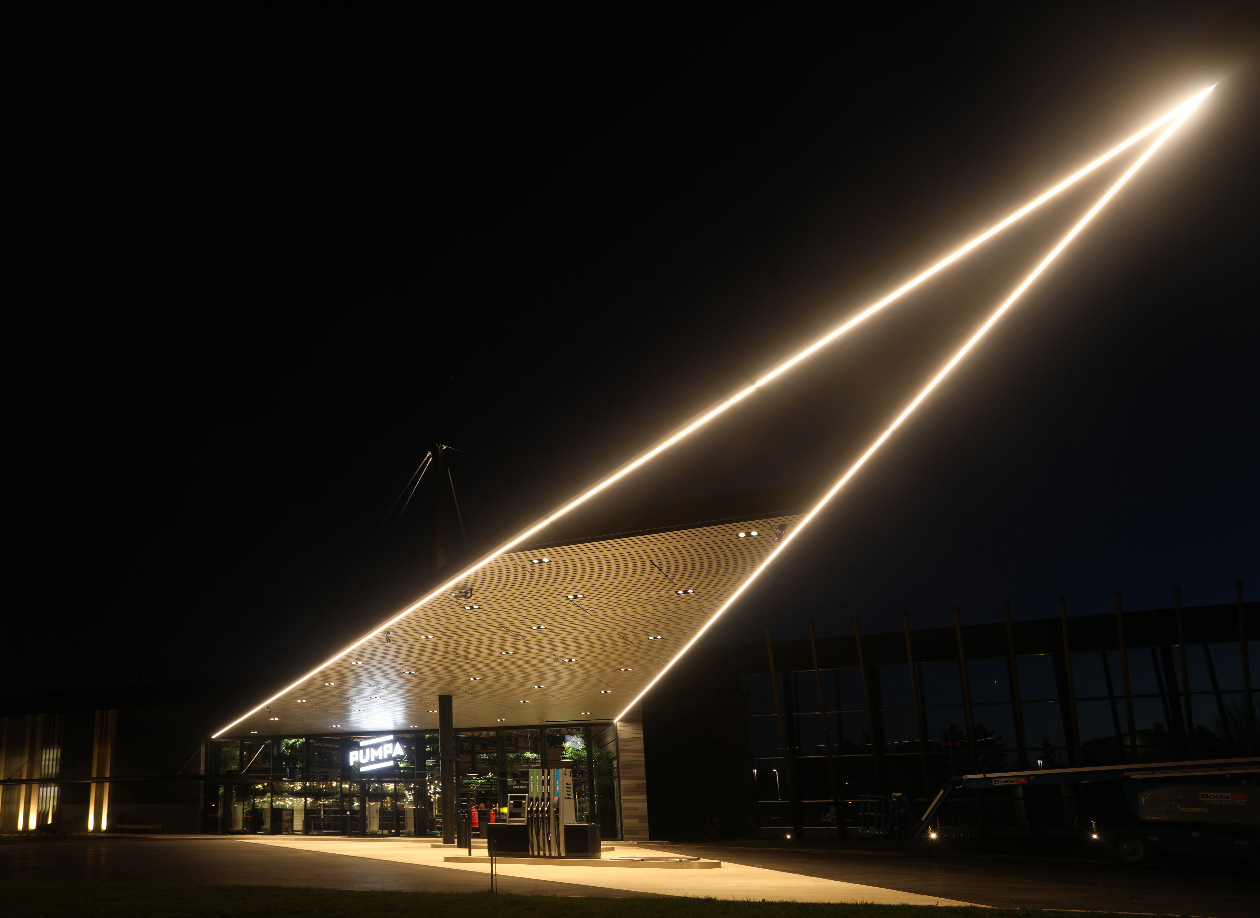
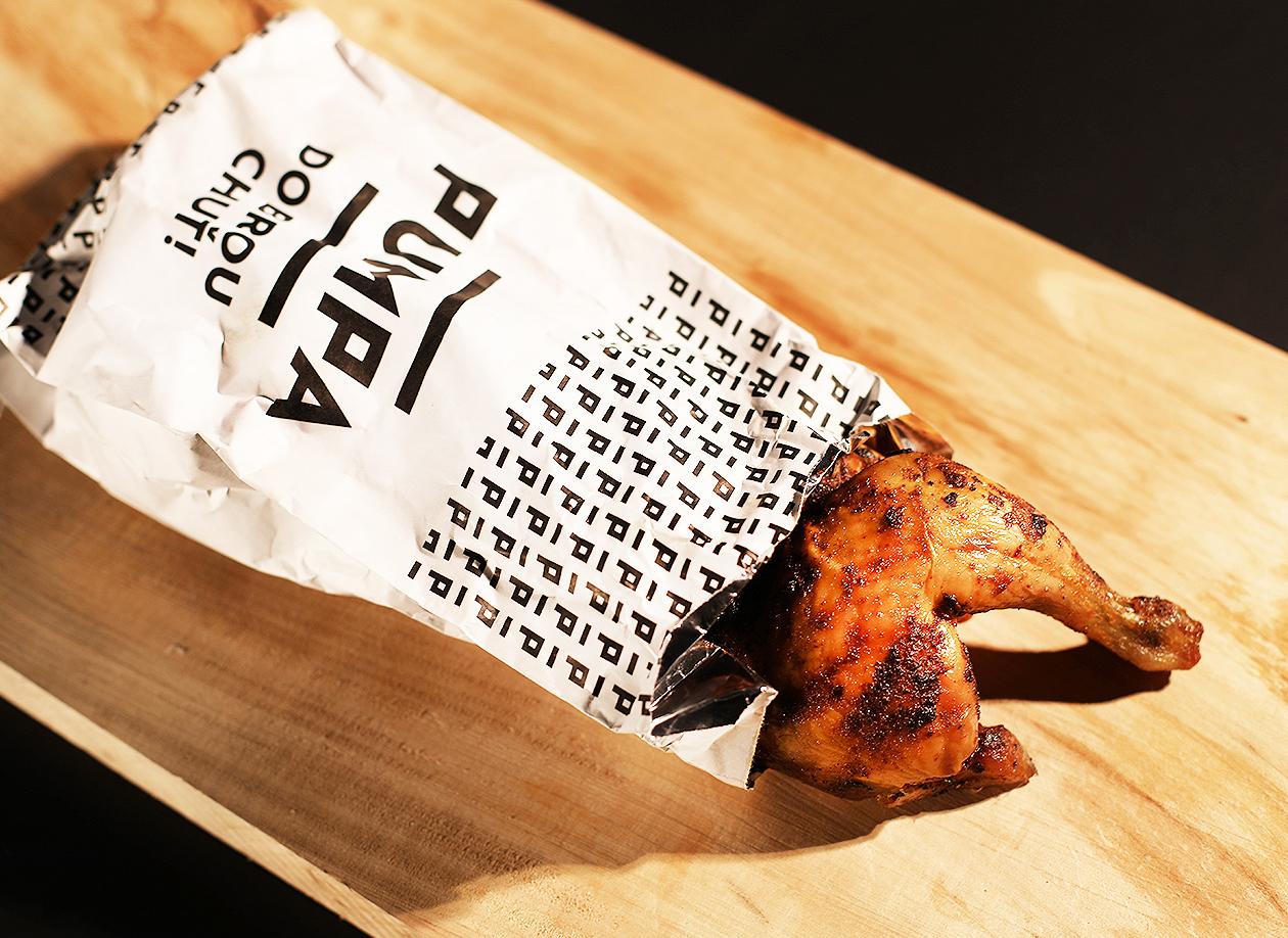
On the exit from Prague, you will finally be able to charge your Tesla in peace, throw in some roast chicken and fresh bread and head to the cottage on the 6km D1 near Pruhonice. The PUMPA concept is the first of its kind in the Czech Republic. It combines gastro with electric charging. The location of the project is a huge advantage. For a very long time, there was no facility at the exit of the city where one could quickly take any kind of food on the road. The only exception was a tucked away fast food outlet of an American chain.
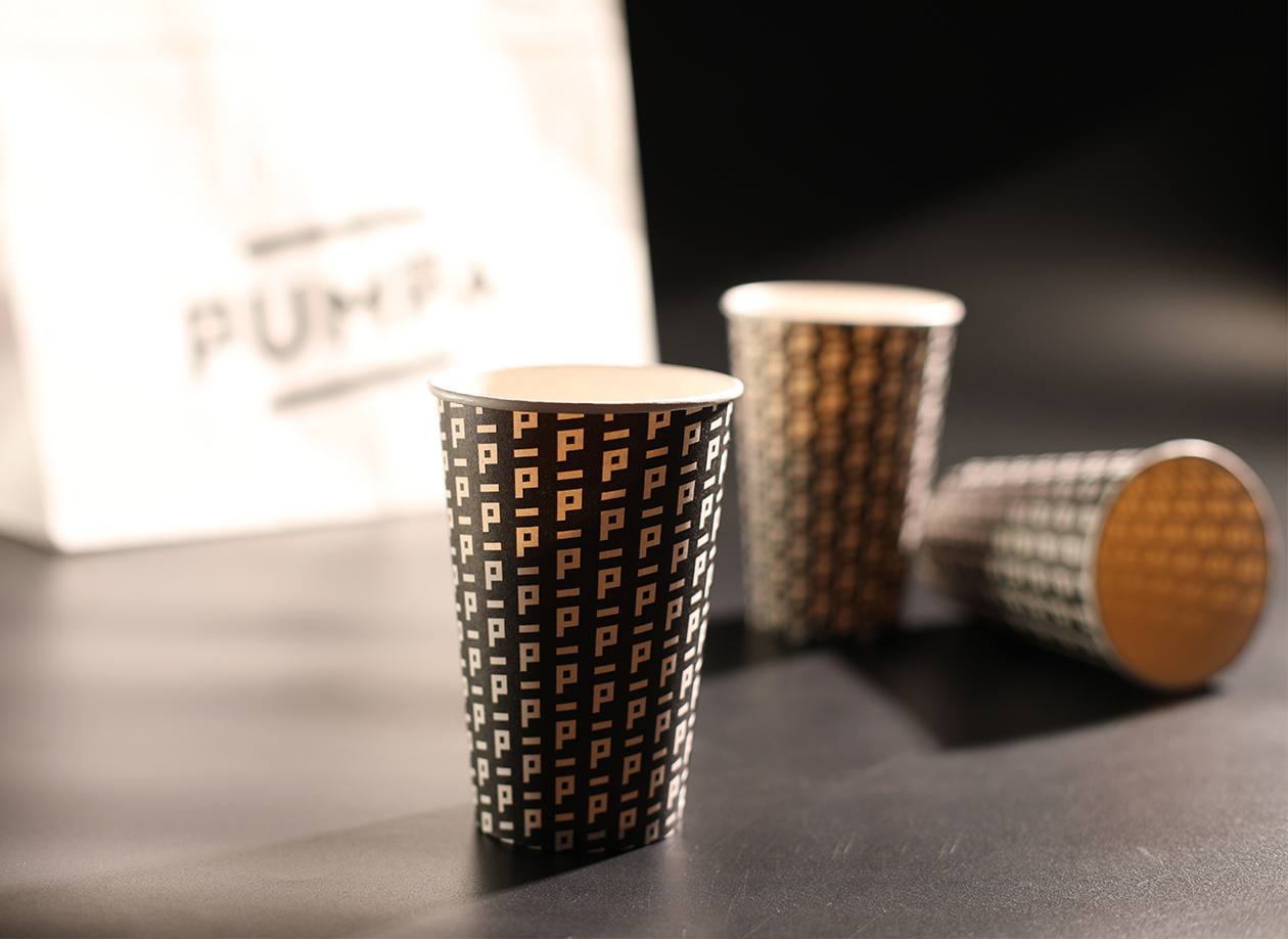
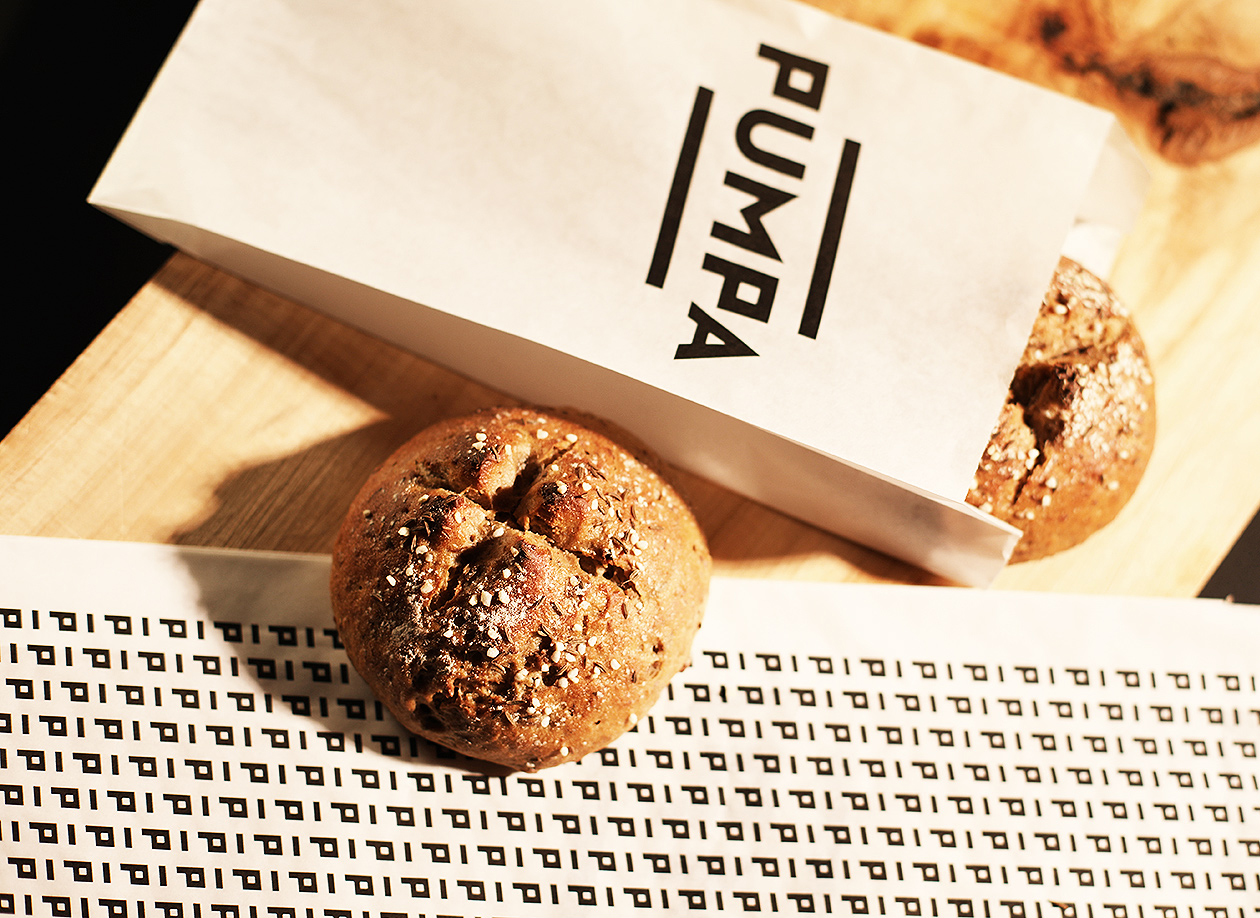
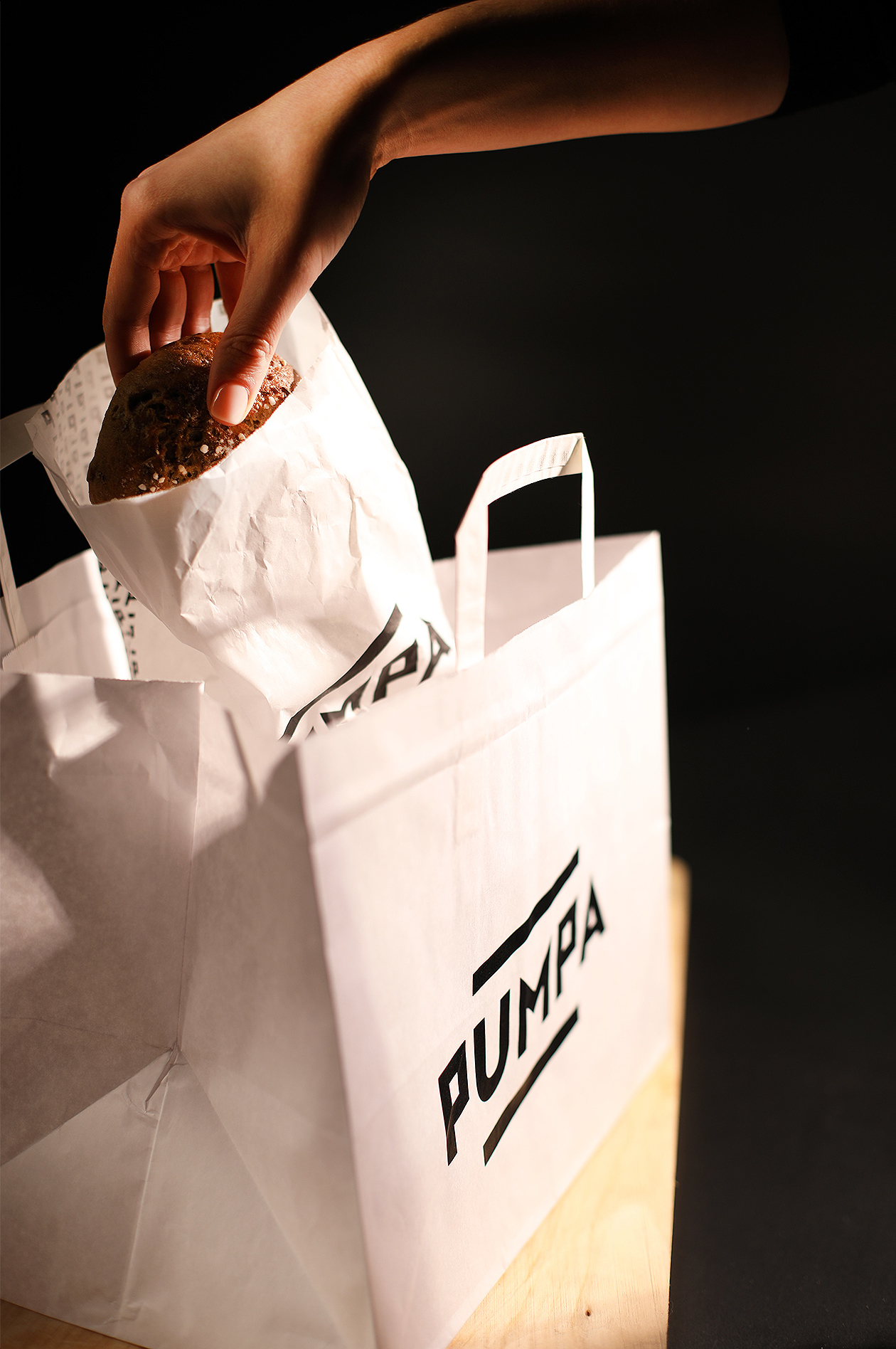
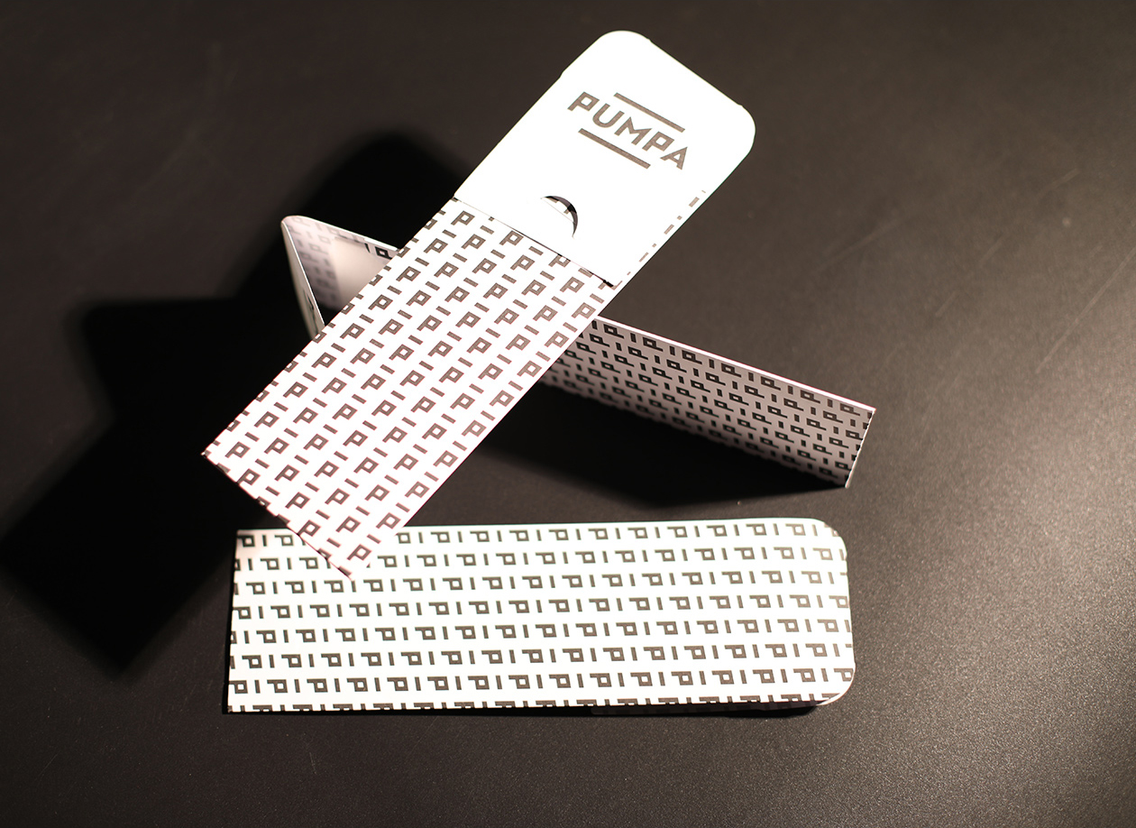
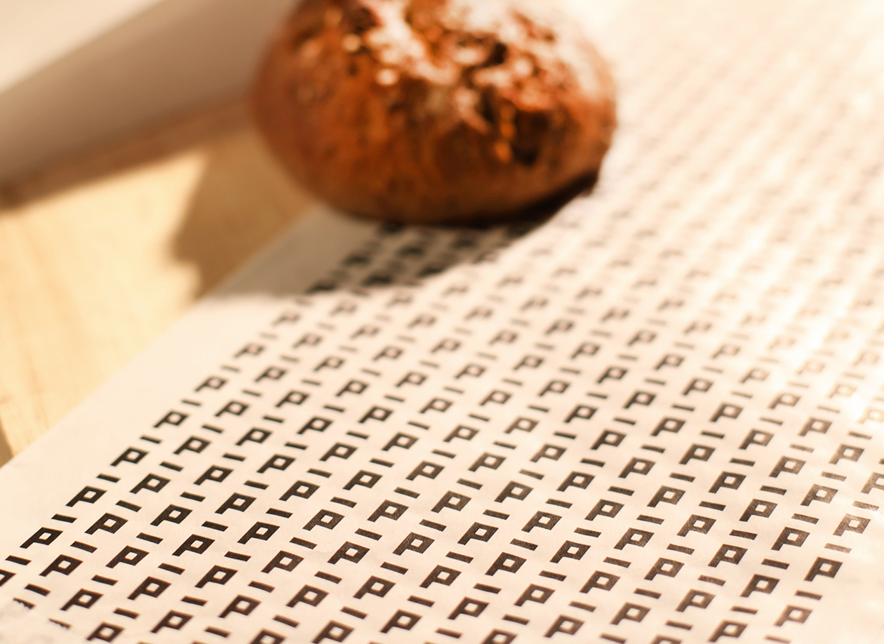
Our brief was to create a logo and visual identity for the whole concept. We were involved in its preparation for a long time and we are extremely happy with the result. The client chose a modern and confident approach. Part of the solution we delivered included securing suppliers for all packaging materials, from wrapping paper, paper bags and coffee cups. All packaging materials carried our distinctive project branding.
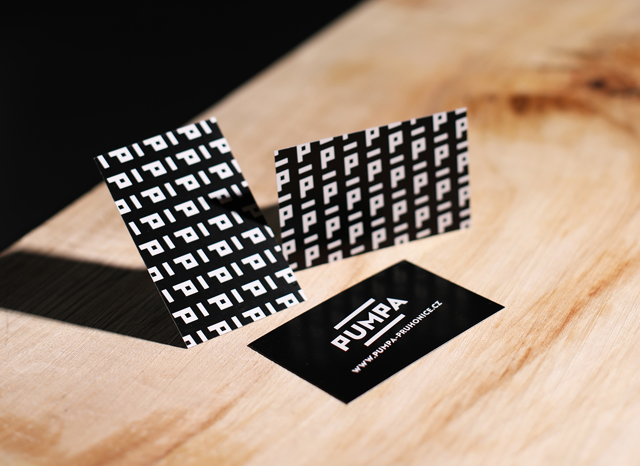
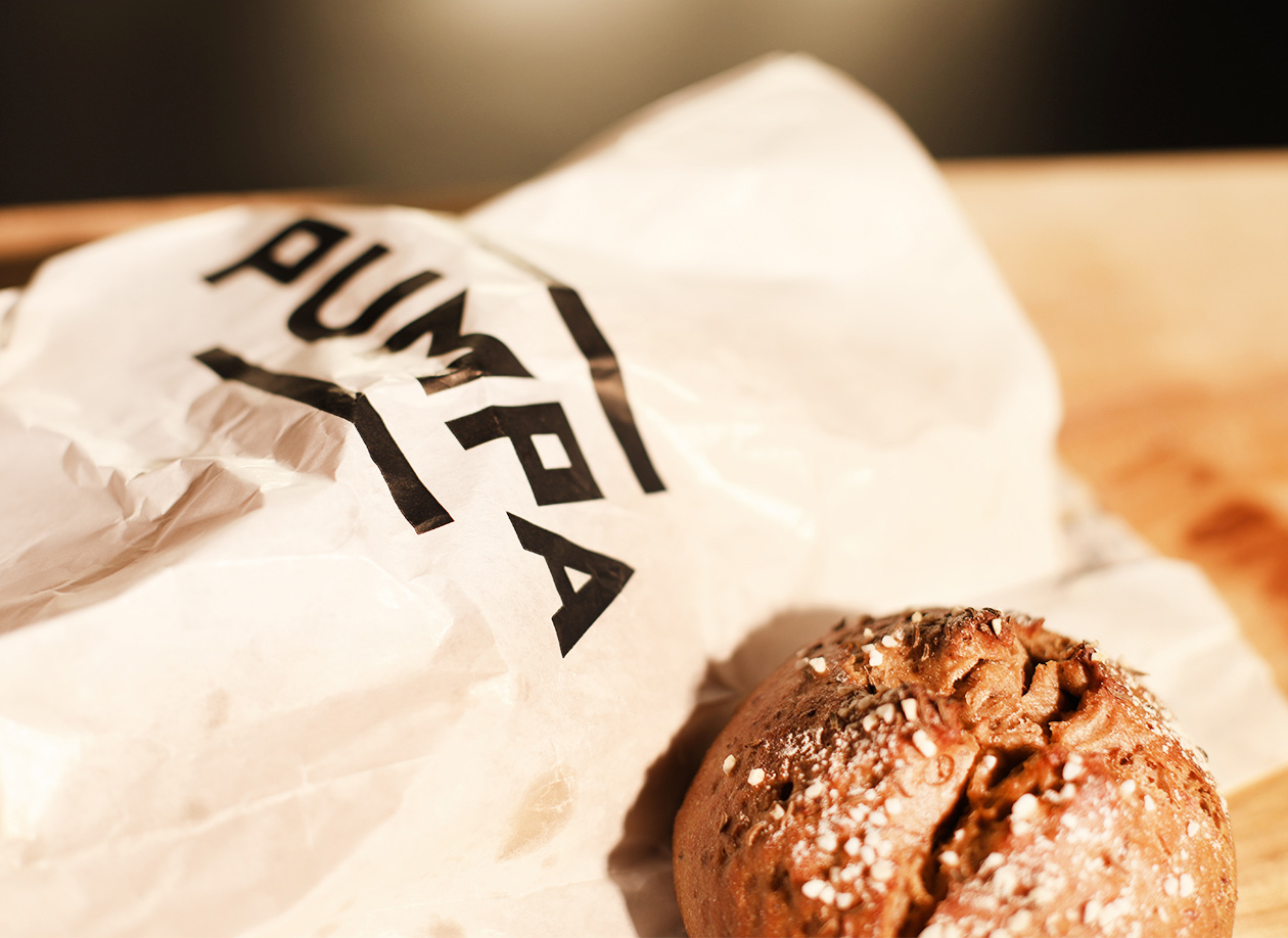
The visual identity is based on a distinctive typography and two parallel lines. The logo is deformed and rotated to create an impression of dynamism. After all, the whole project is designed for people on the move. The branding is later reduced to the iconic P symbol with truncated horizontal lines that complement each other and form an infinite pattern on larger surfaces.
