#breadway #byMAISON #fmcg #packaging #retail
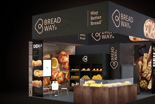
The success of packaging projects is often based on close collaboration with the printer and the overall consistency and quality of all the processes we have managed. Indeed, the journey of our crisp packaging started at displays and test prints, continued through the photo studio, the printer and ended up on the shelves of your favourite outlets and on your desk.
Breadway is a Czech bakery company that artfully combines honest tradition and modern technological processes. It is currently a supplier of frozen bakery products to the Czech pre-shops of the Lidl, Tesco and Kaufland chains, where the products are baked and sold fresh. Since 2019, they have also been supplying the outlets with ready-packed products, with the packaging de-signing of which they asked us to help them.
The complex packaging assignment kicked off a long-term cooperation
After previous collaboration, the client approached us with a packaging redesign for sliced breads. Having experienced the specific requirements and technological limits of printing from past collaborations, we knew that the work on the new packaging didn’t just stop at a pretty and functional design. In order to achieve the client’s and our absolute satisfaction, we managed this complex packaging job from graphic design through photography, DTP preparation to supervision and debugging directly at the printer. This is how a long and intensive cooperation with the Breadway brand was established.
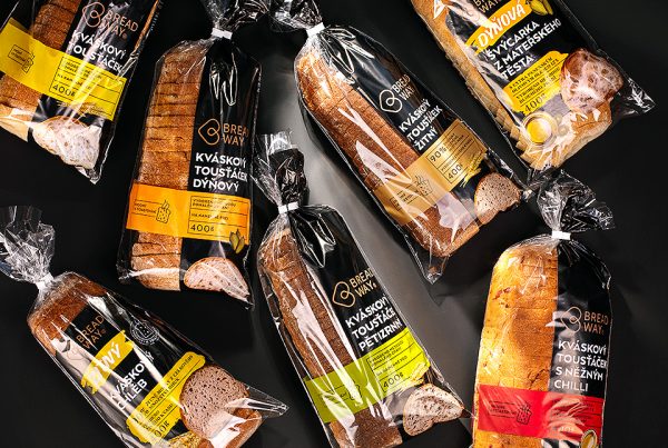
The task was to create new packaging for all products in variants specifically for Lidl and Kaufland. The requirement, which determined the direction of the entire design process, was that the larger area of the packaging had to remain transparent. With regard to the material and type of printing, flexo printing was the obvious choice.
What we had to decipher before the first design
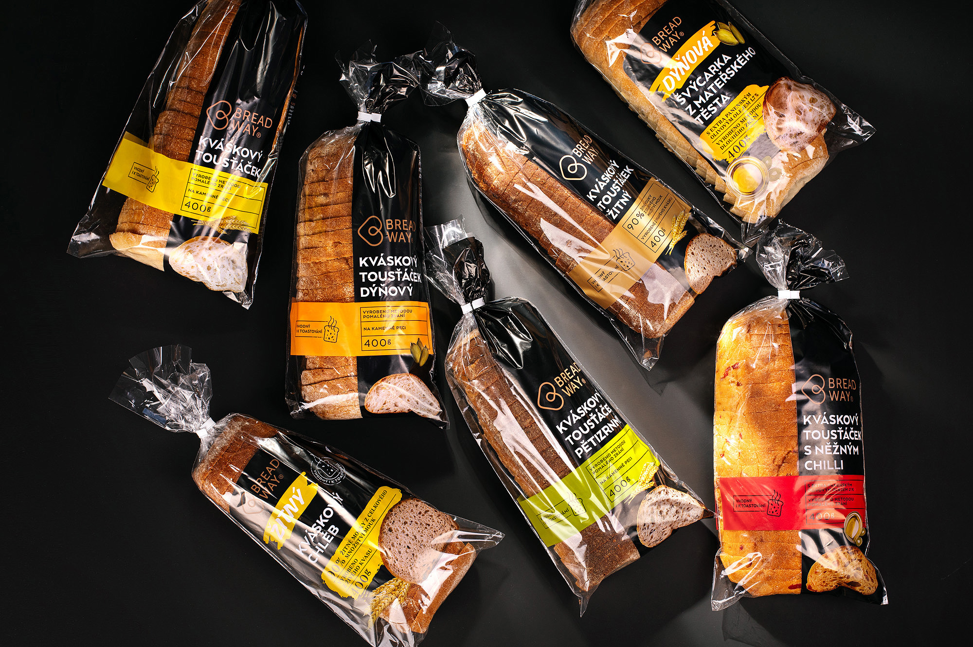
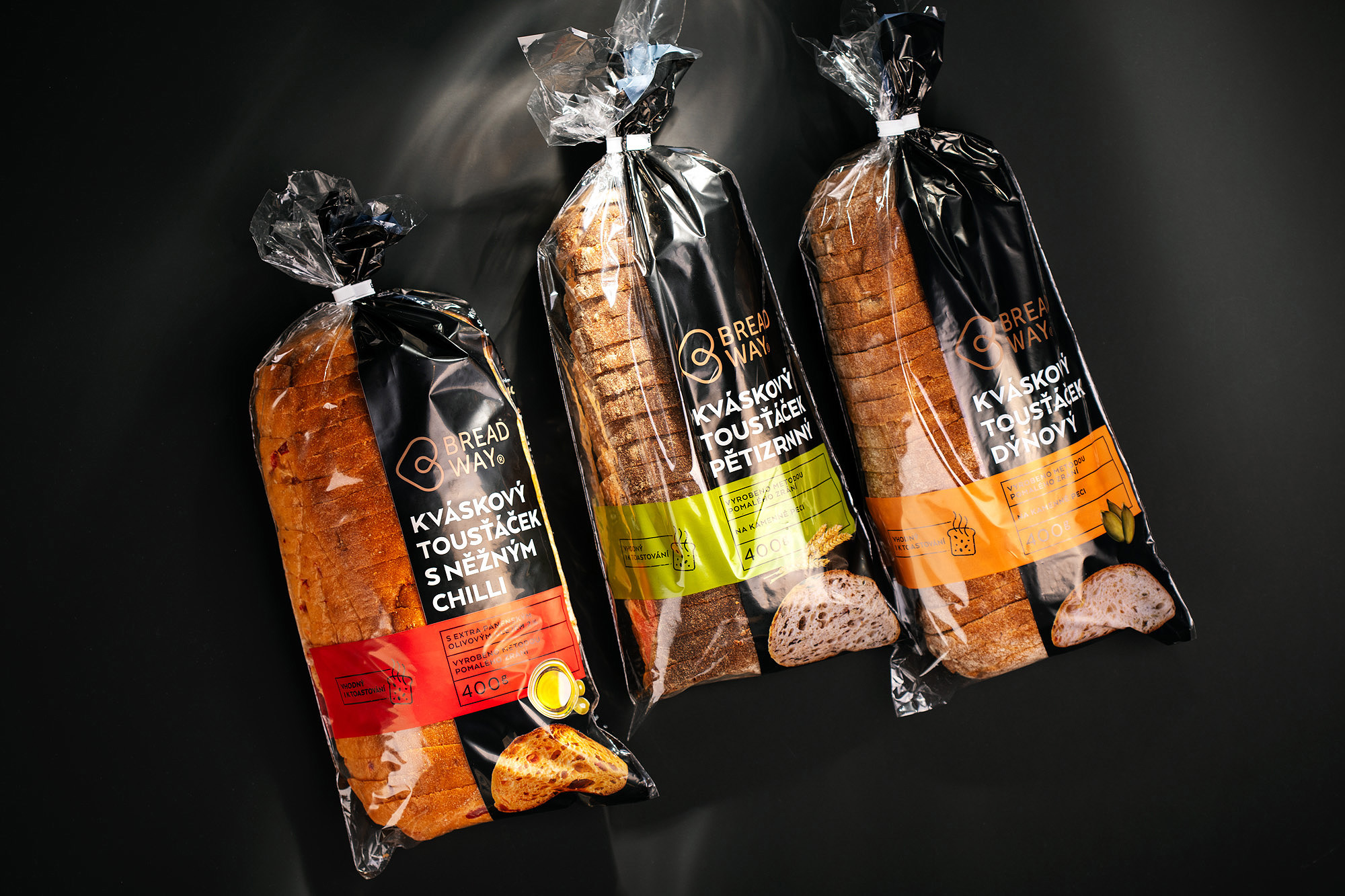
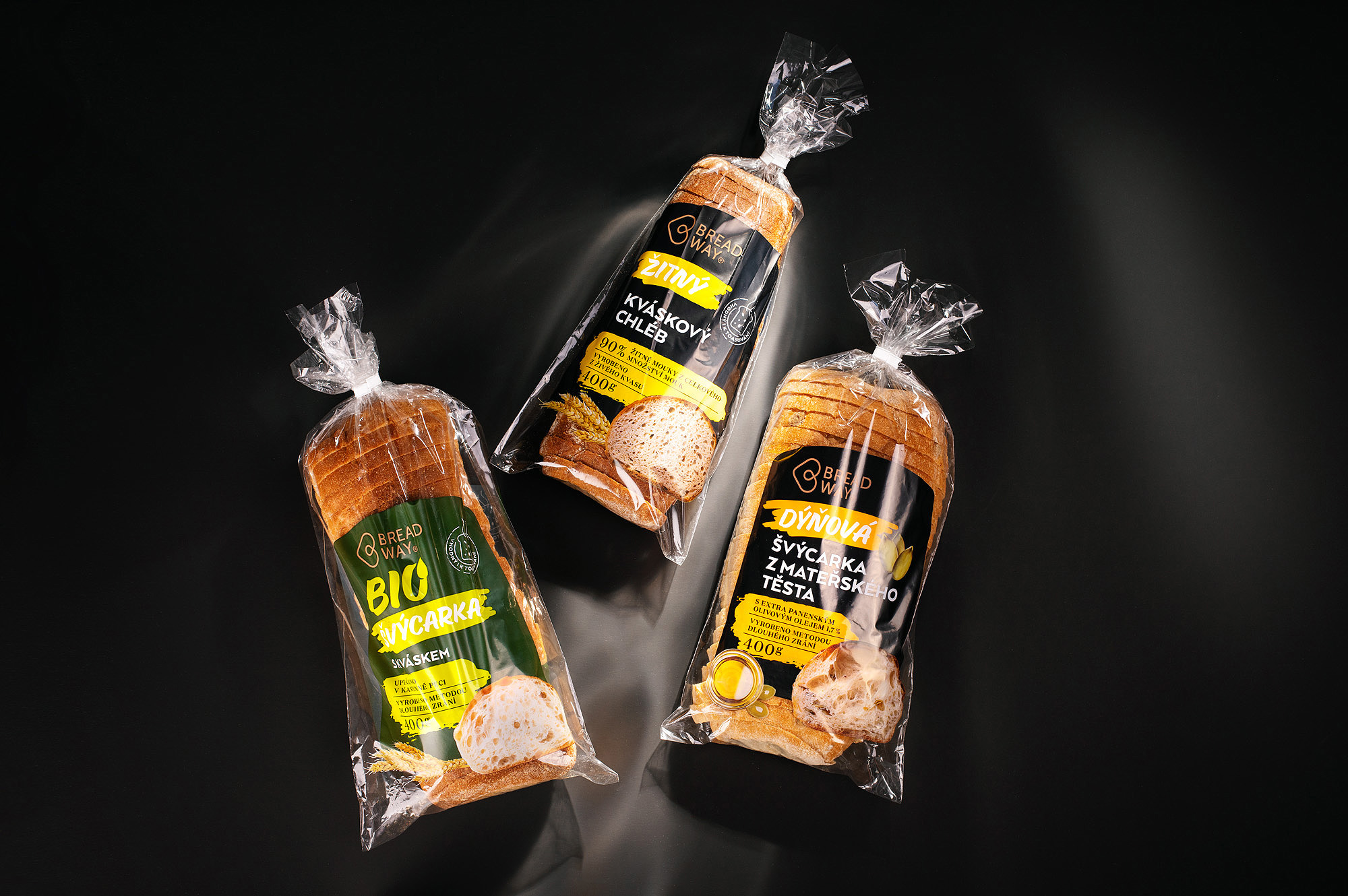
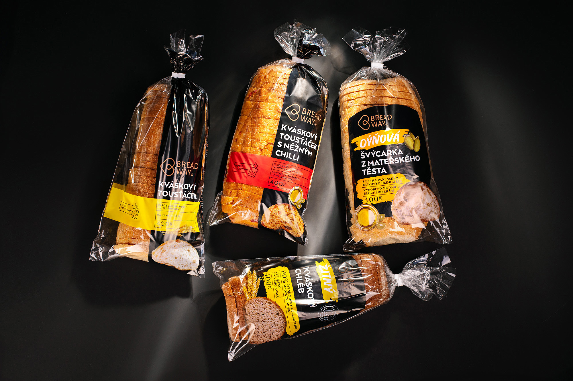
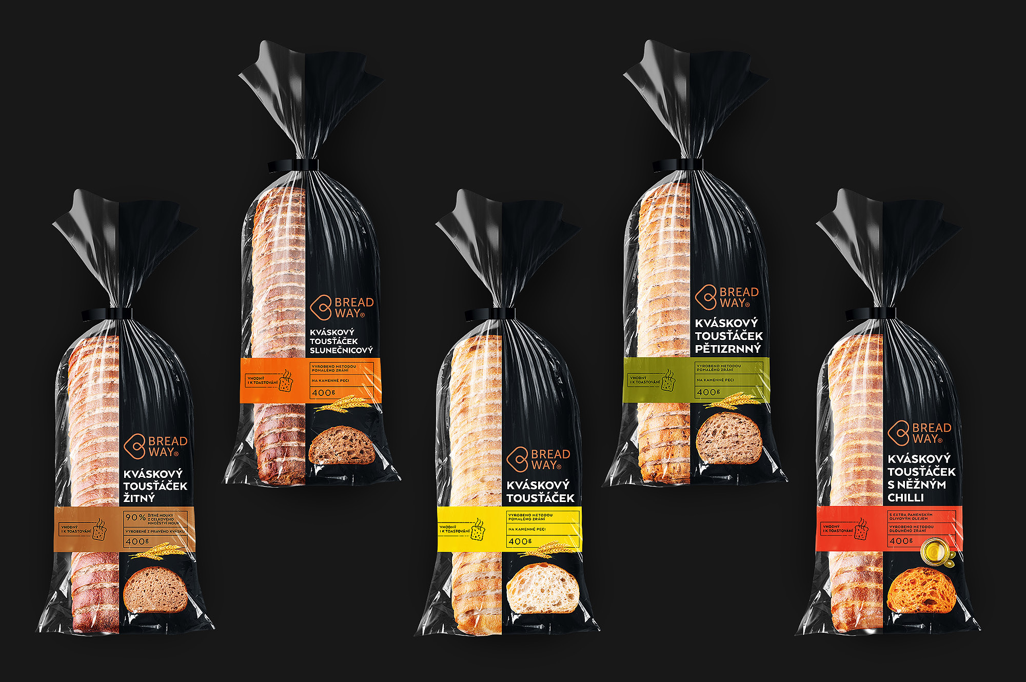
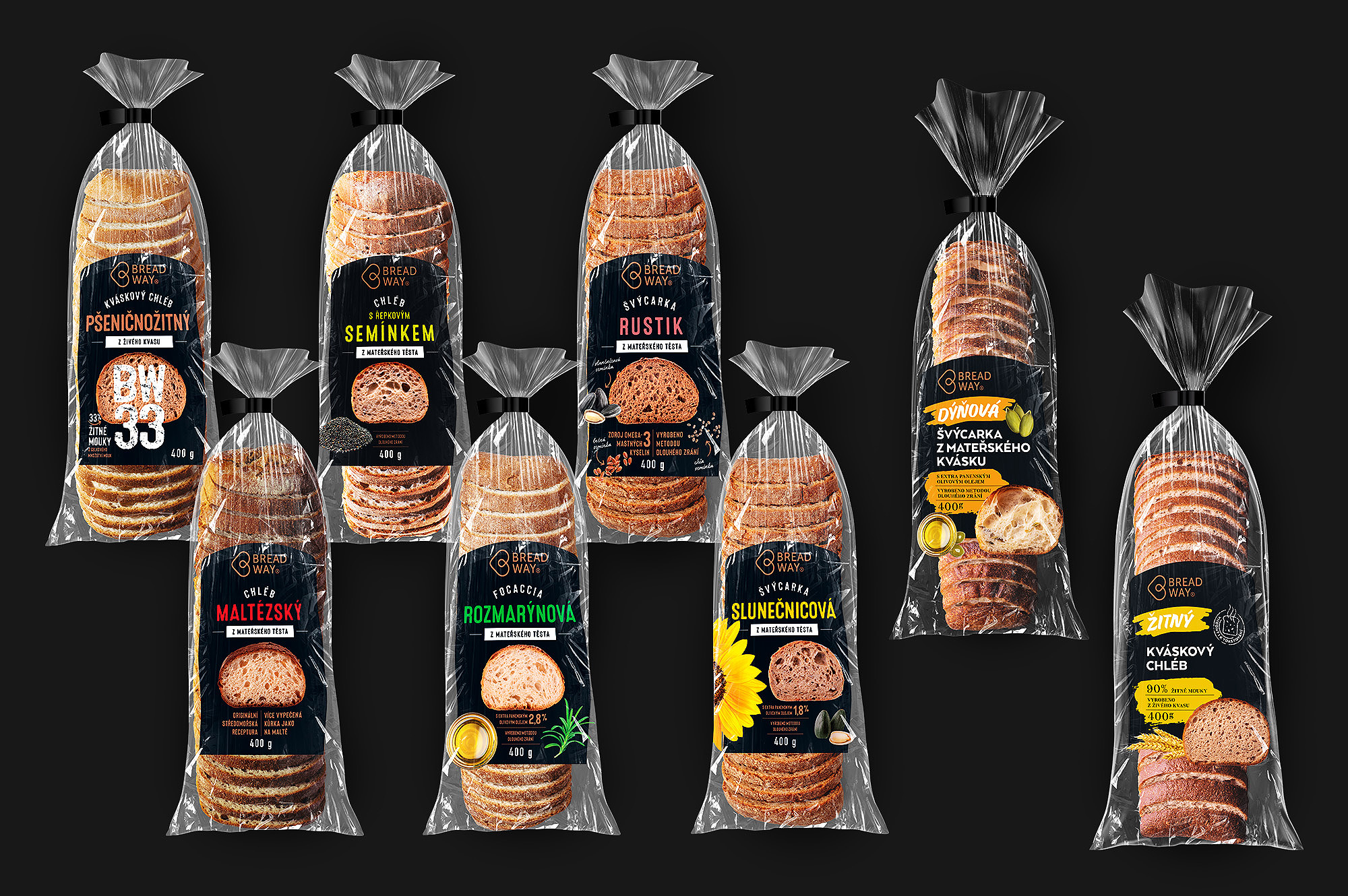
Prior to the redesign, the packaging for Kaufland was vertically split into a clear and a printed section, which caused problems in the print shop with uneven winding of the packaging on the roll and subsequent deformation. This problem was solved by applying varnish to the uncoated part to even out the thickness of the packaging surface. The redesign solved this problem by inserting a horizontal strip across the entire width of the packaging, which carries the colour code of the product and also compensates for the difference in height between the printed and clear material to avoid errors in printing. In the case of the adaptation of the design for Lidl, aware of the limitations, we went a completely different route and the dominant feature of the packaging is a shield set in the centre.
As we redesigned all the packaging, we had a freer hand in creating the function and role of the packaging in detail, but also in the context of the whole range. Products vary in width or height, so we needed to place graphic elements on the same level everywhere to unify the product line on the shelf, in the catalogue or on the web.
Our versatility as added value
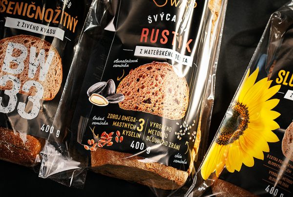
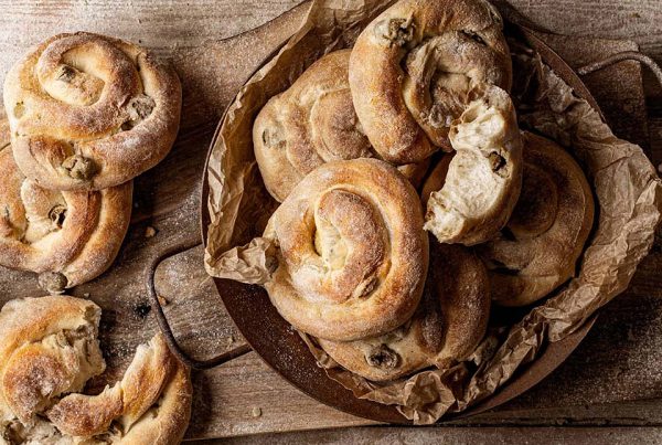
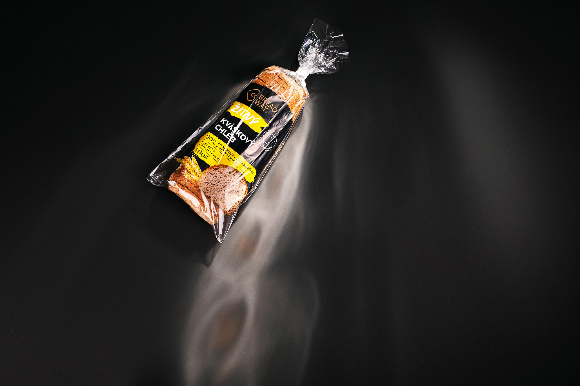
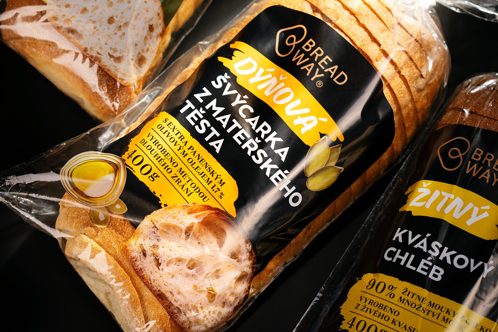
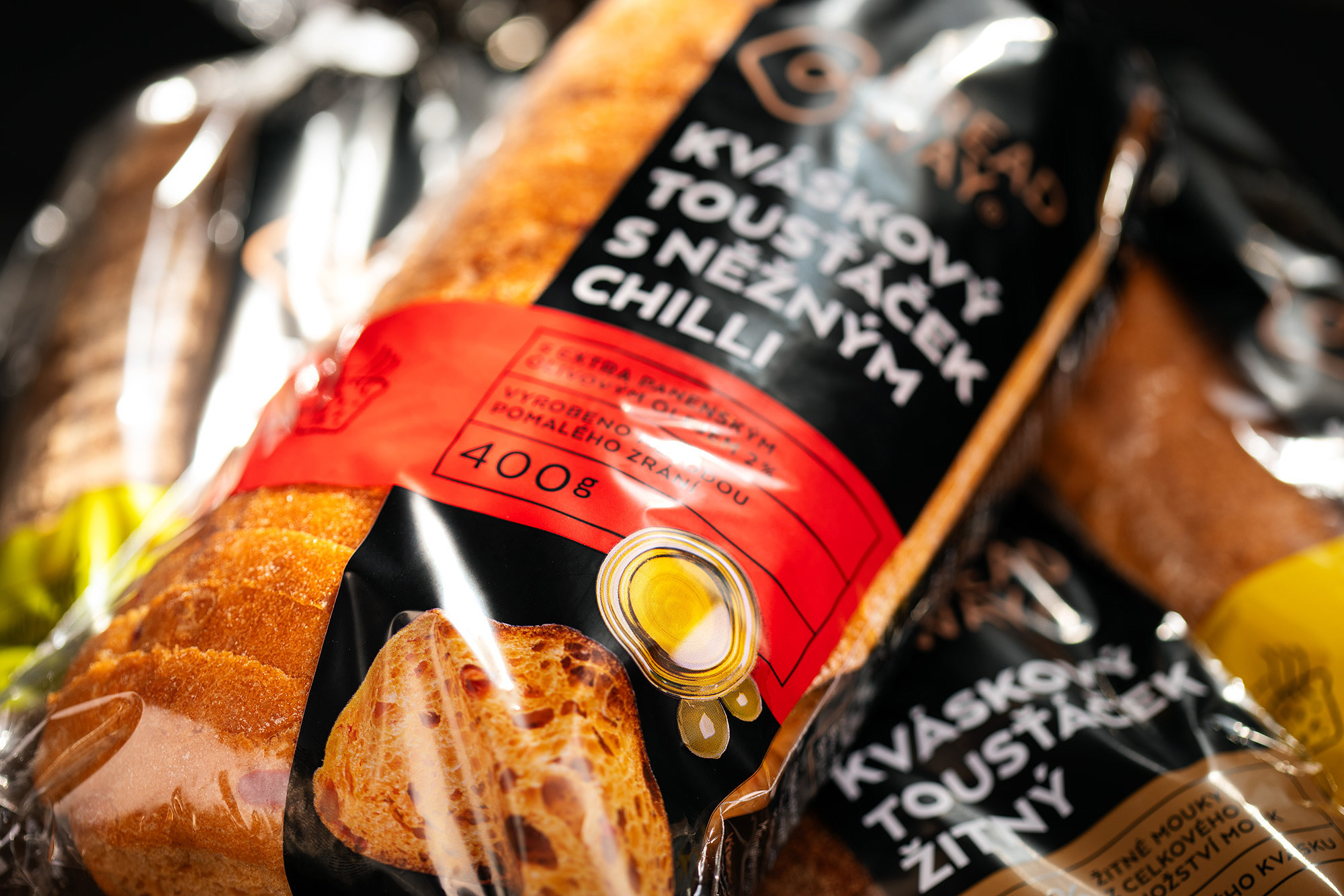
As part of the packaging design, we also created the product photos in-house, these were part of the packaging design as per the brief. Not only that, the photos are still used today in the company’s internal presentations, on the web or in catalogues. On this occasion, we also created image shots, which the company also used.
After each major step, we created test mock-ups, on which we tried to fine-tune the content and composition part of the design. We had to reckon with the deformations of the cover and think about the visibility of the different elements and the logo. Throughout the entire duration of this packaging job, we regularly consulted with our print data specialist and the printer, which we jointly chose with the client. We thus eliminated shortcomings and knew what limits the printing technology, material or inks presented.
We fine-tuned it in print
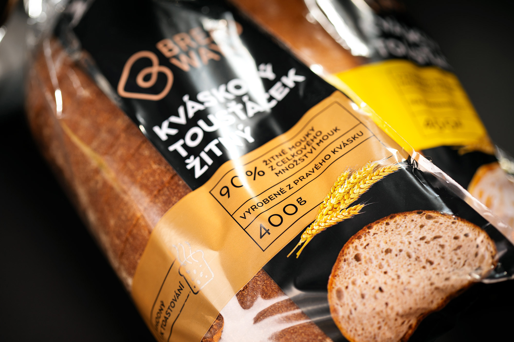
In printing, we used the maximum number of colors that flexo printing technology allows. The primary colour of the packaging is black, we had to create this by double-coating the ink to achieve a perfect deep black. Since we were printing on transparent material, it was obviously necessary to underprint the entire graphic in white as well.
The client wanted to make sure that the project would be completed successfully with the final production of the cover at the printer. Even the best graphic packaging design can fail at this stage. Breadway therefore entrusted us with expert print supervision. We thus handed over the finished packaging to the customer as a result of our comprehensive and extensive work. The client’s investment in the last stage of the process was returned to him in the form of 100% satisfaction with the final result.
Such a comprehensive and long-term packaging cooperation makes both us and the client happy, because we can guarantee the jointly intended result. The client is satisfied with the efficiency, quality and consistency of the processes that we solve for him. As the supplier who manages and oversees the entire process, we are satisfied that we can be absolutely identified with the outcome for which we are responsible.
