Wow it is raw, dried, healthy and bio again! I guess we are going to live forever with these stuff. Being enthusiastic about healthy products is not just a pose, we are genuinely high on fiber and vitamins. We believe that replacing bad habits of crunching on fat high carb potato chips with something healthier and even more delicious can save your life. Enough with praising, let’s talk about the packaging design.
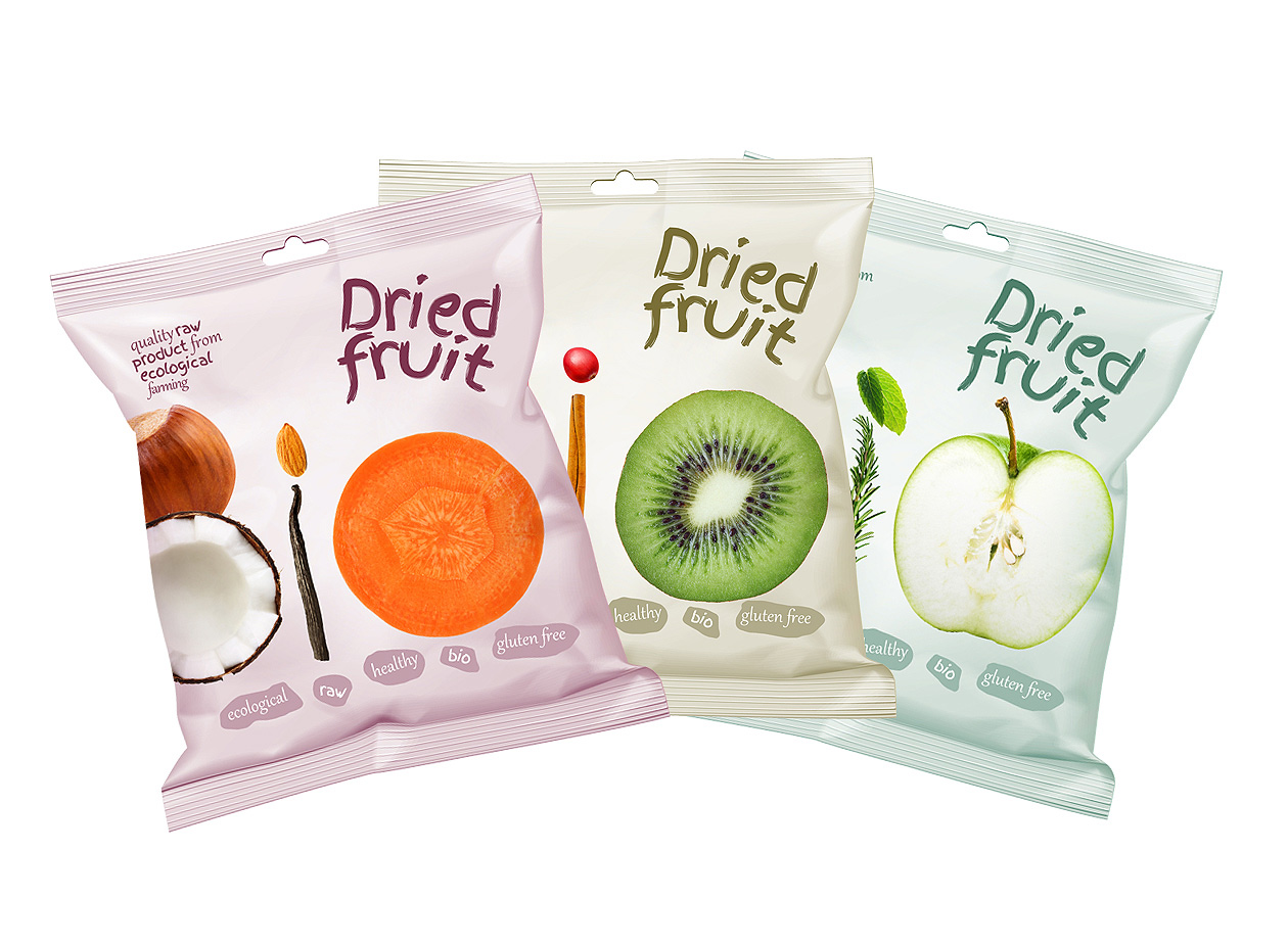
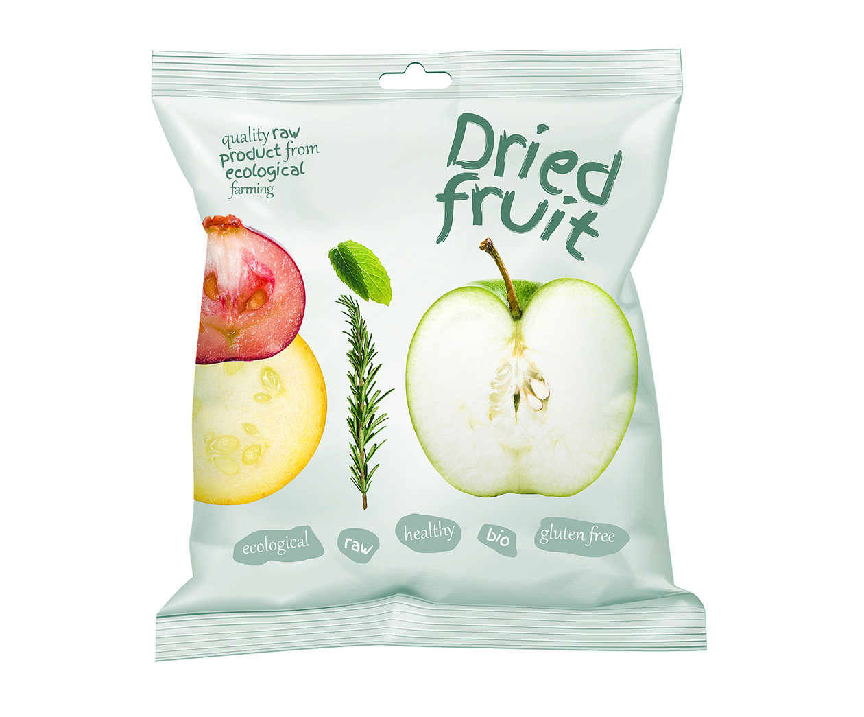
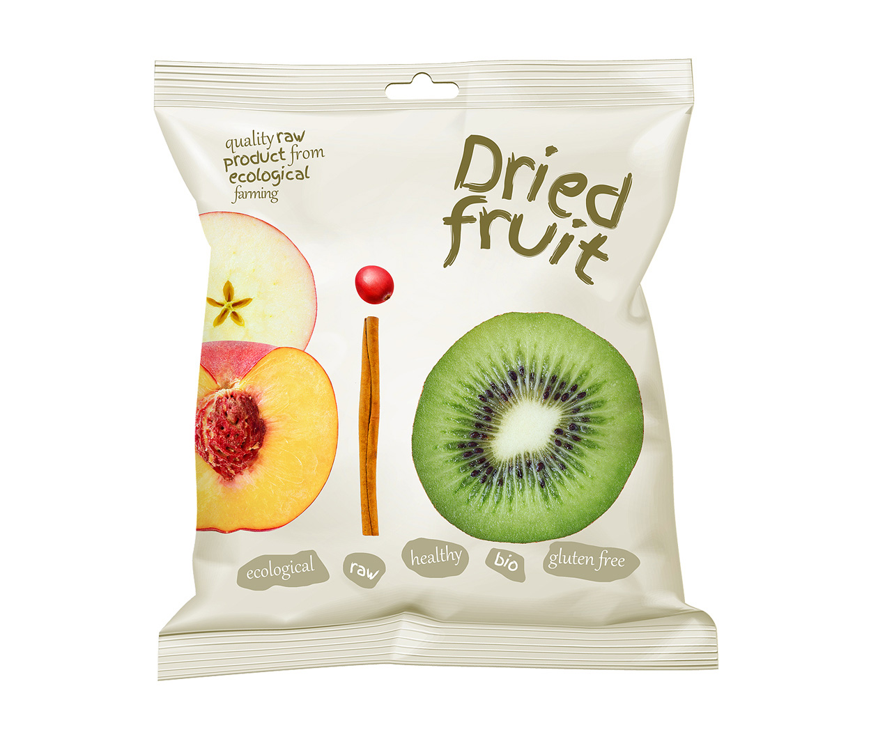
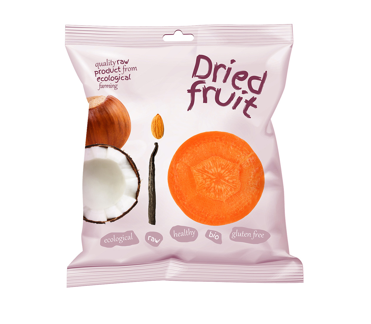
For this product we have decided to use the very components of it to display a subtle sign Bio, which is maybe less obvious when holding a single pack, but upon sight at the display with all of them being stocked nicely one next to each other, one comes to a sudden realization of the hidden message.
This packaging design works with three direct colors plus CMYK for bitmaps and it worked just perfectly well. Typography is playful and additional information about the product qualities is subtly place on the bottom of the packaging in small irregularly shaped frames. The producer decided to go brand-less on this product, simply with the generic dried fruit sign. The strategy played well. Selling at health friendly eco shops, people are set differently to marketing and branding and do not necessarily search for brands, yet rather products itself. The producer’s brand is of course displayed at the back of the packaging with all the additional information. We hope you like it, stay healthy and eat raw.


Project name: Dried Fruit Bio Raw Packaging Design
Art Director: Martin Kuspal
Agency: MAISON D’IDÉE
Design year: 2015