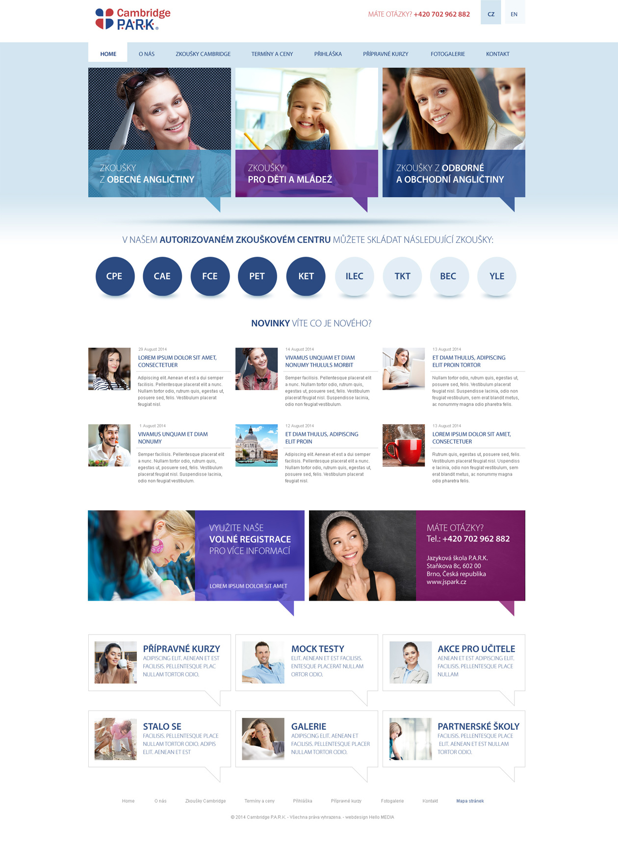
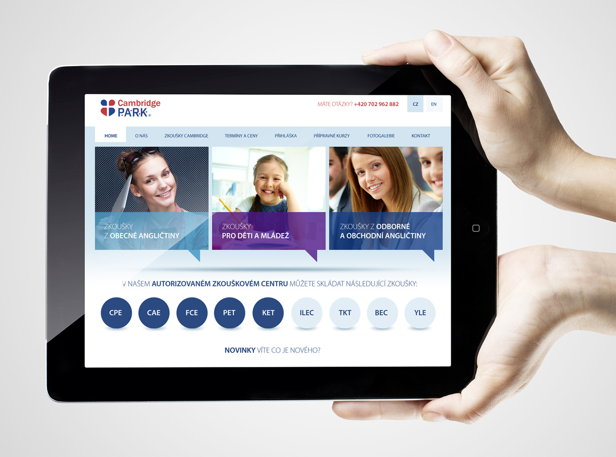
Webdesign for the Language School.
Wireframes and accurate background preparation.
We started the web design for the language school by thoroughly preparing the documents in collaboration with the client. Our clear vision for the overall composition of the design and visual style was well received by the client from the beginning. For this web design, we decided to immediately include some subtle but interactive graphics on the homepage. The navigation solution links the action on mouseover to the basic selection elements placed in rectangles to highlight the circular elements, which are divided into three basic categories. The website visitor thus subconsciously perceives the colourful layout of individual courses, which ties in with the deeper logic of the project’s overall visual communication.
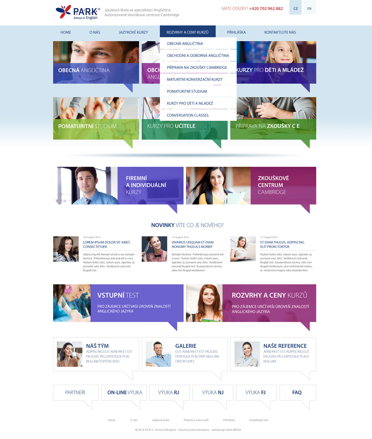
The division resulting from the need to separate target groups.
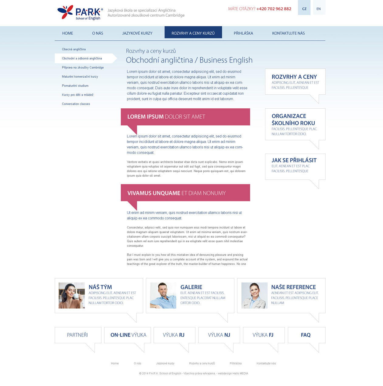
For our client, we implemented two websites, each in different languages. Of course, we implemented a comprehensive content management system that allows the client to update the website content at any time.
What was new was the adaptation of the display functions in the CMS for structured content. These allow certain parts of the content to be collapsed and expanded again into clear blocks in the project images.
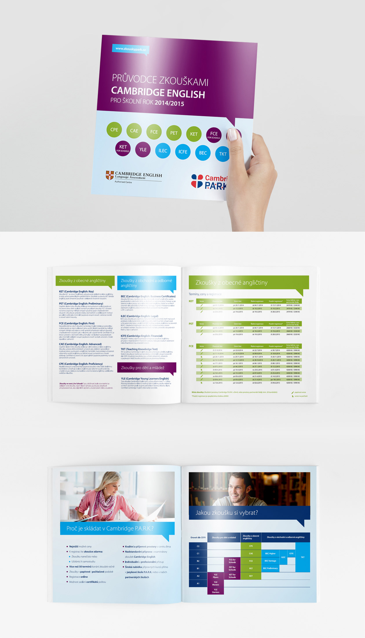
Redesign of presentation materials.
The project included the development of a design manual and printed materials for the language school and examination centre, as well as printing and transporting them.
