#branding #futu #insect
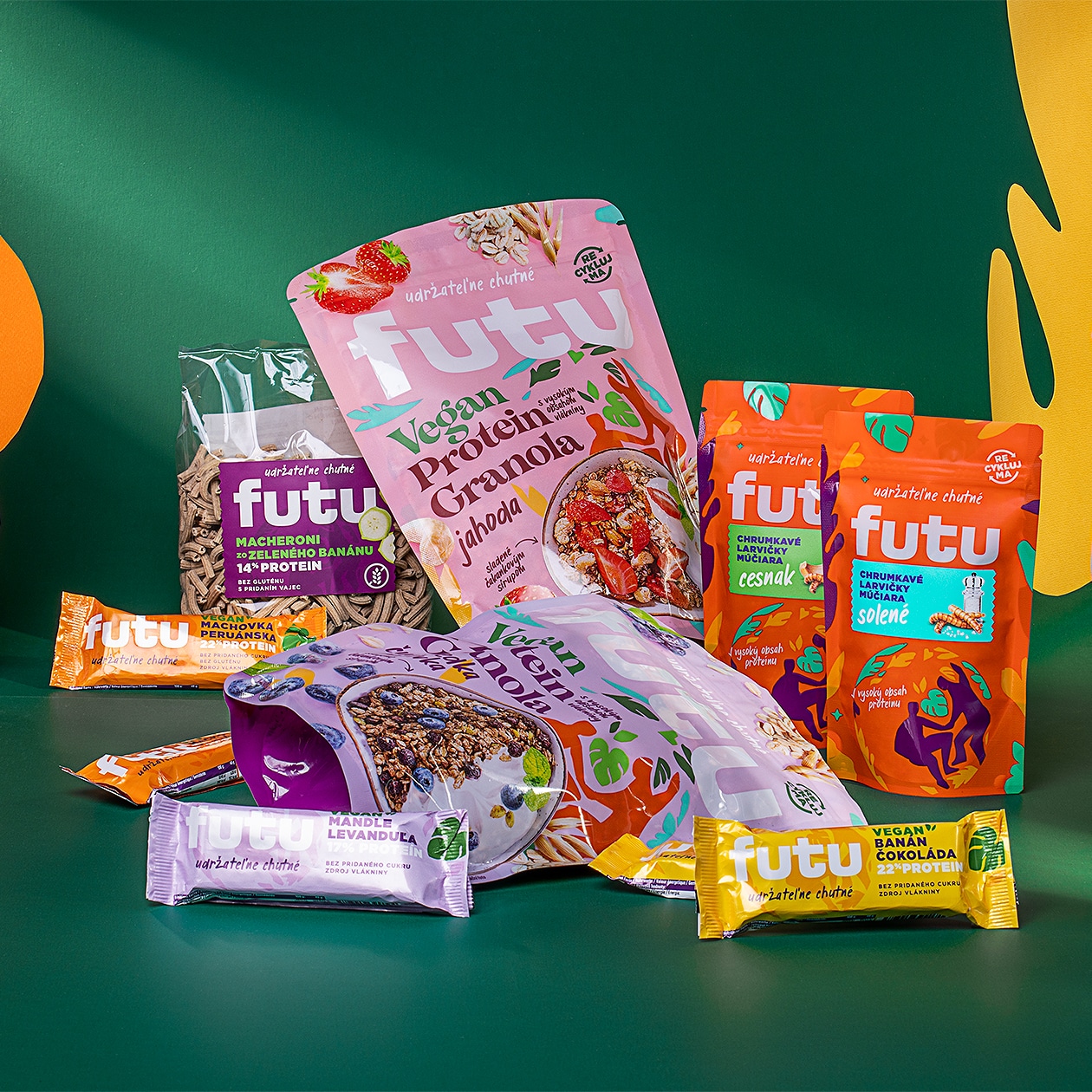
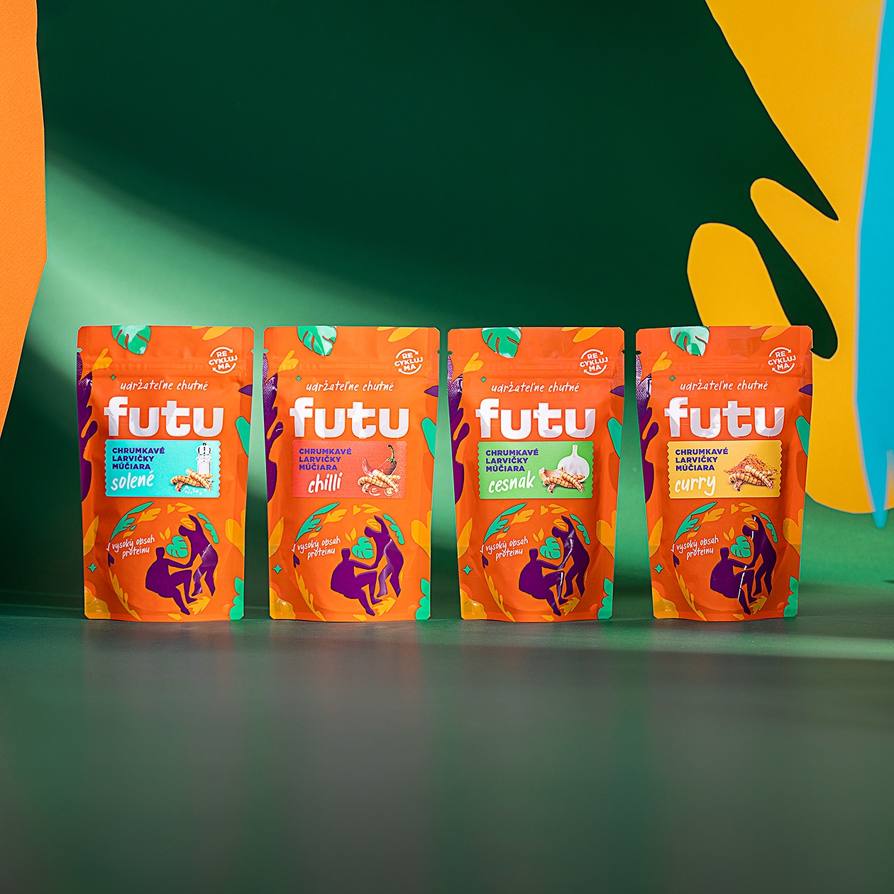
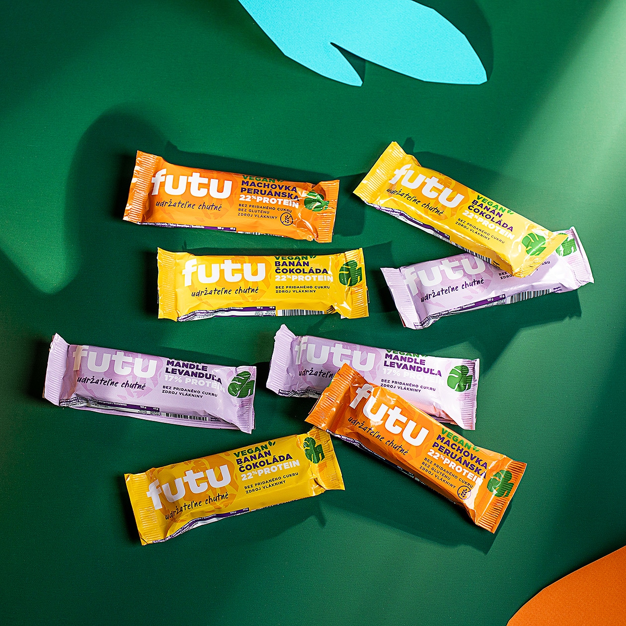
The FUTU brand represents a glimpse into the future of food. Healthy, modern, nutritious and sustainable. This Slovak start-up has ventured into the production of edible insects. Its portfolio includes flavoured Tenebrio molitor larvae. They contain a high proportion of unsaturated fatty acids and protein and their farming and processing does not pollute the environment, unlike cattle or poultry farming. They are therefore an ideal source of protein for a sustainable future.
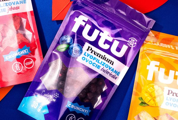
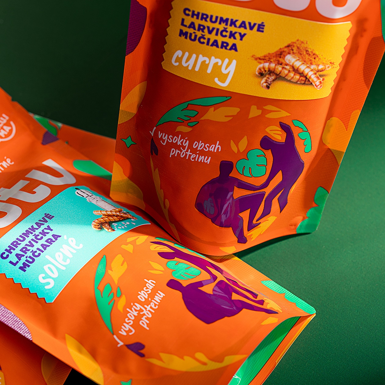
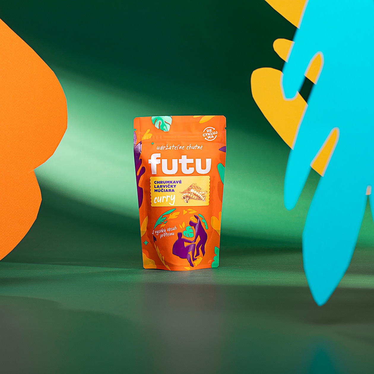
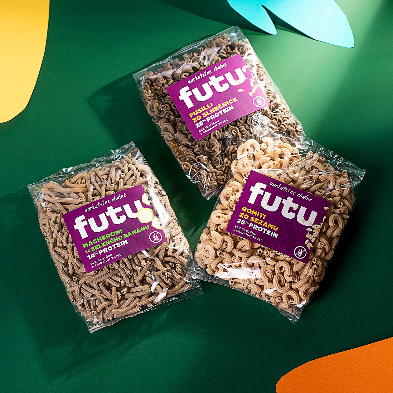
We decided to develop the theme of sustainability and harmony with the planet by depicting the Earth with lilies and plants instead of continents. This element has become the supporting visual element of the entire brand. The logo is contrastingly built on a modern simple font. Contrary to current trends in packaging design, we decided to use an oversized logo, almost always in white – representing purity and innocence. The background for the logo is a range of colours defining the visual identity of the project.
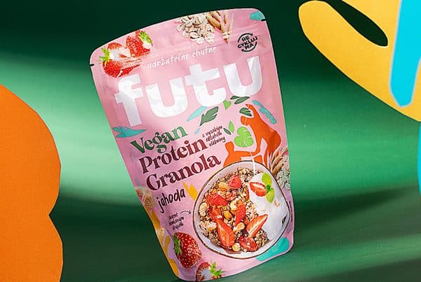
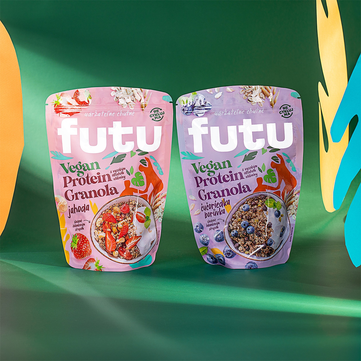
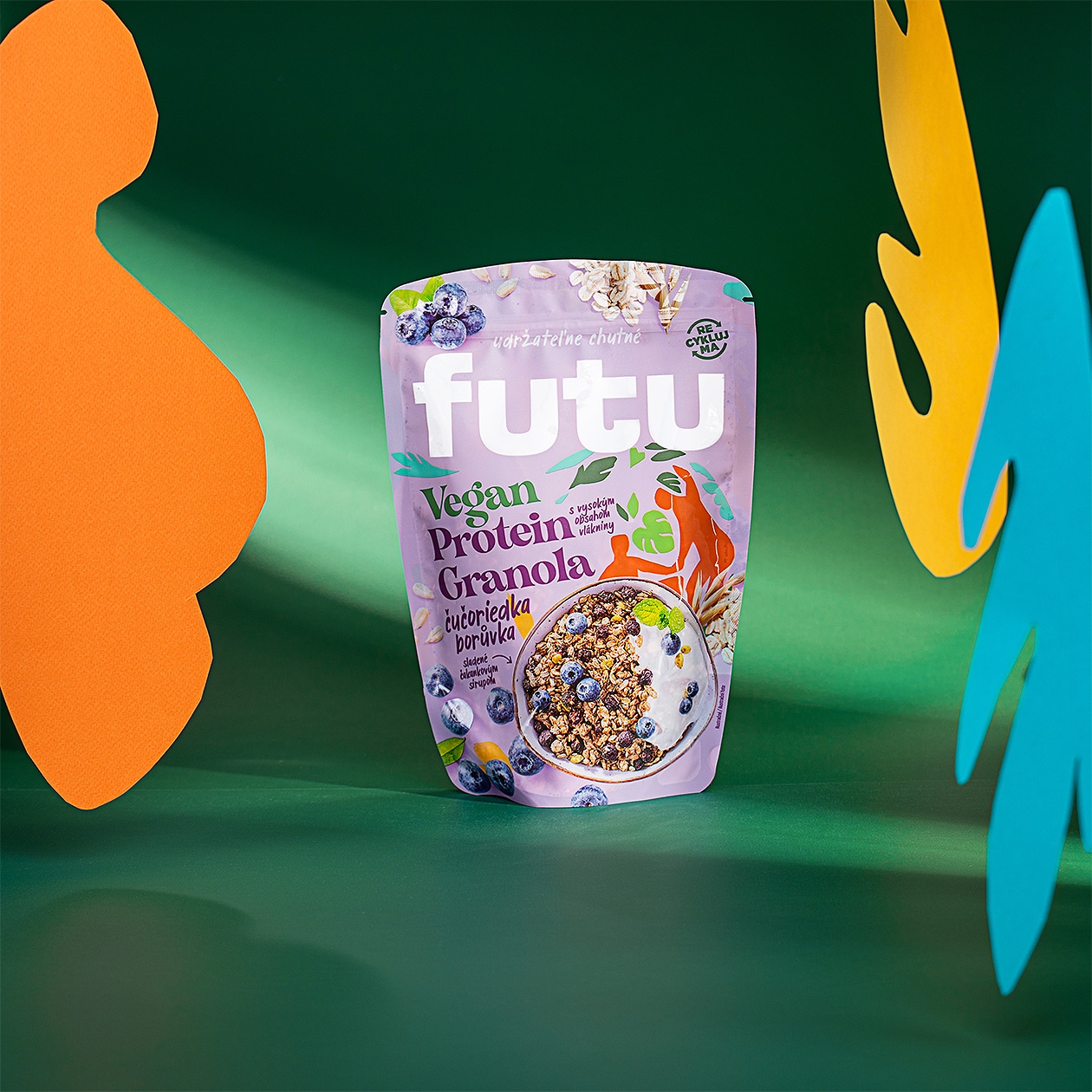
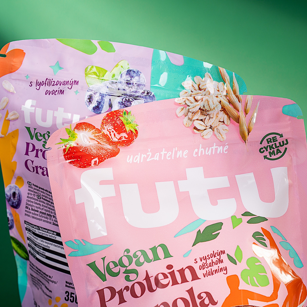
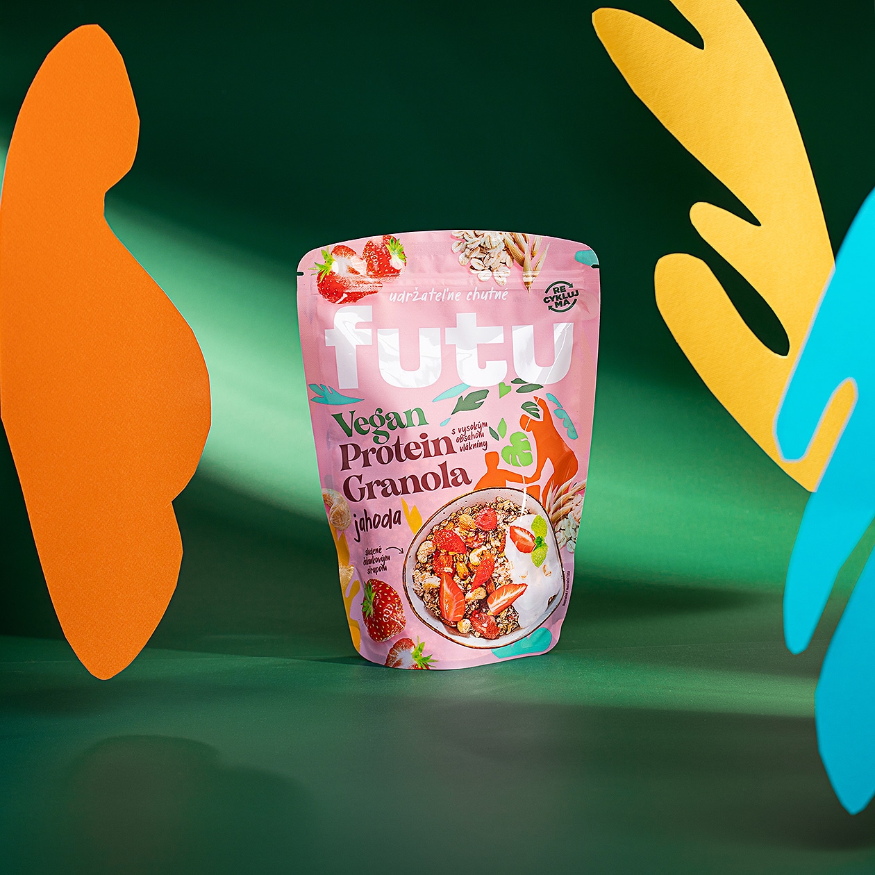
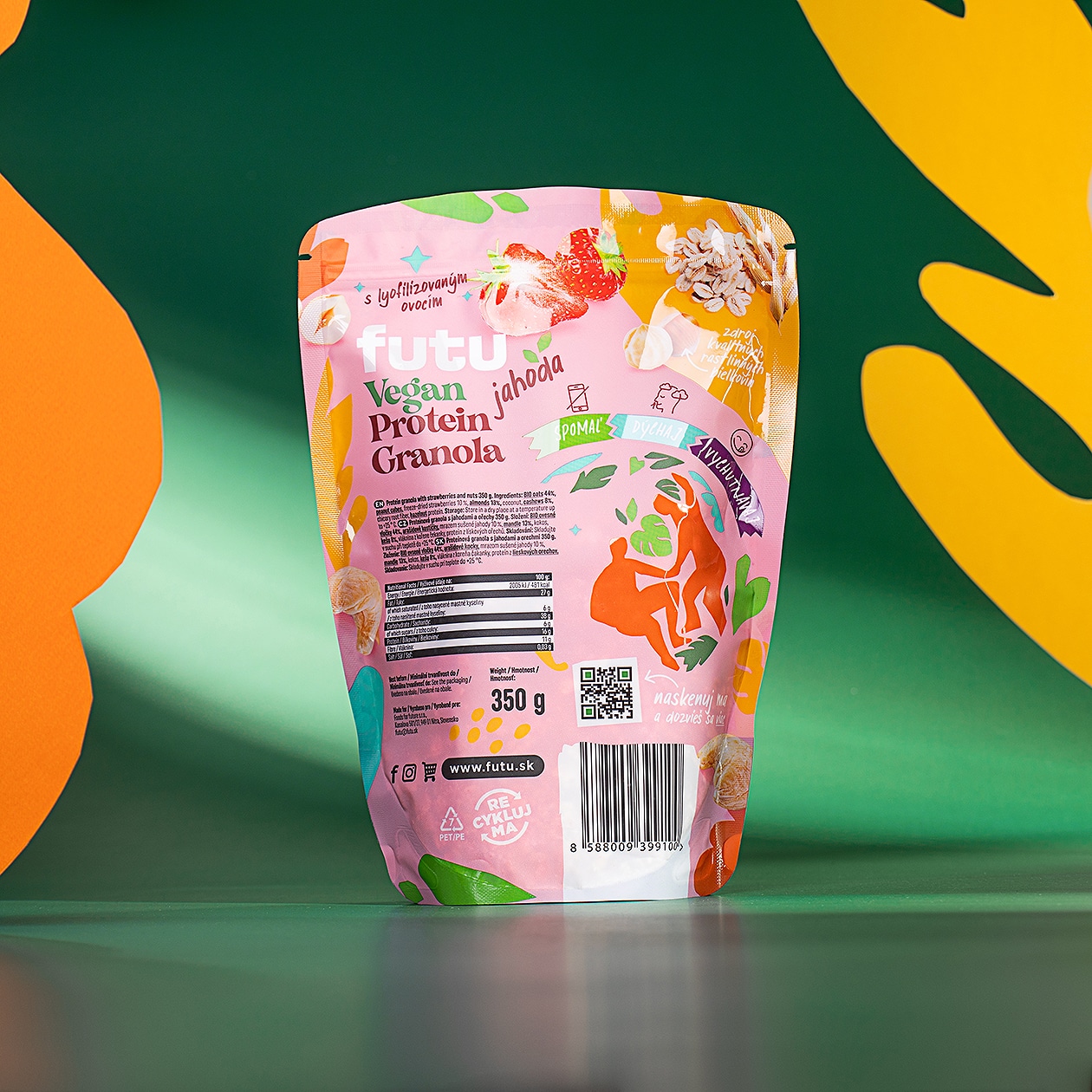
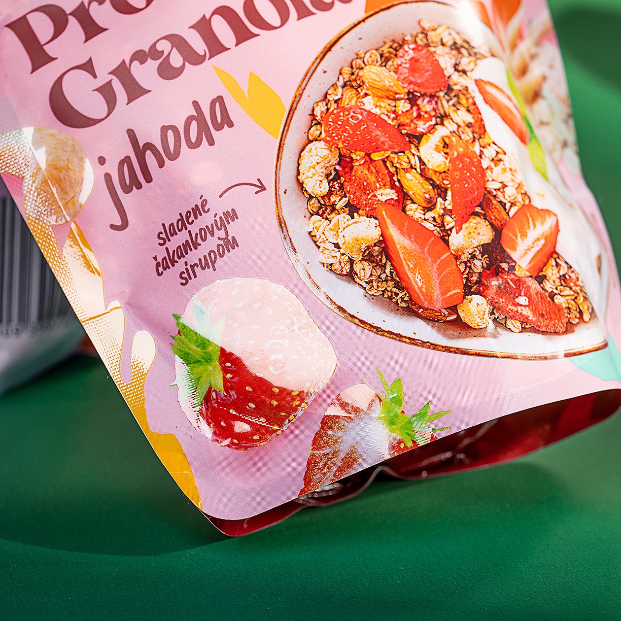
In addition to edible insects, the brand also produces its own granola made from vegan plant proteins. For the granola doypacks, we chose an atypical rounded shape to make the product stand out on the counter. The packaging combines the use of photography and foodstyling, which we completely created in our own photo studio for the packaging.
The product portfolio under this brand is still expanding, but granola and insects are among the main products of this small manufacturer.
