Butchery logo and branding
Every man should know the name of his butcher. We can fully agree with this statement. Since we love cooking, we know how important it is to talk and know your butcher when buying the perfect cut of meat. A real butcher knows everything about his meat and will recommend you the best for your recipe. That is exactly what the brand 4 costole 4 (four ribs) has the ambition to achieve. The vision is to create a strong network of butchers with modern design in communication and branding, while keeping the original traditional values in their approach.
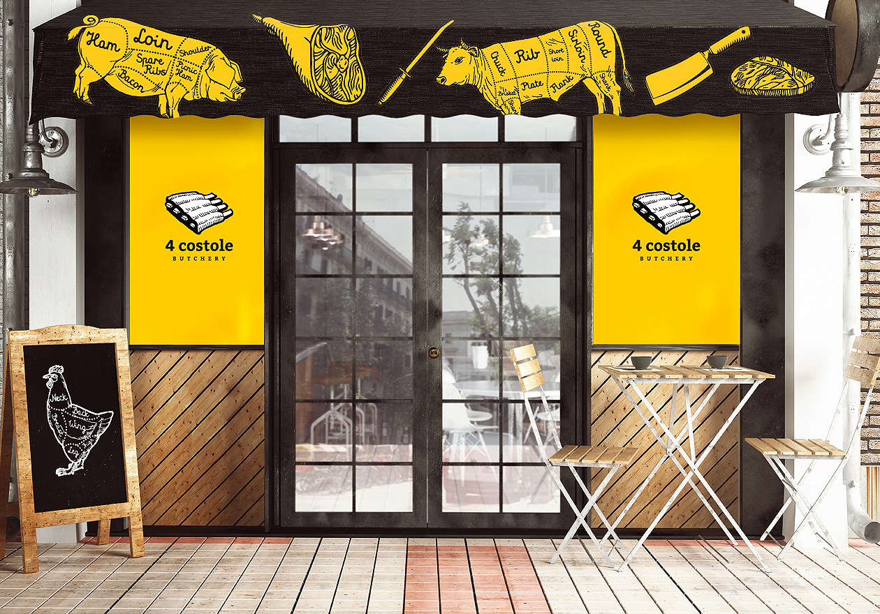
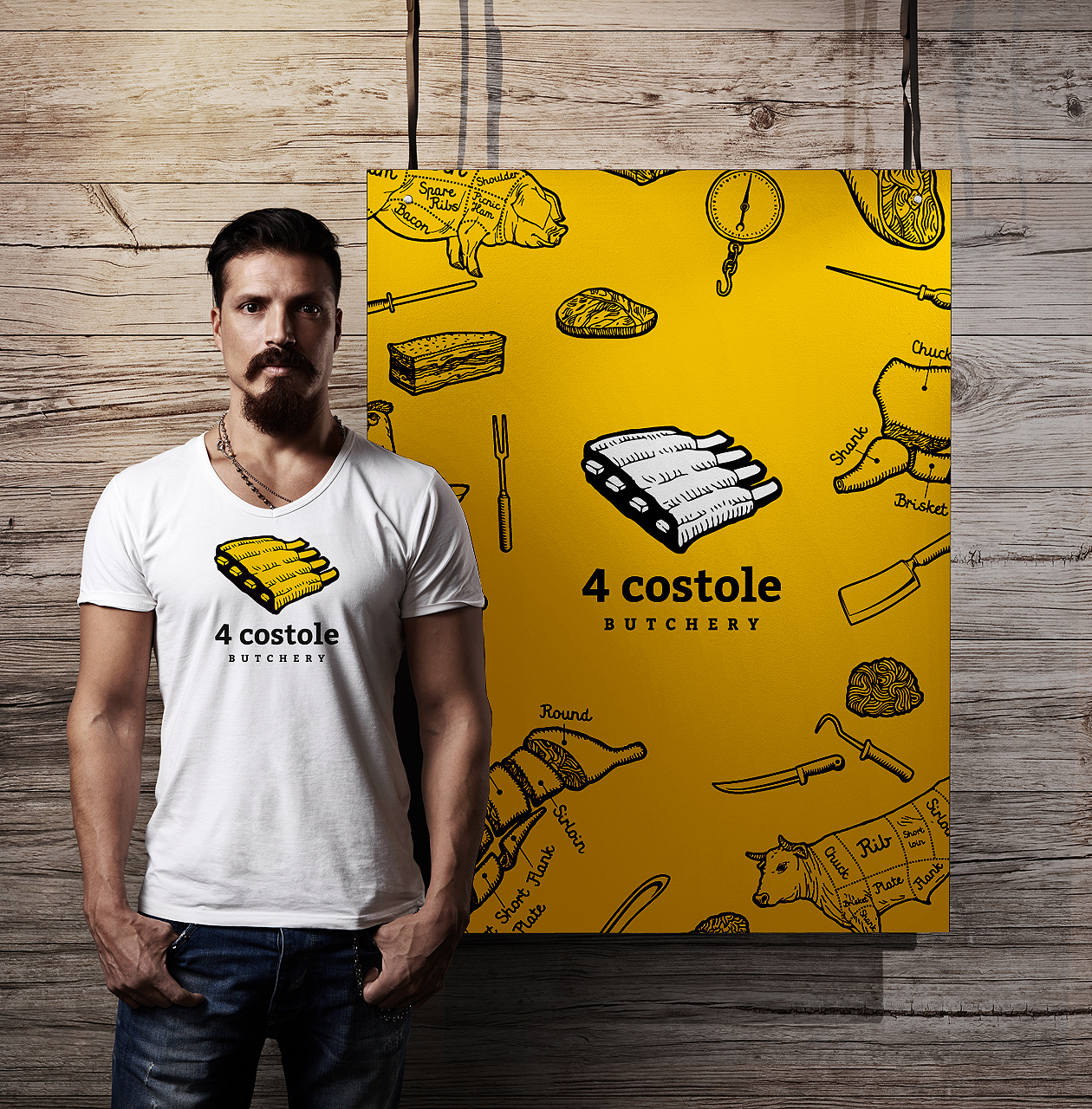
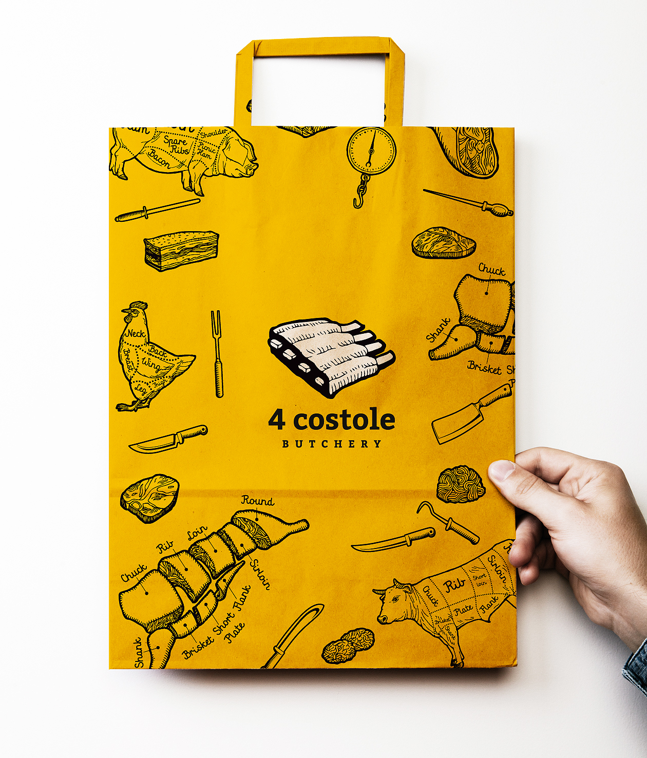
Illustrations accompany the logo across the entire corporate identity
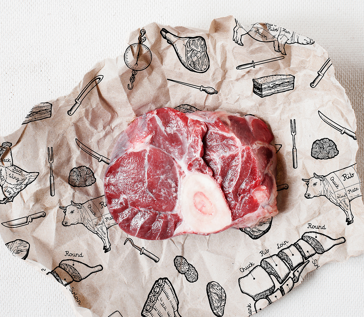
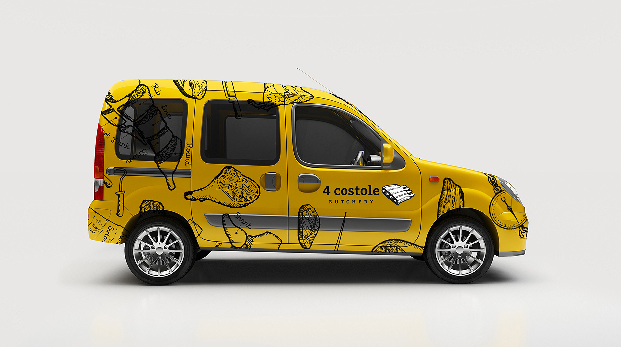
For this concept we began with choosing a set of nice and vibrant illustrations that will accommodate the logo use. The whole identity works with black, white and primary yellow color. We have then repeated the application of illustrations on various elements used Inside and ouside the butcher shop. Whether it was the wrapping paper, bags or other packaging elements. The idea of using yellow background and black illustrations worked excellently on car branding, which is nothing else but perfect mobile advertising in the city center. The concept of this brand is betting on simple, clear and visually bold communication.
Packaging design for small snacks made on point of sale
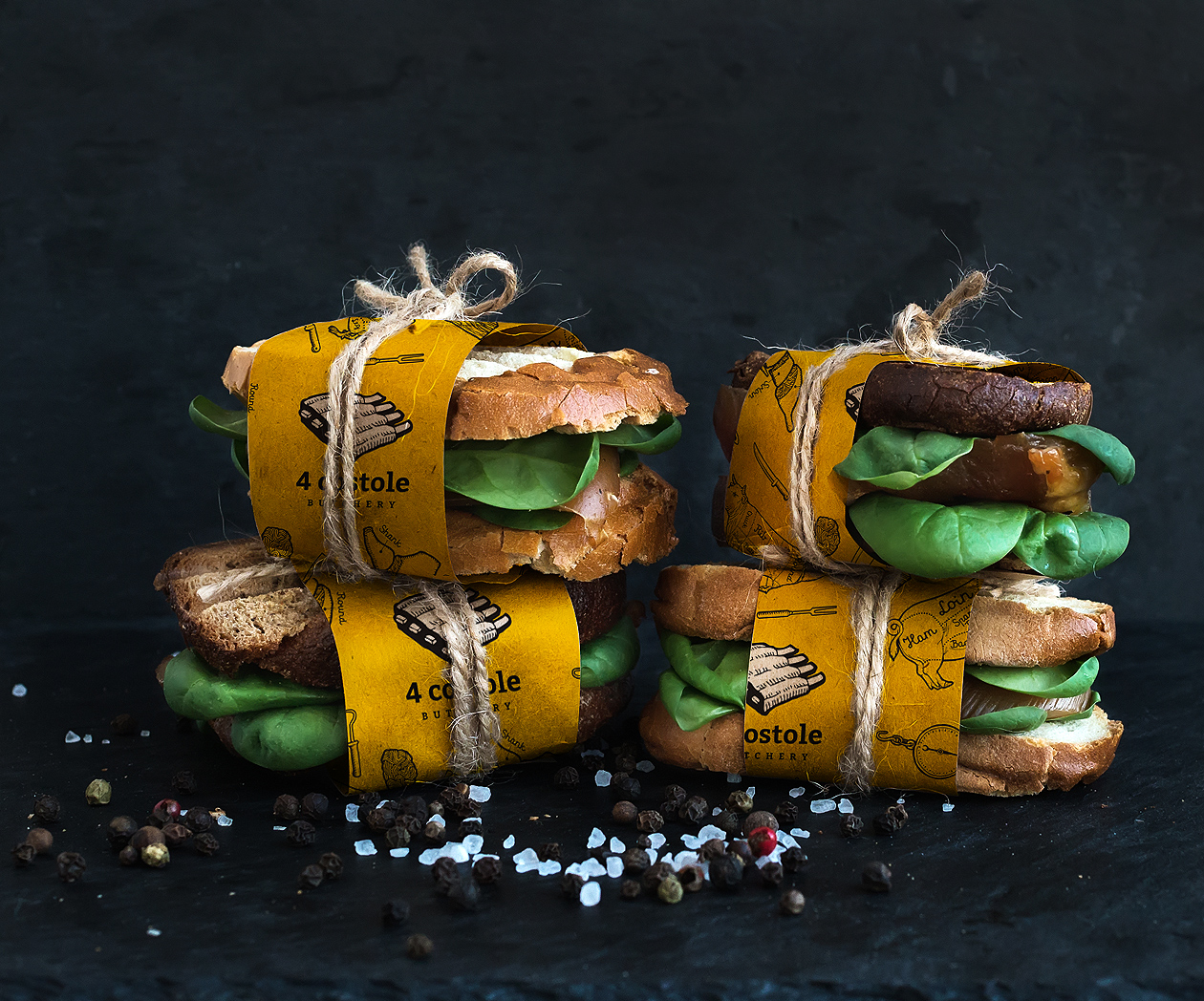
The butcher shop also started offering simple and fresh sandwiches and baguettes using their own meat products. We were happy to apply the identity of the wrapping paper. Branding these disposable forms of packaging helps the client to embrace the brand even when you leave the point of sale.
Project: 4 costole branding, logo, identita
Art Director: Martin Kuspal
Client: 4 costole butchery
Agency: MAISON D’IDÉE
Created in: 2015

