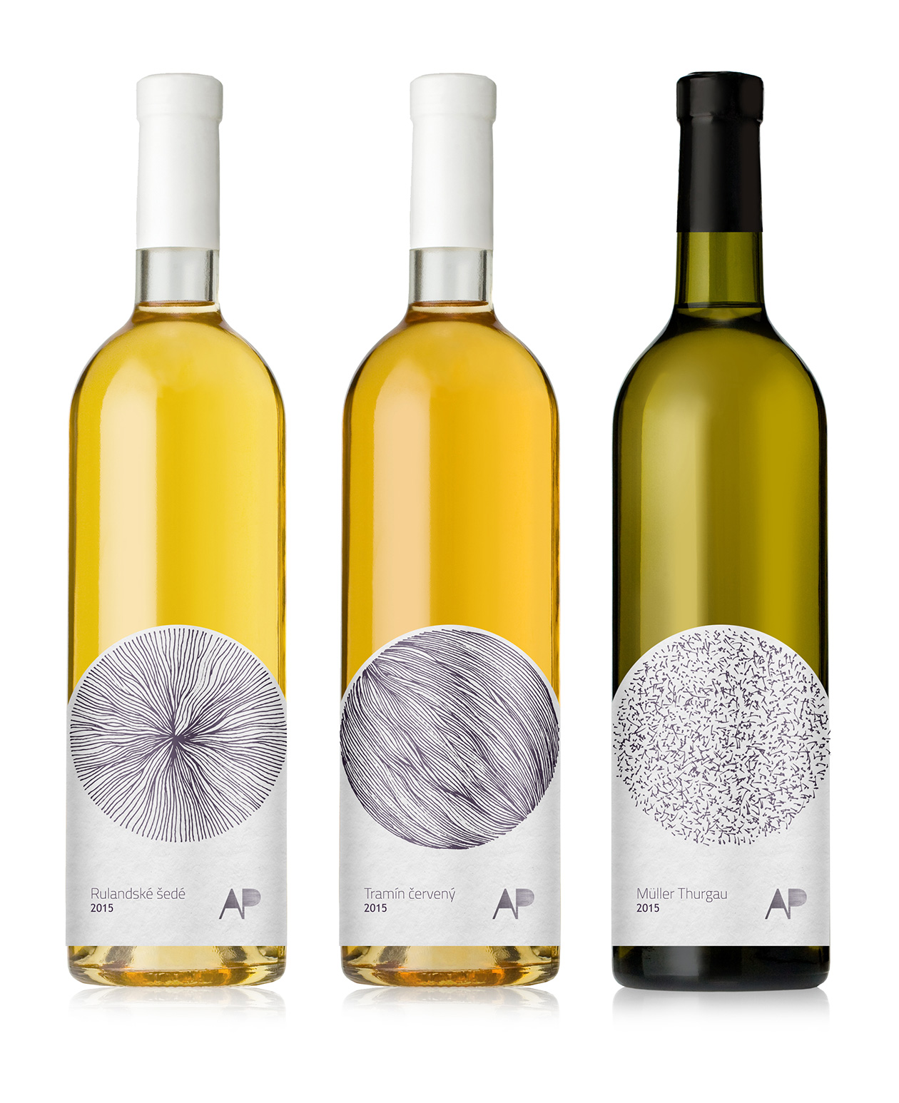
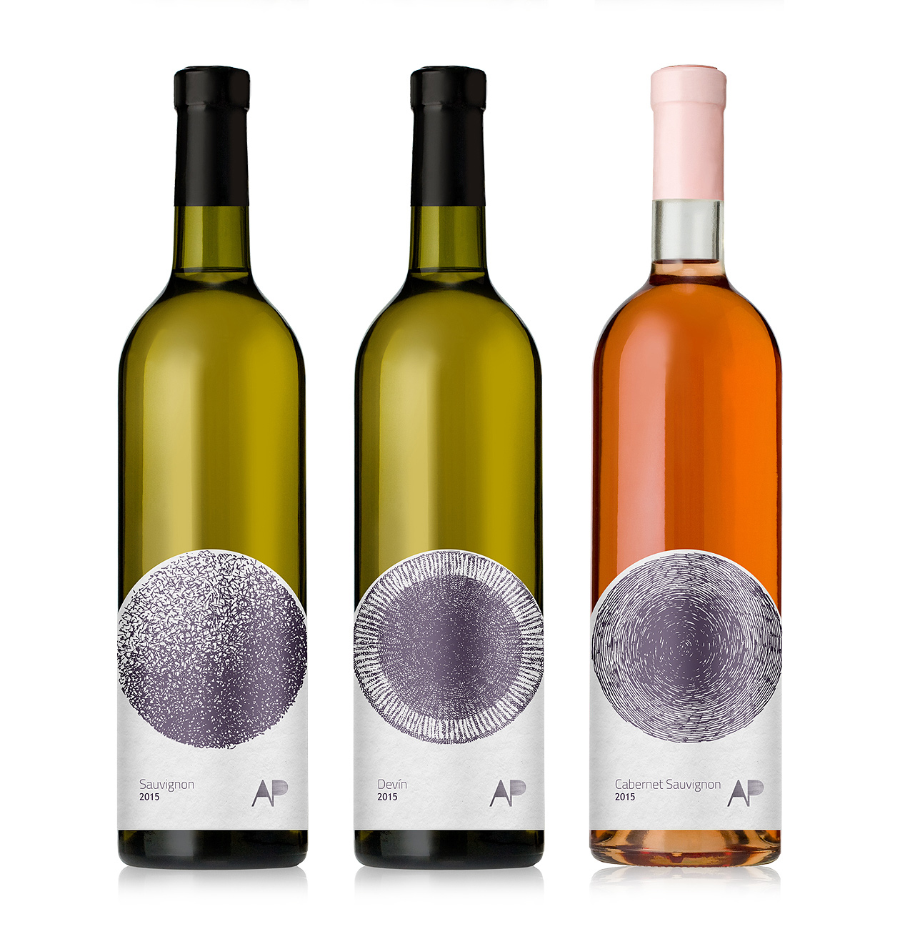
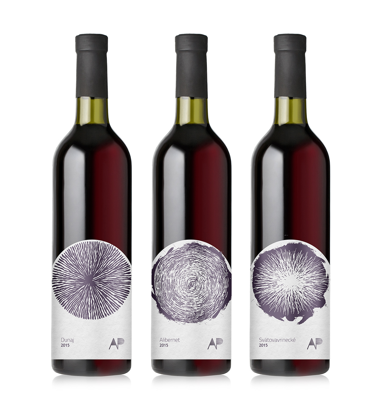
We have just finished this new packaging design for wine series. Bringing back traditional approach with the use of hand drawn illustration, in combination with lowered position of the label. The shape of the label serves as an accent to the spherical illustrations – thus emphasizing the idea of this minimalist packaging design.


Project name: Aperun Wines Hand Draw Packaging Design
Art Director: Martin Kuspal
Agency: MAISON D’IDÉE
Client: Aperun Wines
Design year: 2015